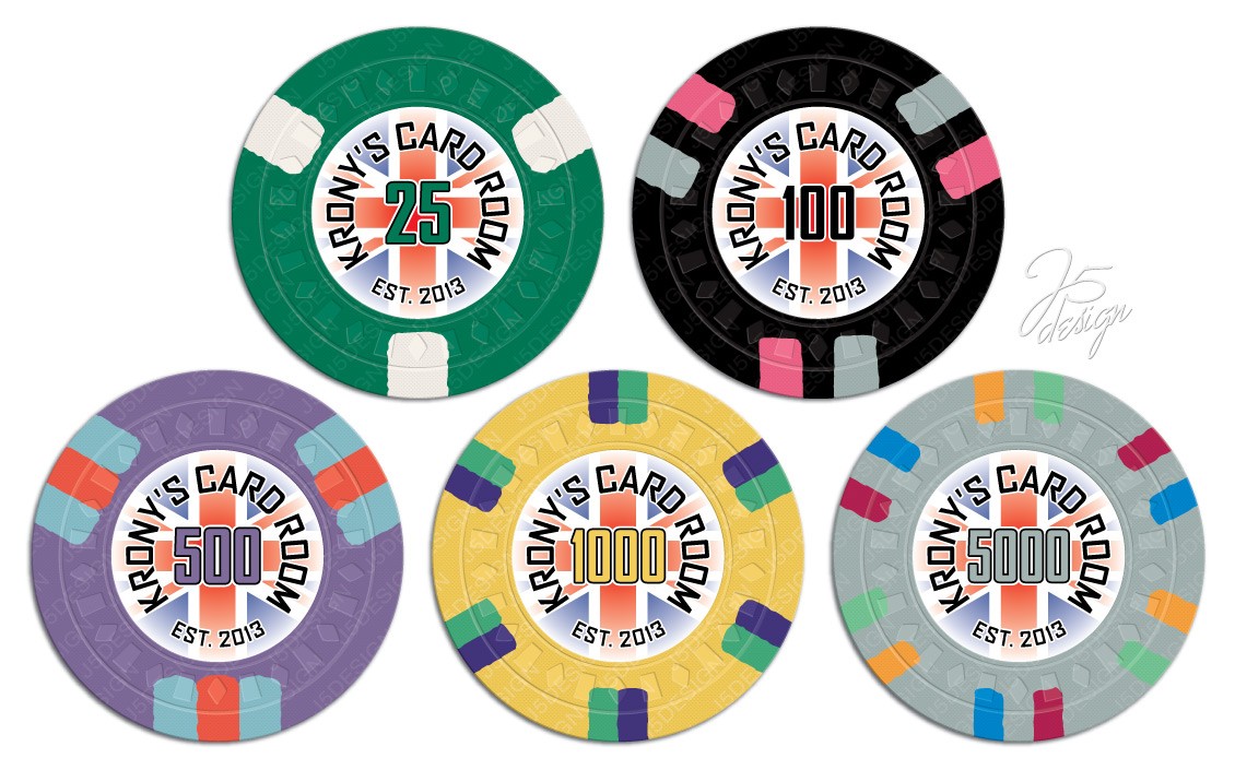
Krony's Card Room tournament set (1 Viewer)

Krony

Two Pair
Joined
Nov 7, 2014
Messages
305
Reaction score
490
Location
Lincoln, England
Hi,

Not been that active over the last year or so but have gotten the chip bug back :)

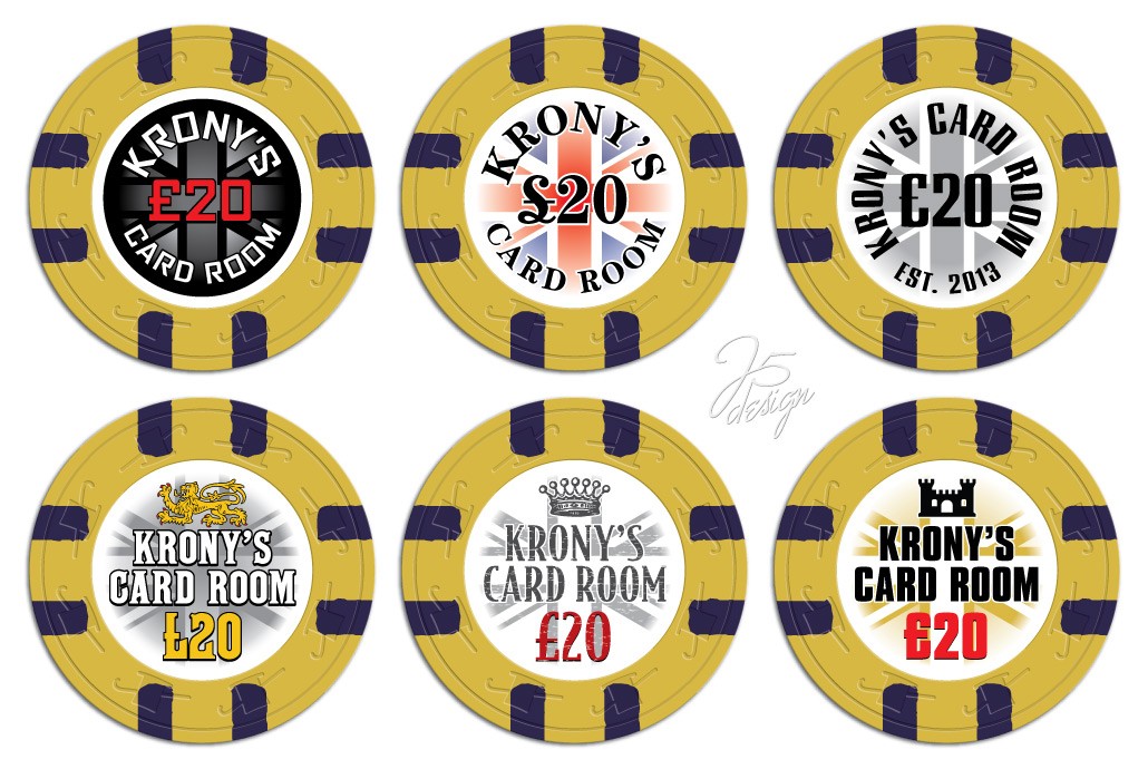
I had the Cash set below made about 2 and a half years ago and am looking to add a tourney set within the next couple of months
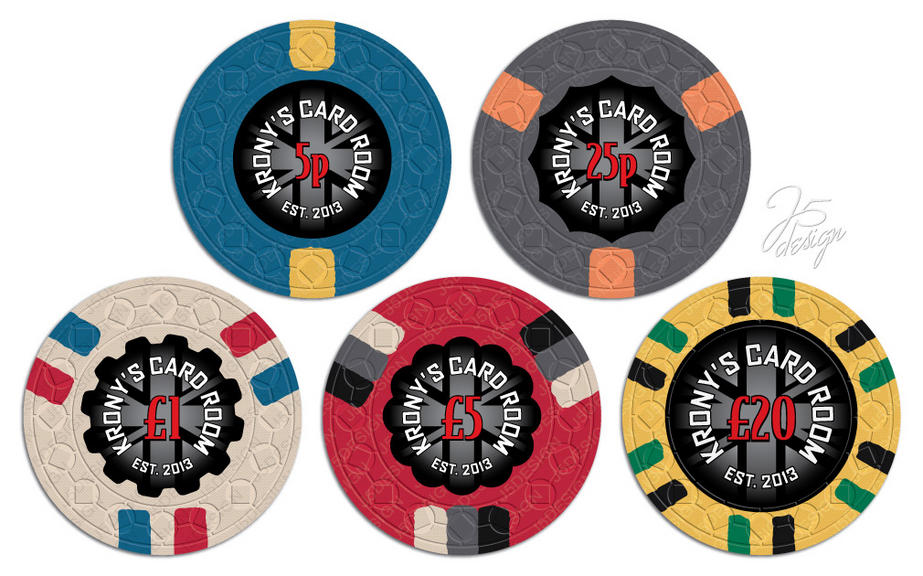
rp_v2_2c-jpg.3167


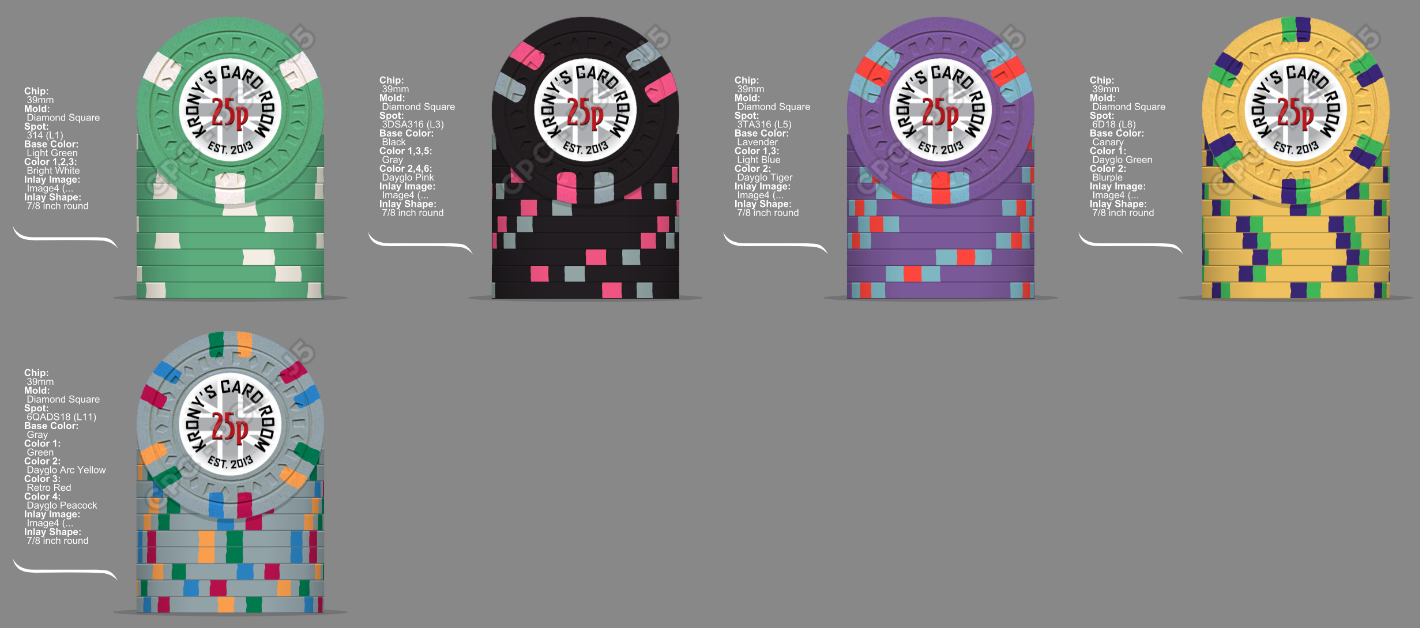
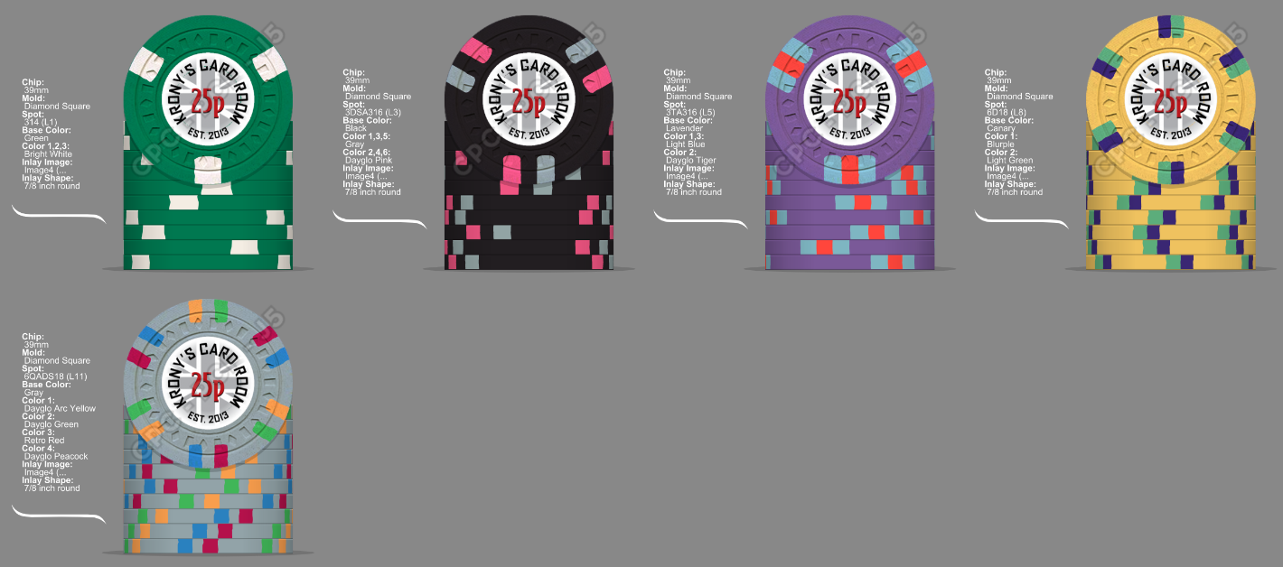
Here is where i am at atm, have used a rough inlay from the cash set to get a bit of an idea, i think the inlay will be the same or similar but with plain tourney numbers.
ESxTcE.png


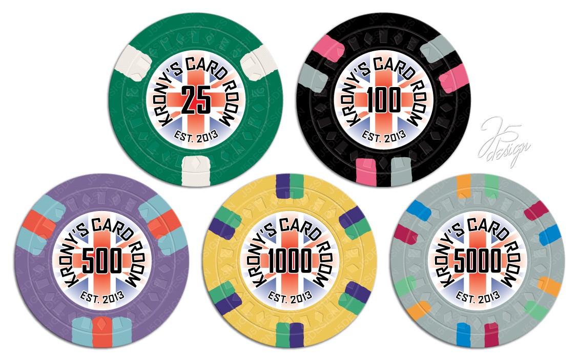
Chips will be 25, 100, 500, 1000, 5000.

Any ideas will be much appreciated.

Edit:

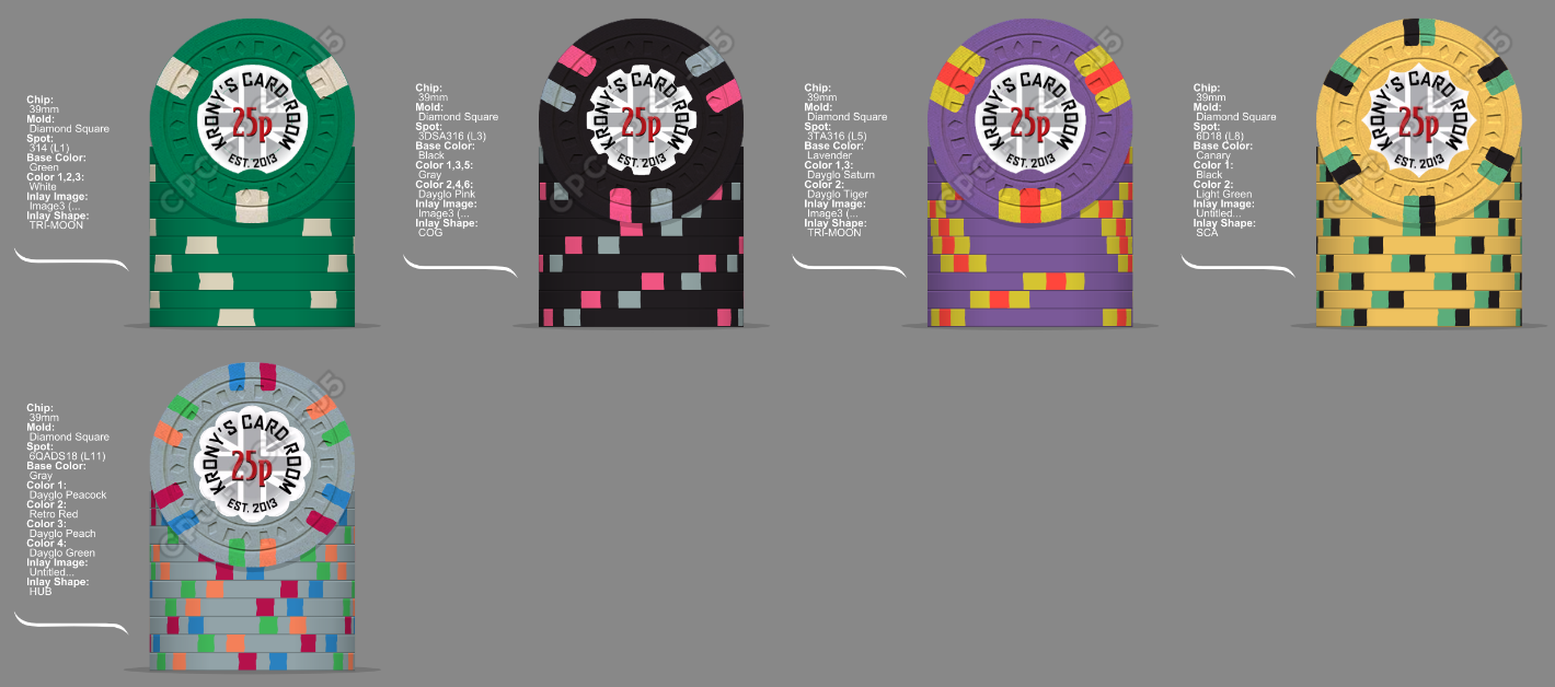
This is the most recent mockup:
PLY7nV.jpg

Z8sL6e.png
 
Last edited:
Big fan of the cash set, and was thrilled to be able to obtain a sample set of them second-hand since I started chipping after these samples were made available.

A few thoughts...
  • As listed, love the 25 exactly as is - properly simple but effective for the opening denom, and allows plenty of room for spot progression if you indeed stick with progressive patterns; ADORE the 500!
  • Shaped inlays are cool, but for a tournament set I'd probably stick to a single shape throughout the set, be it round or otherwise.
  • I know they won't be on the table at the same time, but your T1k too-closely mirrors your 20 pound cheque. To me, that's the one that begs for a tweak somewhere.
  • I like the idea to keep to a similar inlay. Consider simply inverting things to make it look more white than black? Or possibly have the colors of the Union Jack appear, but faded/muted?
  • I'm generally more in favor of consistency for tournament sets. I love spots for tourney sets, but would prefer to see something more consistent such as SPM's 313 pattern used throughout. That being said, your cash set spots are fairly simple (but effective...not a knock at all) as it is, so you've definitely left yourself a little room for some flair in your tourney set if that's the way you want to go with your spots.
  • The 5k is somewhat reminiscent of The Black Cat Club's $500 chip - which is awesome. Not sure how well the x18 DG Green spot plays against the grey base - maybe go regular green there? - but it's still a fine chip for a top denomination. That being said, If I was making a 5k for a set with a bit of a UK theme, I'll be damned if I don't Union Jack the shit out of my top denom - or at least use it as a bounty pattern.
  • In for samples :D

    upload_2017-6-7_19-2-52.png
 
Last edited:
Big fan of the cash set, and was thrilled to be able to obtain a sample set of them second-hand since I started chipping after these samples were made available.

A few thoughts...
  • As listed, love the 25 exactly as is - properly simple but effective for the opening denom, and allows plenty of room for spot progression if you indeed stick with progressive patterns; ADORE the 500!
  • Shaped inlays are cool, but for a tournament set I'd probably stick to a single shape throughout the set, be it round or otherwise.
  • I know they won't be on the table at the same time, but your T1k too-closely mirrors your 20 pound cheque. To me, that's the one that begs for a tweak somewhere.
  • I like the idea to keep to a similar inlay. Consider simply inverting things to make it look more white than black? Or possibly have the colors of the Union Jack appear, but faded/muted?
  • I'm generally more in favor of consistency for tournament sets. I love spots for tourney sets, but would prefer to see something more consistent such as SPM's 313 pattern used throughout. That being said, your cash set spots are fairly simple (but effective...not a knock at all) as it is, so you've definitely left yourself a little room for some flair in your tourney set if that's the way you want to go with your spots.
  • The 5k is somewhat reminiscent of The Black Cat Club's $500 chip - which is awesome. Not sure how well the x18 DG Green spot plays against the grey base - maybe go regular green there? - but it's still a fine chip for a top denomination. That being said, If I was making a 5k for a set with a bit of a UK theme, I'll be damned if I don't Union Jack the shit out of my top denom - or at least use it as a bounty pattern.
  • In for samples :D

    View attachment 102540

Thanks for the positive feedback, not totally happy with the shaped inlays in this set atm so will look at trying other options, i love my £20 cash chip so thought i would try and just mix it up a little but keep the colours, i have some white inlays i will mock up as i do feel the black inlay on the black chip doesn't work that well.
bringing out the Union Jack colours a bit is also a great idea.

500 is my favorite!

It's between that and the 5k chip atm for me.

I'd make the $20 a shaped inlay........it should be the baller chip of the set, so make it so.

The £20 is in a cash set i have already had made and i think the oversized inlay worked well with the limited types of shapes that were available at the time.

Yep. Hard to go wrong with Charcoal/Peach. I did something similar with the Casino Royale set. The two colors are made to go together.

Yea they do seem to work well together.
 
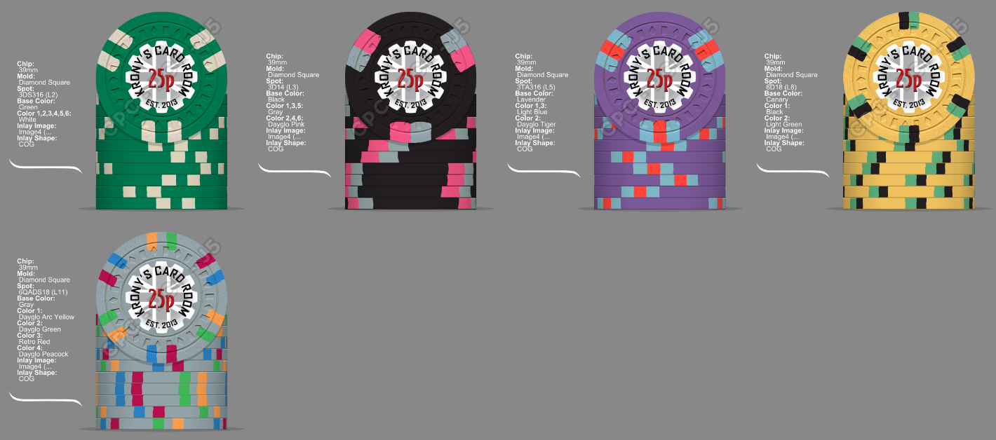
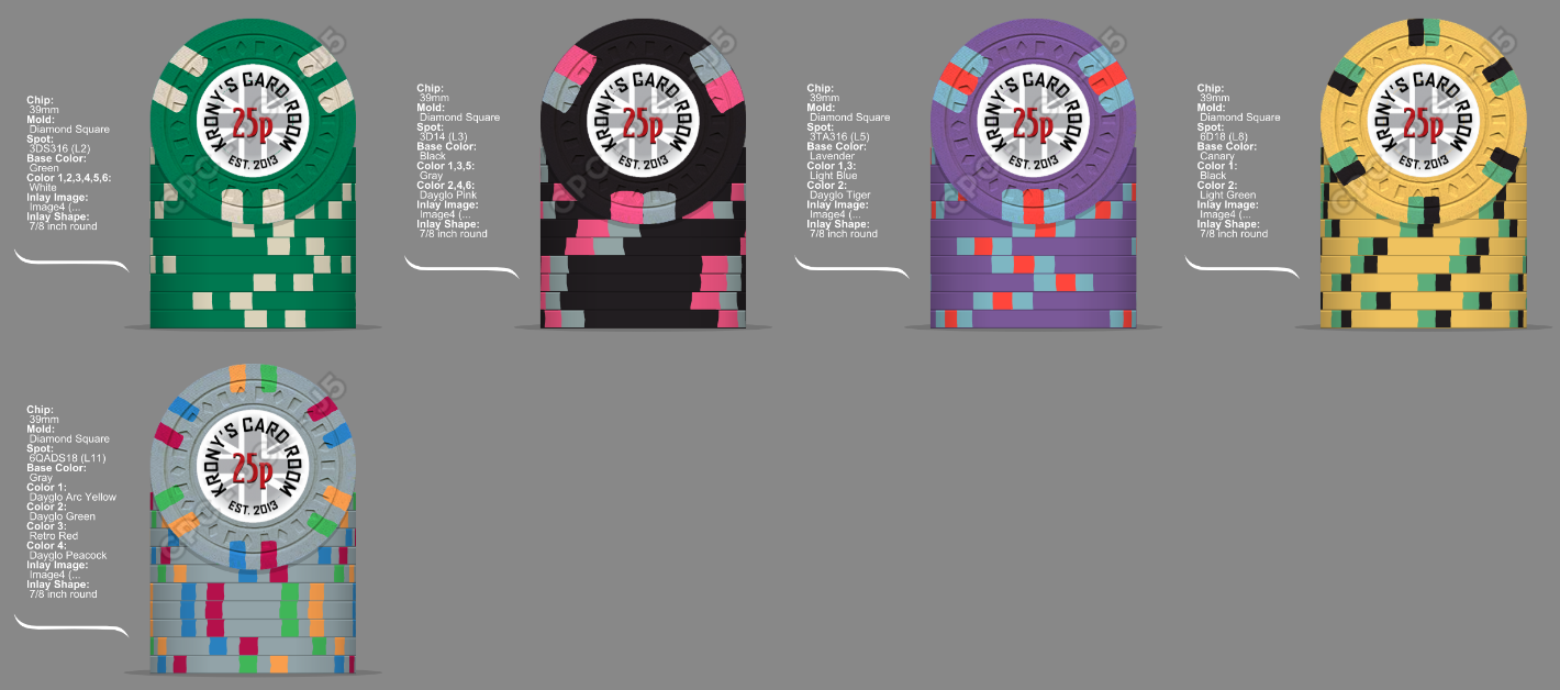
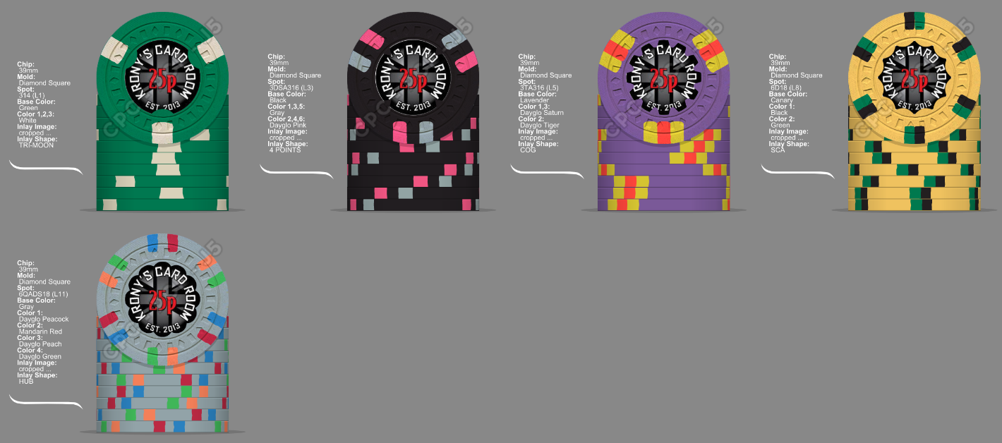
Been a bit busy lately so not spent that much time on this, here is a few more options taking on board some of the advice.

H8red1.png

d4uPUO.png

JRyvUj.png


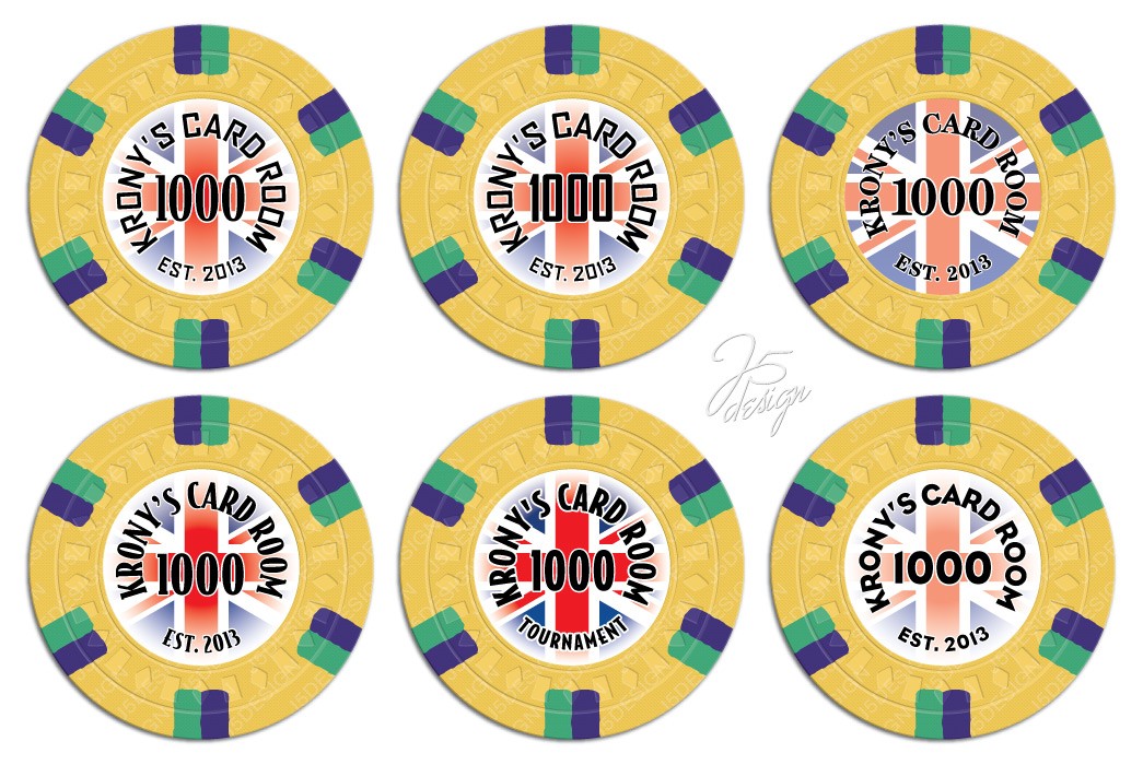
Still not 100% sure on the 1k chip so here are some more options.

zlfHec.png
KegZVI.png
A7bFUW.png
Mbqu4K.png


Also these were some of the early mockups from J5 from one of my other projects, am thinking keep what i have above but change the denom to black and add the colour to the Union Jack as @Psypher1000 mentioned similar to the top middle chip below.

GpOTYa.jpg
 
Last edited:
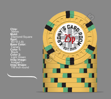
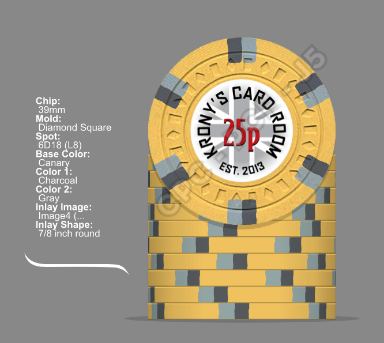
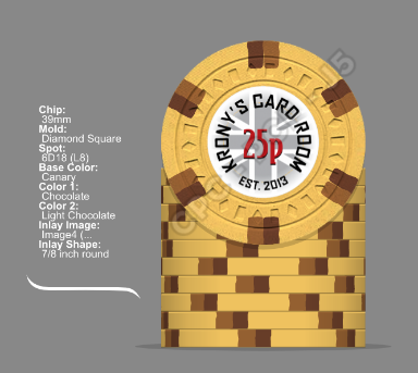
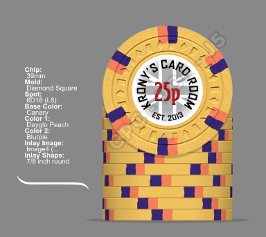
Thanks for the comments, the 25 chip having the same physical spot pattern as the 100 was bugging me a bit and also talk of bright white in another thread got me thinking.

r9IxXT.png


What does anyone think of the adjustment ?
 
I like the change too!

Repeating spots (unless they are all they same) would bother me.
 
My suggestion would be row 1 column 2 but with the "Tournament" label, and the value colored in the chip's base color. Or even any other color. It needs to have some contrast against the circular text around. Definitely do keep the font that was used for your cash set chips.
 
More mock ups from J5, first is #2 from the previous mocks on all the chips, second is same but with base colour denoms.
Now these didn't really work well with the background colours so he added a black stroke around them, unfortunately that doesn't worth with the black 100 chip so options for that are to use spot colours or just go plain back denom on that chip.

rwRTav.jpg

e49jxr.jpg


What do you think ?
 
You could take a dark gray instead, or keep using black just for the 100 chip. (Could do a dark gray instead of black stroke around that one so one can still see it's the same style, i.e. also has a stroke around it)
 
The denom really should have a different color so it stands out from the circle text. But color matching to each chip's base color isn't the only way to achieve that.
 
Wasn't that into the coloured denoms and after the poll it seemed most were feeling the same, have got 2 more mockups from @Johnny5 with different shades of grey that might also be an option.

DohQPk.jpg


r4QfYw.jpg


What does anyone think of these instead of the black ?
 

Create an account or login to comment

You must be a member in order to leave a comment

Create account

Create an account and join our community. It's easy!

Log in

Already have an account? Log in here.

Back
Top Bottom