Jojo's Bizzare Adventure Inspired - UK Micro Stakes Cash Set (1 Viewer)

nauseant

High Hand
Joined
Jul 16, 2022
Messages
94
Reaction score
212
Location
United Kingdom
So I've been wanting to make some custom card molds and have been tinkering with the idea of making some JoJo part 5 chips as it's my favourite anime series

I feel the colours and patterns from the characters lend well to Poker chip design.

I want the chips to be an homage to my favourite characters from the series.

One important aspect of this chip design is one of my players is red-green colourblind so pink looks grey, green & red looks yellow and purples look blue to him so I'd like to make it inclusive for him best I can whilst still keeping them looking nice.

Please let me know if you think any other spot patterns or colours would work, I do plan on having this all don properly in AI but for now i've just used the CPC designer to get something.
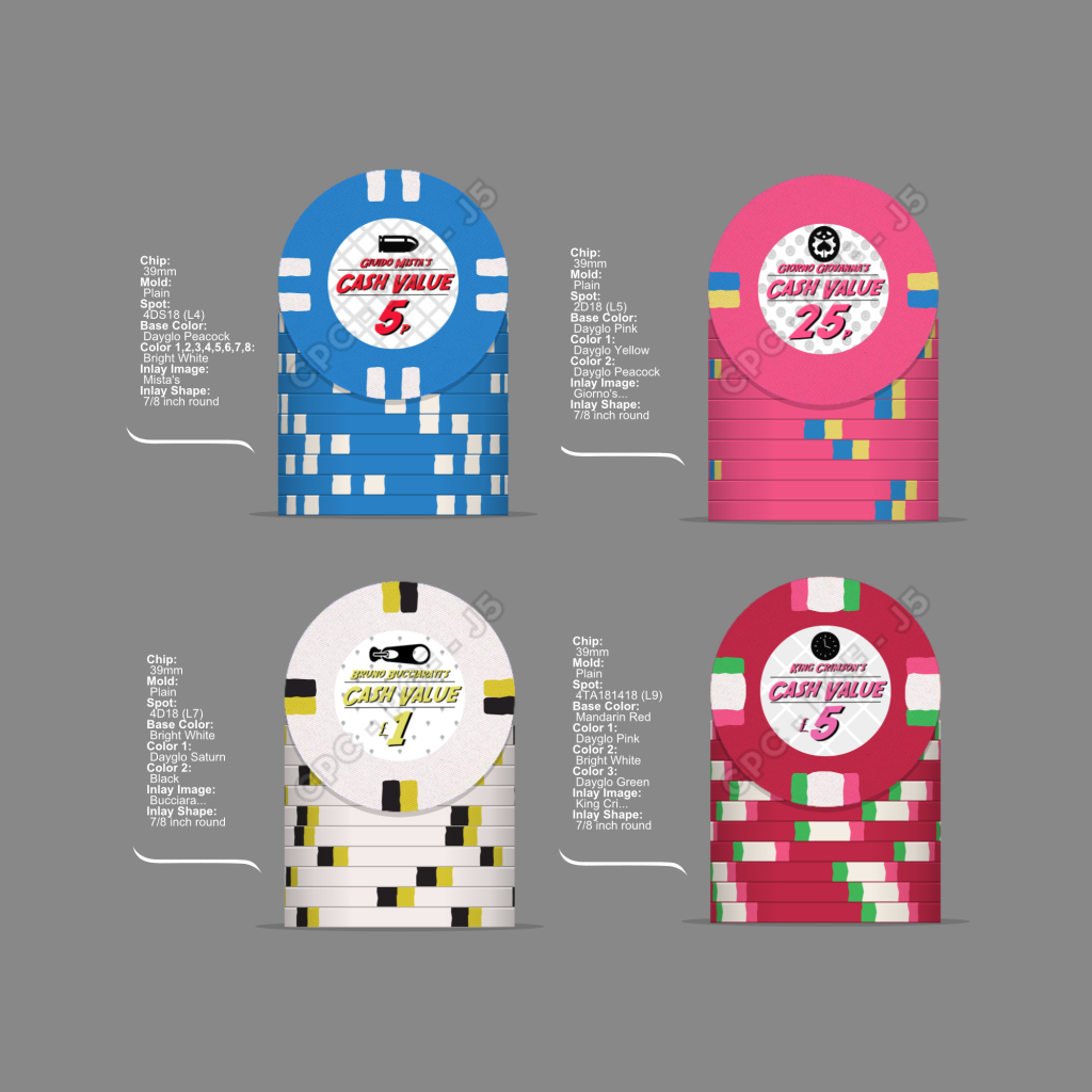
All Chips.png


The 5p is based on the character Guido Mista
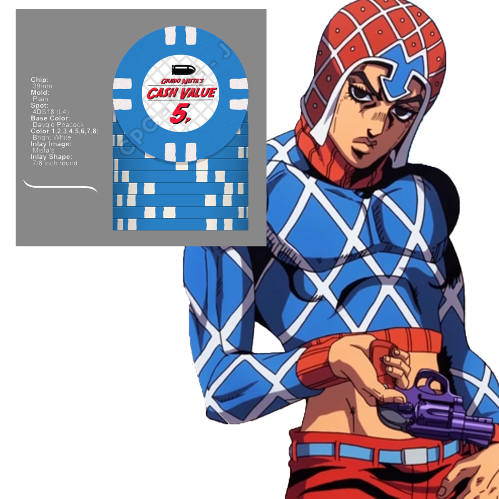
Mista.png


The 25p is based of the main character Giorno Giovanna (I will colour match this better at the final design)
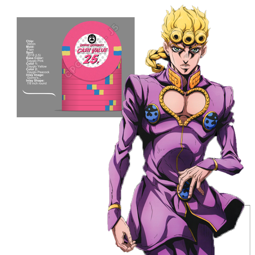
Giorno.png

The £1 is Bruno Bucciarati (My favourite of this set as it currently stands)
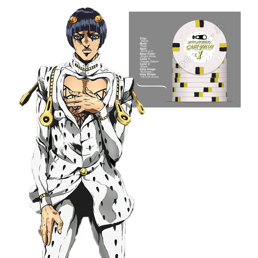
Bucciarati's.png


And finally The antagonist of the series King Crimson
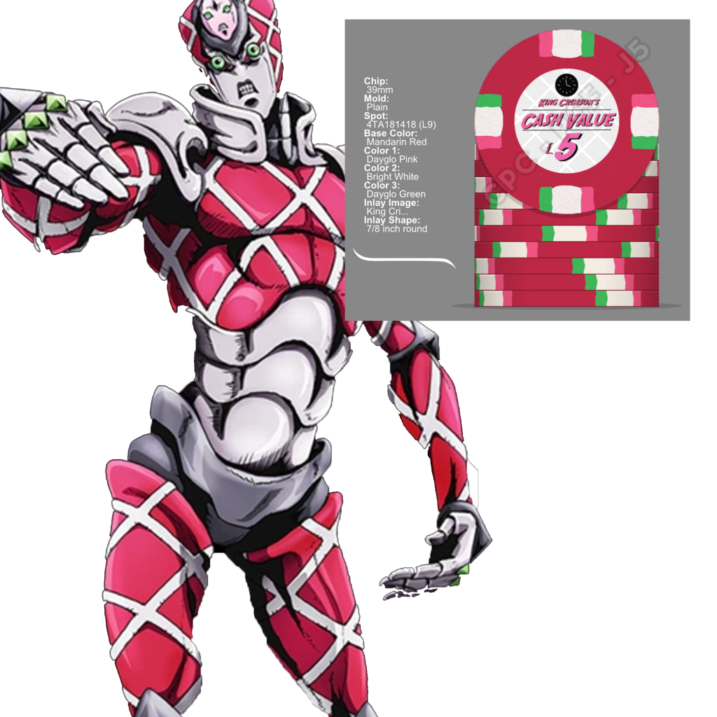
King Crimson.png


Any feedback one how to make the poker chips look nicer would be greatly appreciated.

Much love and thanks for taking a look at my bizzare chip idea!
 
I also forgot to mention this set will be primarily for .05/.10 cash games,

My friends aren't big gamblers so i'll be going low stakes for now with the potential for upping the blinds to .10/.25 if they feel in a frisky mood, optimistically I can hopefully get them to play .25/.50 at some point too.

I plan on 1000 chips total;

300x.05
300x.10
300x1
100x5
 
Neat concept (even if I'm not familiar with basis). I personally love pink.... thinking your 25p should be more purple than pink. Is that what you meant by color matching later?
 
Neat concept (even if I'm not familiar with basis). I personally love pink.... thinking your 25p should be more purple than pink. Is that what you meant by color matching later?
Thanks!

Yeah, the pallette on CPC is a bit restricting, it'll be closer to the overall outfit colour on the final chip when I get the base design sorted
 
Having seen this post, I would take a completely different approach:

1660418683961.jpeg

https://www.pokerchipforum.com/threads/who-made-these-custom-chips.93421/post-1928366

There are some cool patterns in those suits that you could leverage. No need to stick to traditional spot patterns.

The cross hatching, the black tear drops, the lavender scaling. You could still drop in accent colors in the inlay or spread across the chip in a nice pattern.

Lots of opportunities if you break free from spots!

Good luck with the project.
 
Having seen this post, I would take a completely different approach:

View attachment 966748
https://www.pokerchipforum.com/threads/who-made-these-custom-chips.93421/post-1928366

There are some cool patterns in those suits that you could leverage. No need to stick to traditional spot patterns.

The cross hatching, the black tear drops, the lavender scaling. You could still drop in accent colors in the inlay or spread across the chip in a nice pattern.

Lots of opportunities if you break free from spots!

Good luck with the project.
You know what? I really like that idea!

I think I'll go back to the drawing board with the designs, I love the patterns on the outfits and it didn't occur to me to have a wrap around design for the different patterns.

I tried to incorporate the patterns in the background of each respective lable but I like your idea much more!
 
Having seen this post, I would take a completely different approach:


https://www.pokerchipforum.com/threads/who-made-these-custom-chips.93421/post-1928366

There are some cool patterns in those suits that you could leverage. No need to stick to traditional spot patterns.

The cross hatching, the black tear drops, the lavender scaling. You could still drop in accent colors in the inlay or spread across the chip in a nice pattern.

Lots of opportunities if you break free from spots!

Good luck with the project.

So taking on your advice I've knocked something together, Dimensions are probably off but it's just a rough idea for the design,

Personally not happy with the £5's for now but overall happy with the graphic comic book/manga feel!

I'm hoping the the rough black edges on the face and edge will look cool and straight out of an anime.

JoJo Ceramic Chips v2.png

Thanks for your advice!
 
A few thoughts:

On the edges- what do you think about subtle spot-like additions to help with cross-table counts on the £1 & £5? For example, on the £1, perhaps filling in the occasional yellow rectangle with white and/or black? Maybe silver on the £5?

On the £5, the buckle has a gold outline and a gold A. Would a gold or outline on the star work? Or a similar gold A behind it? Or similar gold circle just in from the edge? Or a silver outline around the star like the purple on silver hair? Just something to give a little pop. It’s a dark chip and the two dark purples give a really heavy feel. There are a few options to try.

Really nice set. And while it screams JoJo if you know, it still works for any non JoJo fan at the table.
I appreciate the feedback!

I think what I'm going to do because the set is so yellow heavy in the design already on the £5 chip I'll incorporate more of the lighter purple, maybe add the 'laces' on his top and light gray on the spots. I tried outlines on the star but it didn't really work, you can't see in the picture but the star is actually on top of his head, I tried to break it up with the gray which but I agree it's by far the weakest chip and it needs the most work. Although thematically the character can view past events as if watching a DVD player on rewind so was thinking of incorporating some green rewind symbols in the edge design.

On the £1 chip I was thinking of having the zip partially undone exposing some black underneath it to act as a little spot pattern, this will also allow a zipper on the edge pattern to make it a little more varied and hopefully easier to ready across the table for quick counting,

I don't think I made the edges big enough for the design as I'm unsure of the exact dimensions so they look very cramped right now.
 

Create an account or login to comment

You must be a member in order to leave a comment

Create account

Create an account and join our community. It's easy!

Log in

Already have an account? Log in here.

Back
Top Bottom