Previous threads:
https://www.pokerchipforum.com/threads/frac-design-color-help-me-decide.30689/
https://www.pokerchipforum.com/threads/need-help-w-alternate-design-cardroom-name-tribute.33179/
Current Set (design not changing, except for the name):
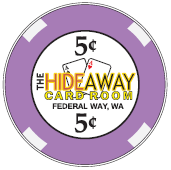
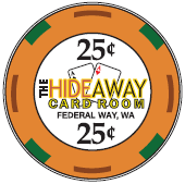


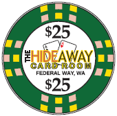
Next up, I have some decisions to make.
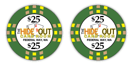
I went with "Hide Out" as suggested in the thread linked above by @CraigT78. But the space between the E and O and the blank card face kind of bugged me. It didn't bother me as much when it was covered up by a letter, but when it's right there in the middle of the chip it seemed like the should have a heart in the center.
What's your opinion on adding the heart, even though it strays just a bit from the original design which I'm trying to stay pretty true to?
Also, I'm commissioning some $100's. I have a pretty clear personal favorite for color scheme, but I'm interested in what people think might look best with the set overall. I'm less sold on which spot pattern to go with, so feedback on your favorites between A-E would be helpful!


Hat tip to @timinater for the fab designs and for being great to work with!
https://www.pokerchipforum.com/threads/frac-design-color-help-me-decide.30689/
https://www.pokerchipforum.com/threads/need-help-w-alternate-design-cardroom-name-tribute.33179/
Current Set (design not changing, except for the name):
Next up, I have some decisions to make.
I went with "Hide Out" as suggested in the thread linked above by @CraigT78. But the space between the E and O and the blank card face kind of bugged me. It didn't bother me as much when it was covered up by a letter, but when it's right there in the middle of the chip it seemed like the
 should have a heart in the center.
What's your opinion on adding the heart, even though it strays just a bit from the original design which I'm trying to stay pretty true to?
Also, I'm commissioning some $100's. I have a pretty clear personal favorite for color scheme, but I'm interested in what people think might look best with the set overall. I'm less sold on which spot pattern to go with, so feedback on your favorites between A-E would be helpful!
Hat tip to @timinater for the fab designs and for being great to work with!
