Damn this hobby.
Inspiration struck like a lightning bolt earlier this week for a new set inspired by a favorite vacation spot. After seeing the awesome aquatic/beach motif inspired sets from @Eloe2000 , @Rbonus012 , and Fink with his P+P set, I figured I'd try my hand at my own. I'm going to keep the specifics on the down low, but I'm shooting for a Caribbean/beach theme with these chips. I want the colors and edge spots to go along that theme as closely as possible.
It'll be on HHR mold if I ever get these made (the reason will make sense when I explain the back story), and that part is not negotiable for change.
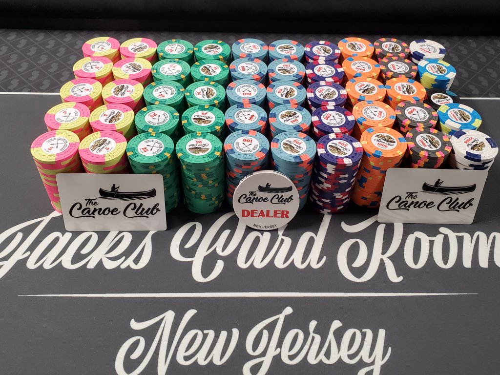
As I won't have any set with shaped inlays, I'll try my hand at it with the cash set with this theme. This is what I have so far, but open to feedback on color, edge spot progression, and inlay shape choices. I'm going to give my thoughts on each chip so far as well below.

Frac: I could go either way here between a red or a green frac. If I go with a green frac though, I'd change the spots on the $1 to red or pink instead of green as is. Maybe go maroon here instead of red? I got my color sample out and I'm just not sure if red provides enough of contrast against the retro red base.
$1: I forgot to change the edge spot pattern on this one before hitting save. I'm likely going to make this 4D14 instead of 4DS18 as I plan on using the latter spot pattern. On my color sample DG Green could work really nicely here, and I don't want to outright copy @Eloe2000 's Casa Mango $1 here, though I won't lie and say that chip is a huge inspiration in thinking this one up. I have a DG Peacock $1 already pending that'll be 3D14, I'm trying to do something different here. I'm flexible with the edge spot pattern here, but as long as it makes sense in the context of the entire set, but am more or less settled on the DG Peacock base and bright white and DG Green or light green spots. Do I rotate the spots 45 degrees to better fit the inlay shape, or is it ok as is?
$5: The first chip I thought of when mocking this set up. This one screams Caribbean and "the beach" to me. I'm really happy with the colors and edge spots as is, but try to change my mind! This shaped inlay works perfectly with the 414418 spot as well!
$20: This was one of the more challenging chips. I already covered so much of the CPC palette in the first three chips and it was hard to think up something that wouldn't cause dirty stack or pot issues. I really want the 3TA316 spot to work here if I can as I don't have a set as of yet with this edge spot in it, and I think the $20 here, especially after a $5 that pops the way it does, is a good place to do it. I'm definitely flexible with the edge spot colors here, I struggled lots in thinking this one up. There may be a good start with the gray and light blue spots on the outside, but I'm trying to find the right color for the third spot in the middle that would provide contrast.
$100: Definitely going white for the base here, but I'm flexible on the spot pattern and edge spot colors. I already know this set will be heavy on the blues, yellows, oranges, and reds, but do I continue with that or do I do something different here? Would love to see some different ideas for this chip and the $20, while the $5, frac, and $1 I'm pretty much set on the colors, at least.
As for the tournament set, I want to do a set with the same edge spot pattern as the others I've made will have different edge spots. Again, going with the Caribbean/beach theme here.

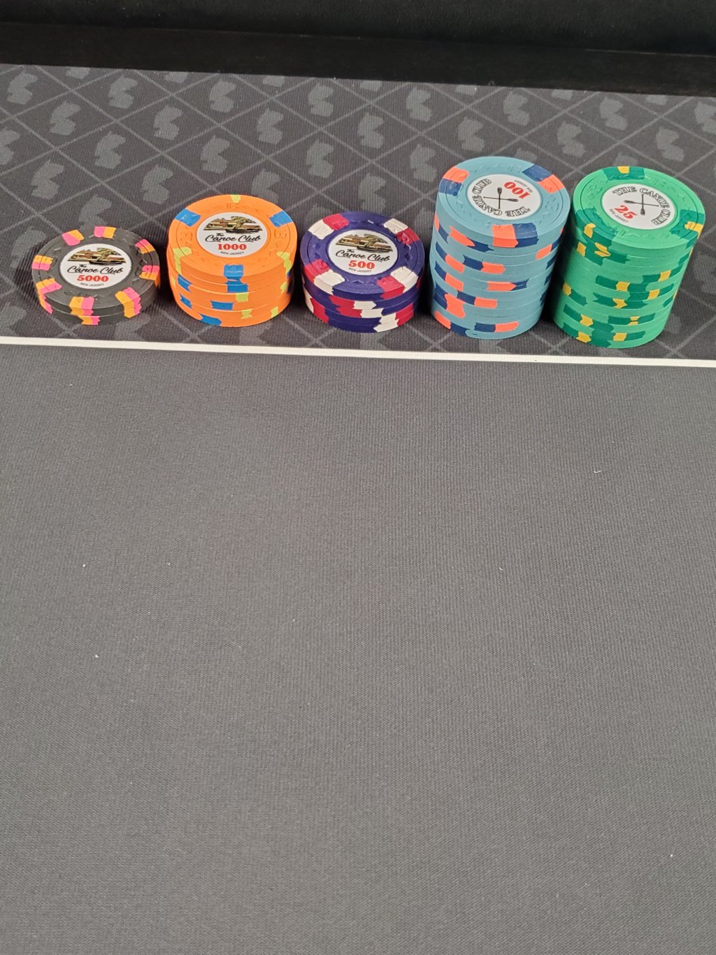
So I'm pretty happy with the cohesiveness and color scheme of each chip individually in this lineup. I opted for the 4DS18 spot because I don't have many chips that have this spot pattern, and would look good in stacks on the table. It also allows for more of the base chip color to shine through as opposed to the 4DS16 pattern that covers the edge of the chip almost all the way to the inlay. I made the set in a way that is very formulaic; one faded color relative to the chip base and a contrasting color (ex. green spot on a light green base, light blue on an imperial blue base, you get the idea).
Some thoughts:
On the T25, do I make it contrast more and go with dark green or retro green instead of regular green?
T100 I'm very happy with. Maybe arc yellow instead of peach?
T500 looks good too, but maybe DG pink instead of regular pink? I think regular pink is just right to provide contrast but not so much that it's screaming and clashing with the DG Tiger base in the T1000.
T1000 is a banger. I'm happy with that completely. Ditto the T5000.
For the white T25,000, I tried to pick two colors that weren't used yet. DG pink fit the bill as it wasn't used on the T500, and the T500 will be off the table by the time T25,000's would ever make an appearance. Any other ideas for a bright white base chip here? I'm open to different color suggestions here.
Alright, go ahead and roast me!
Inspiration struck like a lightning bolt earlier this week for a new set inspired by a favorite vacation spot. After seeing the awesome aquatic/beach motif inspired sets from @Eloe2000 , @Rbonus012 , and Fink with his P+P set, I figured I'd try my hand at my own. I'm going to keep the specifics on the down low, but I'm shooting for a Caribbean/beach theme with these chips. I want the colors and edge spots to go along that theme as closely as possible.
It'll be on HHR mold if I ever get these made (the reason will make sense when I explain the back story), and that part is not negotiable for change.
As I won't have any set with shaped inlays, I'll try my hand at it with the cash set with this theme. This is what I have so far, but open to feedback on color, edge spot progression, and inlay shape choices. I'm going to give my thoughts on each chip so far as well below.
Frac: I could go either way here between a red or a green frac. If I go with a green frac though, I'd change the spots on the $1 to red or pink instead of green as is. Maybe go maroon here instead of red? I got my color sample out and I'm just not sure if red provides enough of contrast against the retro red base.
$1: I forgot to change the edge spot pattern on this one before hitting save. I'm likely going to make this 4D14 instead of 4DS18 as I plan on using the latter spot pattern. On my color sample DG Green could work really nicely here, and I don't want to outright copy @Eloe2000 's Casa Mango $1 here, though I won't lie and say that chip is a huge inspiration in thinking this one up. I have a DG Peacock $1 already pending that'll be 3D14, I'm trying to do something different here. I'm flexible with the edge spot pattern here, but as long as it makes sense in the context of the entire set, but am more or less settled on the DG Peacock base and bright white and DG Green or light green spots. Do I rotate the spots 45 degrees to better fit the inlay shape, or is it ok as is?
$5: The first chip I thought of when mocking this set up. This one screams Caribbean and "the beach" to me. I'm really happy with the colors and edge spots as is, but try to change my mind! This shaped inlay works perfectly with the 414418 spot as well!
$20: This was one of the more challenging chips. I already covered so much of the CPC palette in the first three chips and it was hard to think up something that wouldn't cause dirty stack or pot issues. I really want the 3TA316 spot to work here if I can as I don't have a set as of yet with this edge spot in it, and I think the $20 here, especially after a $5 that pops the way it does, is a good place to do it. I'm definitely flexible with the edge spot colors here, I struggled lots in thinking this one up. There may be a good start with the gray and light blue spots on the outside, but I'm trying to find the right color for the third spot in the middle that would provide contrast.
$100: Definitely going white for the base here, but I'm flexible on the spot pattern and edge spot colors. I already know this set will be heavy on the blues, yellows, oranges, and reds, but do I continue with that or do I do something different here? Would love to see some different ideas for this chip and the $20, while the $5, frac, and $1 I'm pretty much set on the colors, at least.
As for the tournament set, I want to do a set with the same edge spot pattern as the others I've made will have different edge spots. Again, going with the Caribbean/beach theme here.
So I'm pretty happy with the cohesiveness and color scheme of each chip individually in this lineup. I opted for the 4DS18 spot because I don't have many chips that have this spot pattern, and would look good in stacks on the table. It also allows for more of the base chip color to shine through as opposed to the 4DS16 pattern that covers the edge of the chip almost all the way to the inlay. I made the set in a way that is very formulaic; one faded color relative to the chip base and a contrasting color (ex. green spot on a light green base, light blue on an imperial blue base, you get the idea).
Some thoughts:
On the T25, do I make it contrast more and go with dark green or retro green instead of regular green?
T100 I'm very happy with. Maybe arc yellow instead of peach?
T500 looks good too, but maybe DG pink instead of regular pink? I think regular pink is just right to provide contrast but not so much that it's screaming and clashing with the DG Tiger base in the T1000.
T1000 is a banger. I'm happy with that completely. Ditto the T5000.
For the white T25,000, I tried to pick two colors that weren't used yet. DG pink fit the bill as it wasn't used on the T500, and the T500 will be off the table by the time T25,000's would ever make an appearance. Any other ideas for a bright white base chip here? I'm open to different color suggestions here.
Alright, go ahead and roast me!