You are using an out of date browser. It may not display this or other websites correctly.
You should upgrade or use an alternative browser.
You should upgrade or use an alternative browser.
Harlequin Card Room (1 Viewer)
- Thread starter H|Q
- Start date
Forty4
Full House
What about mixing in a yellow? I like the green & purple but think I agree with jbutler that the lavender on the $5 and the purple on the $25 might not work. So yellow on either of those? Probably should have done a mock up before posting, oh well.
What about mixing in a yellow? I like the green & purple but think I agree with jbutler that the lavender on the $5 and the purple on the $25 might not work. So yellow on either of those? Probably should have done a mock up before posting, oh well.
a yellow-family spot on the $25 is a legit option imo. still prob prefer the all green $25, but these both look good.
Chicken Rob
Full House
View attachment 15130
100 - frac
300 - $1
800 - $5
150 - $20 (25 x 4 rack)
50 - $100 (25 x 4 rack)
-------------
1400 chips = 1 sarge drawer
I like these a lot, but miss the black/white/purple hundo...
courage
Full House
- Joined
- Oct 29, 2014
- Messages
- 4,264
- Reaction score
- 6,741
Top row is sweet. Love being able to use dg saturn since its green tinge goes well here. I'd be tempted to change hundo but will wait for HQ to fall in love with another chip lol.

a yellow-family spot on the $25 is a legit option imo. still prob prefer the all green $25, but these both look good.
i really love the original $1, but courage makes a valid point. perhaps put the original $1 into this new line-up?
i mean, yeah, you get a little spillage from the retro lav in hundo and lav in $5 and charcoal in $1 and hundo, but the amounts of those denoms in play will be so drastically different i think you won't have big problems.
i mean, yeah, you get a little spillage from the retro lav in hundo and lav in $5 and charcoal in $1 and hundo, but the amounts of those denoms in play will be so drastically different i think you won't have big problems.
Chippy McChiperson
4 of a Kind
Just playing around 'cause I'm bored.

courage
Full House
- Joined
- Oct 29, 2014
- Messages
- 4,264
- Reaction score
- 6,741
i really love the original $1, but courage makes a valid point. perhaps put the original $1 into this new line-up?
Yeah, he can't have all these fav chips without a frac, amirite?

I like your thinking sir, and believe if it were me I could live with this!
courage
Full House
- Joined
- Oct 29, 2014
- Messages
- 4,264
- Reaction score
- 6,741
All green chips presented so far are meh, imo -- it's a much prettier set with a yellow chip in the mix.
Now that the blue is tempered, I might agree with this. I wouldn't be unhappy if CPC shipped these:
JFCJ
Full House
I think we need two moar denominations... Just say'n
Forty4
Full House
#101 best line up yet. I was trying to think of color combinations that didn't look too comic book influenced. Think you nailed it!
Played around with the designer tool and think you could swap white with grey, charcoal is a tad to dark but doesn't look terrible.


White is probably still the best
Still like the white/blue $1 best. Shame to lose the charcoal chip, though.
Played around with the designer tool and think you could swap white with grey, charcoal is a tad to dark but doesn't look terrible.
White is probably still the best
B.C.
Straight
Liking this green chip.
OP
OP
H|Q
Flush
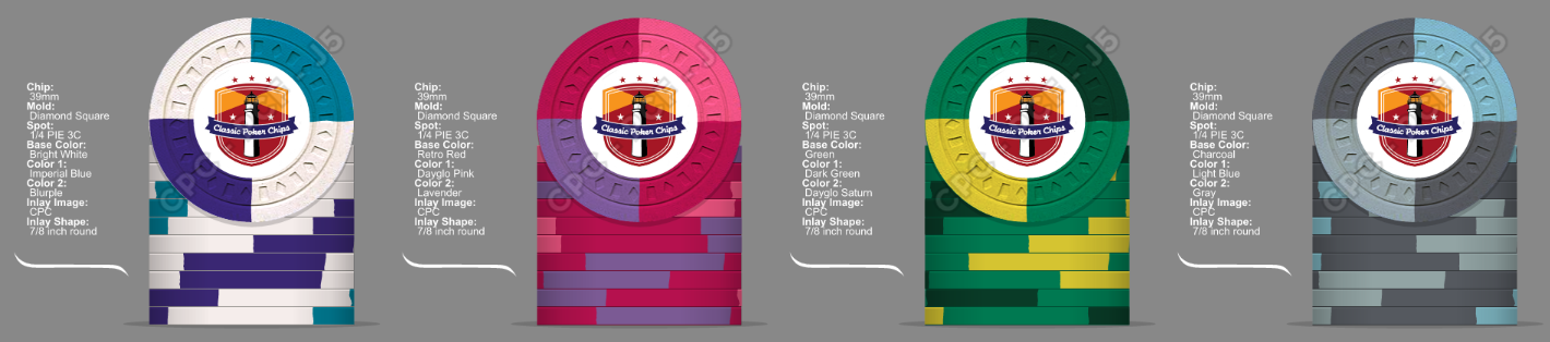
The bug has bit me again. So I'm revisiting this set.

Do you like it? Simple and elegant. The inlays will need to be tweaked, but they should be pretty cool.
Do you like it? Simple and elegant. The inlays will need to be tweaked, but they should be pretty cool.
Mr Tree
Straight Flush
Yes, but I've always loved q-pies. Almost did my tournament set as q-pies originally.
bivey
Full House
I am a holdout on quarter and half pies, but they are amazing in the right setting. Thinking Armory and LuckyDog's circus chips. These fit that category as well. The mockups look amazing.
OP
OP
H|Q
Flush
Always loved this inlay. Would be psyched if you finally pulled the trigger.
EDIT: But may I suggest...
No. Fuck off
OP
OP
H|Q
Flush
My breakdown.
86 ones
988 fives
171 25s
43 Hundos
Once Butler's heart restarts...
300 - $1
800 - $5
200 - $25
100 - $100
86 ones
988 fives
171 25s
43 Hundos
Once Butler's heart restarts...
300 - $1
800 - $5
200 - $25
100 - $100
links_slayer
4 of a Kind
tiger/choc frac?
Psypher1000
Straight Flush
The bug has bit me again. So I'm revisiting this set.
View attachment 23983
Do you like it? Simple and elegant. The inlays will need to be tweaked, but they should be pretty cool.
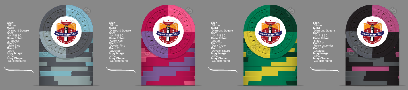
Love it, and I want a sample set.
The only change I would make for functional purposes is with the red - after putting the sample chips together, red and mandarin look too close to my eyes. Consider using New Pink instead of one of the reds for greater contrast.
Other than that, you've got a winner as-is w/the colors.
OP
OP
H|Q
Flush
Love it, and I want a sample set.
The only change I would make for functional purposes is with the red - after putting the sample chips together, red and mandarin look too close to my eyes. Consider using New Pink instead of one of the reds for greater contrast.
Other than that, you've got a winner as-is w/the colors.
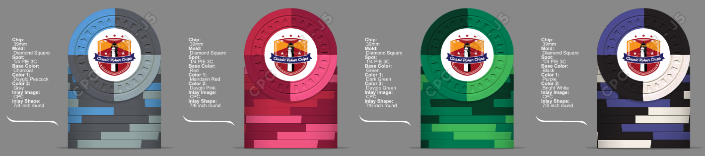
You are right, this does look better with pink. I don;t see an option for new pink
Psypher1000
Straight Flush
You are right, this does look better with pink. I don;t see an option for new pink
The Pink option in the design tool is New Pink. The sample chips are labeled as New Pink to differentiate them from a no-longer-available shade of pink.
OP
OP
H|Q
Flush
tiger/choc frac?
Maybe a non-denom 1/2 pie
OP
OP
H|Q
Flush
tiger/choc frac?
Is that a Browns joke?
Psypher1000
Straight Flush
Is that a Browns joke?
The Browns are their own joke.
OP
OP
H|Q
Flush
Nice bounty! So... you just received one chip, huh? Where's the rest - spill!
Similar threads
- Replies
- 3
- Views
- 280
- Replies
- 1
- Views
- 260
- Replies
- 19
- Views
- 793
- Replies
- 16
- Views
- 799
- Replies
- 5
- Views
- 274