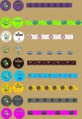
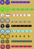
frist run at a ceramic set. (1 Viewer)

facinfears217

Straight
Joined
Jul 23, 2018
Messages
819
Reaction score
818
Location
casino
first take on a ceramic set. going to incorporate edge spots on face with a custom M letter mold in time.

new to illustrator so be kind LOL. definitely was different

? really is. can brpros/ abc or sunfly do this edge pattern
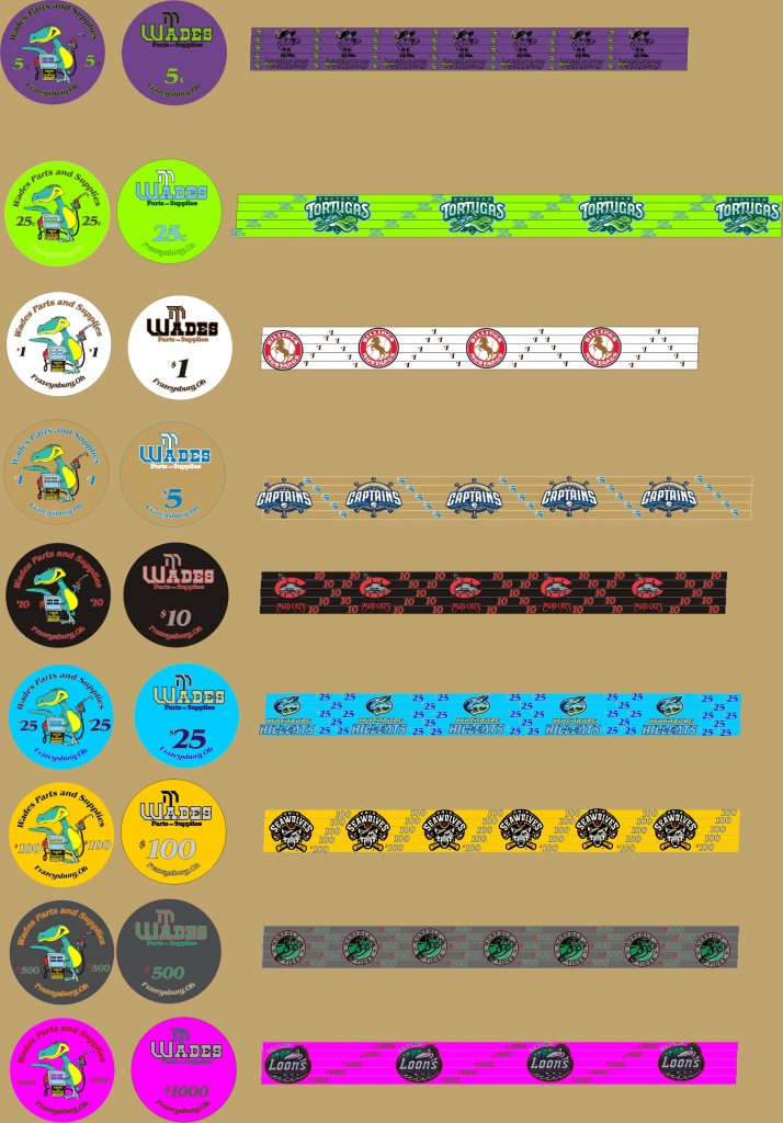
chipco wps cash.jpg
 
jpg maybe a little better with file.
 

Attachments

  • chipco wps cash.jpg
    chipco wps cash.jpg
    138.7 KB · Views: 104
I think you're off to a great start! I was new to Illustrator not too long ago when I was designing my first ceramic set, my experience was that my final draft looked nothing like my first draft. I think I went through about 10 different drafts over 7 months before I got it right. Keep it up, like anything it gets easier the more you use it.

A couple of notes:

- make sure you're using CMYK colors as your setting for your artboard in Illustrator. I think you're using RGB, which is meant for screens which gives you much brighter colors. When converted to CMYK the colors can change significantly. For example I don't think your pink, blue and green chip would come out anywhere close to how you'd expect. The great thing about brpropoker/ABC is they can do samples for you and it's inexpensive


- the way your edgespots are designed now I think you'd have to order five different versions of each chip, which will get expensive. If you could squeeze the design to work in stacks of 4 chips instead of 5 that would be better. I think this concept looks super cool when the chips are aligned just right in stacks, but might looked weird when they're mixed up in stacks. Also you will probably have a problem with copyright issues. But to answer your question yes I believe they can execute this concept.


- what do you mean by "M mold"? Do you just want this incorporated in the design on the face of the chip, or do you actually want a recessed "M" manufactured into the chip? If you want the latter I don't really think that's possible without spending a literal fortune on a custom mold.


- lastly, can you tell us more about the design/inspiration for this set?
 
Ty on rgb / cmyk

I wasn't sure on how edges would look. I assumed they be like multi color spots on clay .

Just a "fake" M around face kinda like a clay but dyed not an actual mold. As I'm keeping the set pretty plain on face I thought I'd make them look traditional with edges/fake mold .

Concept. We're a big baseball family from Ohio. We frequently attend Minor league baseball games. Tourney set is layed out but it's taking more time lots of chips to design lolol. Reds / Indians minor league teams from AAA to rookie/ independent league. So I had 4 left over that became a cash set. Couple to finish the set are from Michigan/pa ( on great lakes teams we've seen play)
 
first take on a ceramic set. going to incorporate edge spots on face with a custom M letter mold in time.

new to illustrator so be kind LOL. definitely was different

? really is. can brpros/ abc or sunfly do this edge pattern

View attachment 559959
I would consider centering the denominations more and making them larger. The "$100" is a much larger font than the "$500"
Also maybe making the outlines of the denoms thicker and darker so they stand out a little more.
 
Try taking into account what color is your table. Chips should be easily visible and on your design they have one color background. Maybe some shading or pattern could make them look more visible. Nice think about ceramic chips is that you can let your imagination fly.
 
Last edited:
I love your rolling edge design that stacks up to create the logos on the side!

BUT

All your stacks are 5 chips high, so your logos should repeat exactly 5 times (I see a range of 4-7). When stacked correctly there will be an offset in height by 1 chip per complete logo. This would save you a ton of money, because then each chip has a single rolling edge design, rather than several, and you can recreate the logos with any 5 same-denom chips in your stack.
 
I would consider centering the denominations more and making them larger. The "$100" is a much larger font than the "$500"
Also maybe making the outlines of the denoms thicker and darker so they stand out a little more.
I love your rolling edge design that stacks up to create the logos on the side!

BUT

All your stacks are 5 chips high, so your logos should repeat exactly 5 times (I see a range of 4-7). When stacked correctly there will be an offset in height by 1 chip per complete logo. This would save you a ton of money, because then each chip has a single rolling edge design, rather than several, and you can recreate the logos with any 5 same-denom chips in your stack.
So adjust denoms ( on edge ) to where logo is repeated 5 times.
 
So adjust denoms ( on edge ) to where logo is repeated 5 times.

Yes. The idea is to match the number of repeating logos to the number of chips in the stack required to make the logo.

3 repeating logos in a stack 3 high, or
4 repeating logos in a stack 4 high, or
etc.

You come to a point of diminishing returns based on the total length/circumference of the rolling edge vs. stack height. I can see a practical maximum of 4-5, unless your completed logo is particularly tall and thin, then maybe up to 8 could happen.
 
newest mockup. heres the m i was talking about , not sure i like the ring yet.
 

Attachments

  • chipco with edge spots rolled cash set new.jpg
    chipco with edge spots rolled cash set new.jpg
    162.6 KB · Views: 105

Create an account or login to comment

You must be a member in order to leave a comment

Create account

Create an account and join our community. It's easy!

Log in

Already have an account? Log in here.

Back
Top Bottom