Fleur de Lys - Stained Glass design (1 Viewer)

PokerChipsDesign

Straight
Joined
Nov 18, 2014
Messages
750
Reaction score
1,533
Location
Agen, FR
It's been a few monthes that I'm thinking about stained glass poker chips... But I couldn't make it "real", I've tried several times and the result was always bad...
Last night I finally could design something that I'm happy with.
The major issue was to be able to put some texts for room-name and denominations... I've removed the room-name and only use a Fleur de Lys. For the denominations I've used the white faux-inserts around the design...

What do you think ?

Here is the last updated version of this design.
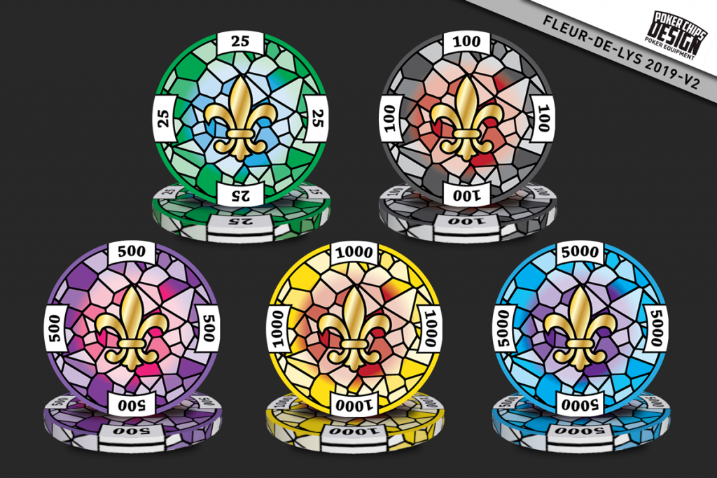
254667
 
Last edited:
Love the effect of the "sunlight" coming through the window. Very nice!
Can't wait to see what they look like in stacks!
 
I'm not sure about the blue of the 5000. How about an orangy-red?
I like the 5k blue ^^
Love the effect of the "sunlight" coming through the window.
Wait a minute... I've only made a gradient in the background, not sun rays... What if... I could re-use the rays pattern I'm using in the Jazz Club design...

Here is v3! What's new:
  • Added a "sunbeam" pattern in the background, behind the Fleur de Lys (thank @jja412 for this)
  • Changed the background's gradient color to gray for ALL chips, the set is much more homogeneous
  • Changed the color of the Fleur de Lys to yellow/orange instead of gold-like, it's better with the new gradients
  • Changed the color of the 500 to bright red
So far, the sunbeams look great, on a computer screen, but I might have to remove theses after the first samples are printed :/ We will see...

254751
 
I was just worried about stack colour issues between T500-Purple and T5000-Blue. But if you're changing the T500 to a red (or a redder shade of purple), as well as lightened the T5000 blue, then there's no problem! :tup:
 
I like the 5k blue ^^

Wait a minute... I've only made a gradient in the background, not sun rays... What if... I could re-use the rays pattern I'm using in the Jazz Club design...

Here is v3! What's new:
  • Added a "sunbeam" pattern in the background, behind the Fleur de Lys (thank @jja412 for this)
  • Changed the background's gradient color to gray for ALL chips, the set is much more homogeneous
  • Changed the color of the Fleur de Lys to yellow/orange instead of gold-like, it's better with the new gradients
  • Changed the color of the 500 to bright red
So far, the sunbeams look great, on a computer screen, but I might have to remove theses after the first samples are printed :/ We will see...

I prefer V2 as it closer resembles a stain glass window. Version 3 looks too busy and less organic with the rays.

254923


254924


254926


@Gear... recognize this place?
 
I prefer V2 as it closer resembles a stain glass window. Version 3 looks too busy and less organic with the rays.
Yeap that might be right, we will see with the first samples.

This is the last version I've send to the factory for the samples :
The only change is the edge with the four suits...

255647
 
I like the v2, however, I can't imagine using it as poker chips..
I guess they are "too busy" with the black lines required to recreate the stain glass window
 
Nice improvements since the last time I checked in! I was thinking for a more complete feel; could you make the white piece with the denomination part of the stain glass pattern, instead of just having it superimposed. You don’t have to change the shape of the denomination, just have the stain glass pieces form around it.
I’m so envious, 2 chip designs in 2019 :tup:
 
Thanks @yone for the idea of making the denomination pattern match with the stain joints... Now the denomination no longer "floats" and it adds a lot to the design ! Also, by rotating the stain glass at 90° for each denom, it gives a new pattern for each chip now (except similar 25 and 5k)

Now I'm going to try the idea of @Amish Rabbi of making the FDL part of the stained glass pattern ;)

255663
 
What better chip could there be for all the Catholic Church festival charity tournaments I play. I like them, keep on keepin on!
 
Regarding the suits on the rolling edges....I'd go with the following color-coded markings:
  • Green clubs on the 25
  • Black spades on the100
  • Red hearts on the 500
  • Blue diamonds on the blue 5000 (actually, I'd make this chip the 1000)
  • Yellow stars on the yellow 1000 chip (which I'd make the 5000)
The set already has 'non-standard' colors, so a minor switch of the top two chips shouldn't set off any ocd alarms. And I absolutely would not use repeating suits for more than a single denomination.
 
Thanks @BGinGA for your contribution. I'll work on colors too because the more I work on this, the more I think that I could use non-standard colors for all values...
The idea of an edge single suit-color for each value is great, I'll do that or something very close !

Anyway, the first samples have arrived (with an early version).
And I think that the chips look great for a design in progress ;)

What do you think ?

The rendering of the sunbeam and the many color gradients on each chip are very good in my opinion.
I'll work on the thickness of the black lines, I think I can make them thinner.
Color correction is needed on the 1000 but the other ones are just fine !

256250


256251
 
Last edited:
I'd be very concerned with those specific color shades -- the green, black, and blue are all three way too close in hue and will cause issues in pots and dirty stacks. Not impressed with the vibrancy of the yellow or red chips, either, or with the detail sharpness on any of the chips.

If they can't improve upon image quality or the color issues, I'd be looking for another vendor. This is very substandard work, imo.
 
Maybe the rolling edges could be solid color instead of all of the black lines on the edge. Could brighten up the edges quite a bit
 

Create an account or login to comment

You must be a member in order to leave a comment

Create account

Create an account and join our community. It's easy!

Log in

Already have an account? Log in here.

Back
Top Bottom