First Custom Set - CPC Dos and Don’ts (1 Viewer)

kk405

Full House
Site Vendor
Joined
Dec 8, 2015
Messages
4,293
Reaction score
14,684
Location
NYC
I am planning to order a custom CPC set sometime in the next few months, based on the new tri-moon scrown mold. I have a few questions, especially for PCFers who have specifically ordered CPC sets, but many of the questions do apply to those involved in the Stars/BTOP GBs, and other group buy designers as well.

What are some of your best advice for ordering custom chips? If you were to do the process all over again, what are some of the dos and don'ts...mistakes you've seen/done and things you wish you knew before your customs were delivered. In YOUR opinion, the design pitfalls and things to do/not do...for example, certain color combinations that may have looked fine/good/awesome in the design tool, but didn't work out so well in actual production. Any advice on inlay design (again, dos and don'ts.)
 
I've made a few sets. :)

Don't
I would not run a design thread and get your head filled with hundreds of differing opinions from people that you really don't know. In place of that, ask a few chippers to critique your designs via PM. I asked a couple guys that had made great sets and were known for their chip color advice.

Do
Make the set you want with no regard for cash. Saving a few bucks on some cheaper spots/mold/colors will leave you feeling empty down the road.

Do
Buy enough chips.
 
Number 1 for me is don't rush things. There were at at least 4 times I was sure my chip selections were final and couldn't be improved. Then a week later something would occur to me to try, and it would result in further improvement. I wound up taking four months to get the chips right.
 
Enjoy the journey!!

I agree with Mike about having a small, private, group discussion with PCF'ers that you trust. I did that with my bourbons, and I've also helped guys out with their sets.

However, I also think design threads can be useful. You just have to be able to say no, and keep things focused where you want them. Some great ideas came out of my Bourbon design thread.

When you get close to figuring out what you want. Pause, and reflect on the colors/design of where your currently at. You can fall into a rabbit hole of making changes just because you can.

Oh, and enjoy the journey :)
 
First and most important is to have the full color chart in sample form in your hands. That just can't be stressed enough.
Mold samples also, if you 're not sure about which to get. The issue here is that you would need at least 10-12 labelled chips of each mold to listen to how they sound:)
Gather lots of ideas and input by seeing a lot (not necessarily asking, but that doesn't hurt either).
Dream up an -even elementary- concept.
Sleep on your choices for many many nights. Don't rush! In the end, get what you want.
And don't even think about trying to economize. It's a custom set.
 
What @slisk250 said.

Also, with CPCs, contrast is a huge issue (imo). I would make that priority number one, i.e. that chips are very easy to discern from each other. No matter how cool the design is and how pretty a chip is, if they get mixed up together, the set won't be in use.

Lastly: @Johnny5
^That

I had to remake my $25’s after a nasty dirty stack issue became a problem after they were made. Be very aware of this problem when designing and choosing your base and spot colors.
 
I've made a few sets. :)

Don't
I would not run a design thread and get your head filled with hundreds of differing opinions from people that you really don't know. In place of that, ask a few chippers to critique your designs via PM. I asked a couple guys that had made great sets and were known for their chip color advice.

Do
Make the set you want with no regard for cash. Saving a few bucks on some cheaper spots/mold/colors will leave you feeling empty down the road.

Do
Buy enough chips.

Thanks Mike. I do agree and I am not a fan of 'deign by committee', but have benefited form a small private group discussions which inevitably have bene more efficient and far better at producing a better product.

And I hear you about budget...good thing is I don't have a 'chip budget' (or maybe that's a bad thing :nailbite: )
 
Get color samples

I think I have a complete color sample :tup:...it just arrived via CPC

Screen Shot 2019-05-12 at 2.23.28 PM.png
 
What @slisk250 said.

Also, with CPCs, contrast is a huge issue (imo). I would make that priority number one, i.e. that chips are very easy to discern from each other. No matter how cool the design is and how pretty a chip is, if they get mixed up together, the set won't be in use.

Lastly: @Johnny5

That is one of my main priorities... I have always hated how 'close' the colors of $r500s and $100s are in most sets...and $100s being the workhorse in our game, it is utterly important to make sure the chips are easy to discern, in stacks and especially in the main pot in the middle.

and @Johnny5 has already been given a heads-up...he just finished designing the felt for our new table and did a spectacular job :tup::tup::tup:
 
I have done 2 sets. The first one I did an open thread to get color and spot ideas. You have to be willing to stick to your idea though. It did help me with a few chips for sure and I think the set turned out better overall for it. But the amount of input can be overwhelming if you let it.

My second set I only bounced my ideas off a few people before placing the order and feel the set came out great as well. I also felt much more comfortable with the process on the second set.

Make sure you have a complete color sample set.

Once you think the set is done let it sit for a few days, you will probably have some new ideas.

Be careful with the greens and blues they run very close in color.

Enjoy the process. Check when the Small Crown mold is running again so you know how much time you have to get the chip colors and spots done. The inlay design doesn’t have to be in at the same time if that becomes an issue.
 
Do's:

1- Stress about the shades of yellow.

2- Have Fun!

Besides liking the scrown mold and the tri-moon spot pattern, what has pushed me over the hump is seeing the yellow chips in Travis' new set... Although the colors still don't match those of Paulsons, some of the improvements in the CPC color palette are pretty awesome.
 
Have not purchased a custom set, but I began the early stages of my design a couple months ago with no real timetable on when I would actually purchase them.

I can definitely say that I’ve thought I “nailed it” more than a couple times, only to come back with fresh eyes after a few days, or even a week or two, and made tweaks that seemed rather obvious. Definitely take your time and I’d specifically advise that you “take a break” (at least a couple days) every so often. There’s a good chance you’ll love something on your screen, come back a week later, and say, “What was I thinking there?”

I’d also have at least a rough idea of what your inlay is gonna look like before you fall in love with any base chip colors or spot patterns.

Again, haven’t seen it all the way through myself. Just my two cents.
 
x2 on what others have said above, lots of good advice. You have samples, which is the best first step.

Something I always tell folks designing a set is to spend your initial effort on your workhorse chips and get those right. You can spend a lot of time and effort getting a $100 or t25k thats awesome and your favorite, but if you only have those on the table at the end of the night, they're wasted. Spend the extra time and effort on the chips you'll play the most with.

Another thing simiar to what Paulo said, be wary of how chips interact with each other. Two chips may look awesome in their own, but not together. Goes back to the above, get the ones you really like set (or close to set), and then move to the others.

Something else that helped me a bit with finding good color combos for edge spots were these (google color wheel, lots of info on the web about color combos):

color-wheel1.jpg


And above all, get what you want!
 
  1. Take your time :tup:
  2. Live with the color samples - DONE
  3. Unless you have a crystal clear vision for your theme, research the hey out of your ideas - :banghead:
  4. Do what makes you happy, not the community - :tup:
  5. Hire @Johnny5 - :tup:
  6. Go Paulson :whistle: :whistling: - Let me know when the next GB is and a few of us will send the 18-wheeler to pick up our order :p
 
Besides liking the scrown mold and the tri-moon spot pattern, what has pushed me over the hump is seeing the yellow chips in Travis' new set... Although the colors still don't match those of Paulsons, some of the improvements in the CPC color palette are pretty awesome.
Some of the new colors are colors I wish they had when I made my sets. I've already remade my 25¢ chips and did an add-on for a 5¢ chip I'll never use.
My sets were made so long ago that I can't match the colors for add-ons which might mean a whole new set (secondaries?) if I want to add-on now.

Lots of good advice already given. I'll add to buy more than you think you'll need. My games have changed to almost exclusively Limit these days and none of my custom sets can accommodate them as I'd like.

The contrast problem also bit me with my 30 person tourney set. The purple looked a lot brighter in samples I had but was quite dark on production. Makes it tough with the 100 and 500 on the table at the same time if the lighting isn't good.

Stick to getting what you want and don't settle. Don't use a mold you aren't in love with just because the one you want isn't coming up in the rotation soon.

Prepare to accept mistakes. I ordered bright white for my 25¢ redo and they used regular white on the spots. They apologized but I didn't get the feeling they were willing to remake them. I also didn't want them to eat that kind of a loss so I just lived with it. This isn't a "try and return if not quite right" type of good. Just be aware it can happen and set expectations. The plus side of such custom work is that they are willing to get creative. They did a spot on my $1 that wasn't available at the time. They also aligned my labels, which is a pain in the ass, without an up-charge because they are just good guys/gals.

They feel very different than Paulson. My first hourglass mold set was so shocking different in feel that it took a while to accept. They were much lighter and "scratchy" feeling. My tastes have evolved over time and the weight doesn't bother me anymore. The feel gets MUCH better over time with use. I love the feel of my well-shuffled A mold chips now.

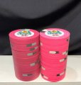
What I ordered back in the day when this was as pink as they got and what I actually wanted (except with bright white. This white looks good enough). The pics don't show it well here but that pink on the left is so dark my players confused it for the red $5 in a pot.
IMG_1001.JPG

Black and purple looks high contrast here but in real life they are too close:
IMG_0902.JPGIMG_0903.JPG

Blue and black is also too close in a mixed pot:
20080902-16010.jpg20080920-16007.JPG
 
Lots of great advice already listed. A few things I didn't see mentioned:

Print out your inlay artwork in actual size and color, and test it on multiple sample chips on your felt under actual game lighting conditions. This can help identify a lot of issues with font sizes, design details, etc.

If possible, have somebody 3D-render your designs in stacks and pots. It can often help visualize what the final product may really look like (vs what you *think* it will look like).

Order more chips than you think you will ever possibly need, mostly because of potential future color-matching issues makes it cheaper and less frustrating to order now rather than later. And then order 'dedicated extras' on top of that, at least a barrel of each chip design, to support loss, theft, accidental damage, or who-knows-what. Shit happens.

As already stated, having current color samples in hand, and letting your 'finished' work sit untouched for a period of time before revisiting it, are both crucial design aspects imo.


Oh.....and every time I fire up the design tool to create my perfect custom set, I end up with multiple designs for essentially four or five different yet spectacular sets. Since I'm not made of money, I just silently close the tool back down, and vow to try again when I'm convinced I know exactly which one (or two!) that I really want.
 
Yeah, two elements I forgot about:
-Colors should be felt-contrasting somewhat (so think about the felt(s) you 'll be playing on), and
-Get more chips than you think you 'll ever need.
 
Something I always tell folks designing a set is to spend your initial effort on your workhorse chips and get those right. You can spend a lot of time and effort getting a $100 or t25k thats awesome and your favorite, but if you only have those on the table at the end of the night, they're wasted. Spend the extra time and effort on the chips you'll play the most with.
Great advice!
 
Simulate real world conditions as much as possible so that you can see if your design withstands contrast issues. For example, place all of your base colours together in a stack at the opposite end of your table with the lighting conditions you'll be using during a game. If you can't tell the difference between some of the chip colours then you know you've got some work to do.
 
I actually liked having my design process in an open thread. I even had one on two different forums.

That being said, I definitely was selective with which suggestions I wanted to listen to. But at least two of my 5 chips came out infinitely better than they would have because of an idea thrown out by someone that I would not otherwise have asked.
 
Do's:

1- Stress about the shades of yellow.

2- Have Fun!

The only true regret about my own cpc set is underestimating the visual effect of the brass flakes on the chip edges.

One of my denoms is a canary base and in the right light they can look really dingy. It bothers me ALMOST to the point where I want to replace them with dg yellow.

White versus bright white is another example. It’s a 53c per chip difference to upgrade to bright but I thought it was money well spent on my recent 500’s add on.

image.jpg


The flakes are less of an issue on darker colored chips; and may even enhance their appearance.

Either way it’s worth it to be aware of them.
 
Last edited:

Create an account or login to comment

You must be a member in order to leave a comment

Create account

Create an account and join our community. It's easy!

Log in

Already have an account? Log in here.

Back
Top Bottom