First Ceramic Design - Ideas, thoughts and feedback very much appreciated! (2 Viewers)

jebu

Sitting Out
Joined
Jul 20, 2021
Messages
43
Reaction score
70
Location
Finland
Hello,

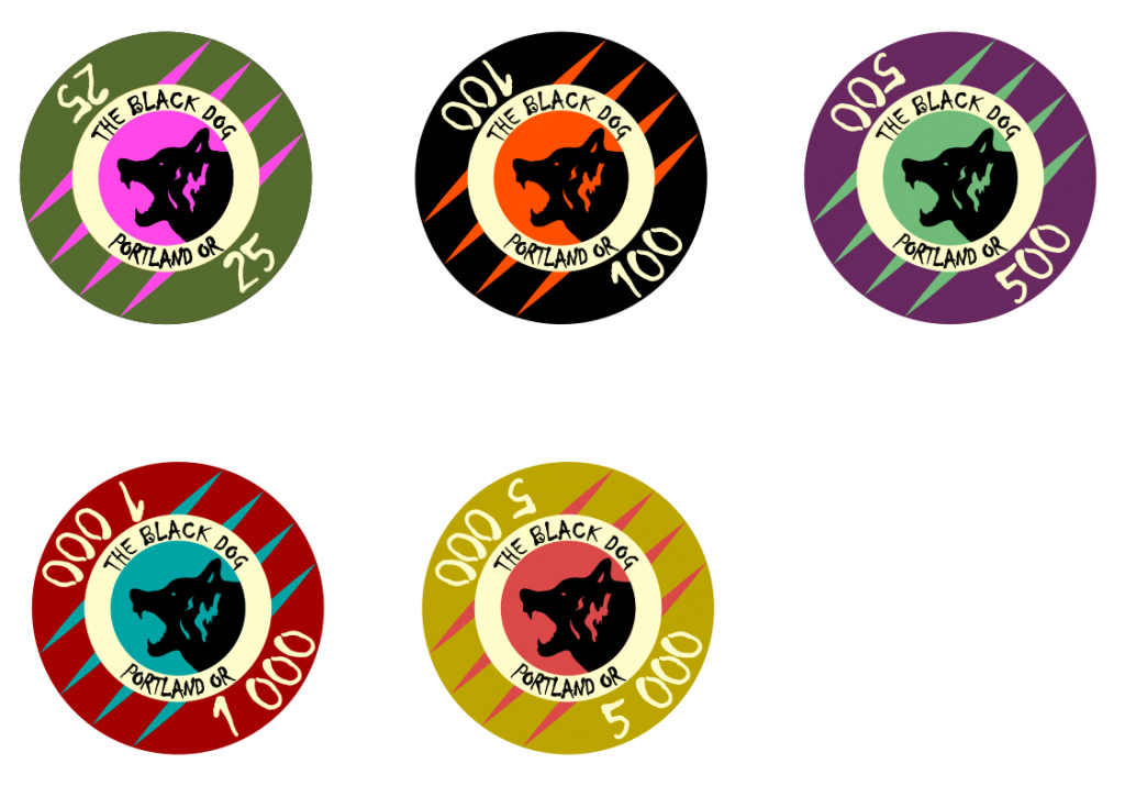
Second post on PCF, let's up some content. This is my first attempt at making something in Inkscape, after a few refreshing beverages I got it done.
I was about to order ceramics with the logo in the middle and a premade "chip layout", the EPT one, but in the end it did not feel personal enough
I got samples, lurking this forum was definitely worth it
.
The logo is simply drawn over on a photo of my dog, the dog is black and his official name is PORTLAND OR, so that's where the text comes from.
v12_export.png


Any thoughts on colors? Thoughts in general?
I was thinking trying to get a set of these to a breakdown recommended by the chip picker in resources section.
I guess it's possible to print the whole chip if it's ceramic?
 
I like that your chips look like ceramics, and not an imitation of clay or plastic chips. What samples did you get and which manufacturer(s) are you looking at? I’m not an expert regarding ceramics, but different blanks can give a different look and feel. You should probably get color wheel chips if possible, to help you see how certain color values would look in person.

With ceramics you can indeed print all over, including the edges. Then there are hybrids, a ceramic chip with a recess for a label, creating a different look. A lot of options, so take your time. As the set looks now, I might personally switch the colors between the 1k and 5k chips.

If you need any help with the breakdown, let me know. :tup:
Samples were for a different design, just with the dog logo and EPT chip decal.
Got them from pokershop.de, don't know the manufacturer..
Any solid recommendations on the manufacturer, bonus points for location i.e. if it doesn't cost a fortune to ship to Finland?

I'll try to post a version of the colors of 1k and 5k swapped tomorrow.

Regarding breakdown, I'd surely like some guidance!
I'm looking to buy a set of 500 chips, or so that they fit in one case. Don't expect to be having more than one full table, so with 10k starting stacks of 12/12/5/6 for 10 players I'd need;

120 x t25
120 x t100
50 x t500
60 x t1000
= 350 chips

+15 x t1000 for coloring up t25 and t100
+5 x t5000 for coloring up t500

totals to 370. Of course there should be room for rebuys, chips missing and what not, but what should the remaining 130 chips be?
 
Interesting font! Do you have a rolling edge design? I would encourage one.
Interesting in a positive way or negative? To be honest, it was the first odd-looking font Inkscape offered me so I just slapped it in. Looking at it now a few hours later I think I'm liking it even more, I see it fits in this kind of a rugged theme.
Do you have ideas of other fonts i should try?

also, "rolling edge design" is something you have to elaborate, I don't have a clue what that might mean.
The "rolling edge" refers to the side of the chip that would roll if you "stood" the chip and tried to roll it.

Check out the Nuclear Monkey Ceramics thread. It has many examples of rolling edge design. Their rolling edge design takes full advantage of ceramics by effectively having multiple rolling edge designs that when the chips are stacked you can order the different chips to make an image.
https://www.pokerchipforum.com/threads/nuclear-monkey-ceramics.77042/

1630887095449.png

Photo credit to @nuclearmonkey .
 
Last edited:
Interesting in a positive way or negative? To be honest, it was the first odd-looking font Inkscape offered me so I just slapped it in. Looking at it now a few hours later I think I'm liking it even more, I see it fits in this kind of a rugged theme.
Do you have ideas of other fonts i should try?

also, "rolling edge design" is something you have to elaborate, I don't have a clue what that might mean.

Interesting in a positive way, I think it fits with the design, if you're going for a "wild and untamed" feeling.

Yes, you can customize the edges of a ceramic chip! You can put in coloured spots, shapes, text, you name it, as long as it fits in the edge boundaries. Some have even designed a graphic that is only properly seen when the edges are stacked properly 4, 6, or 8 chips high! A cool option that you'd never have on clay or high end plastic chips.
 
Hello,

Second post on PCF, let's up some content. This is my first attempt at making something in Inkscape, after a few refreshing beverages I got it done.
I was about to order ceramics with the logo in the middle and a premade "chip layout", the EPT one, but in the end it did not feel personal enough
I got samples, lurking this forum was definitely worth it
.
The logo is simply drawn over on a photo of my dog, the dog is black and his official name is PORTLAND OR, so that's where the text comes from.

View attachment 771194

Any thoughts on colors? Thoughts in general?
I was thinking trying to get a set of these to a breakdown recommended by the chip picker in resources section.
I guess it's possible to print the whole chip if it's ceramic?
Nice logo bud. Enough detail but not too intricate , could be used won inlays at a later date and has nice personal meaning for you, good choice. As for colours I like sticking to the recognised green , black , purple for first three so maybe you should carry that through and use the yellow for the 1000.
Hello,

Second post on PCF, let's up some content. This is my first attempt at making something in Inkscape, after a few refreshing beverages I got it done.
I was about to order ceramics with the logo in the middle and a premade "chip layout", the EPT one, but in the end it did not feel personal enough
I got samples, lurking this forum was definitely worth it
.
The logo is simply drawn over on a photo of my dog, the dog is black and his official name is PORTLAND OR, so that's where the text comes from.

View attachment 771194

Any thoughts on colors? Thoughts in general?
I was thinking trying to get a set of these to a breakdown recommended by the chip picker in resources section.
I guess it's possible to print the whole chip if it's ceramic?
Nice logo chap, good detail but not too intricate so could be used on an inlay at later date for another set, nice personal meaning to you. On colours I like that you’ve stuck with traditional, so on that note maybe the 1000 should be the yellow, think you have leeway on 5000 as not really a standard, I’m a fan of something subdued like a grey.
Overall I like it
Chris
 
The "rolling edge" refers to the side of the chip that would roll if you "stood" the chip and tried to roll it.
Some have even designed a graphic that is only properly seen when the edges are stacked properly 4, 6, or 8 chips high!
Wow, I could not even think something like this existed. Seems I have a lot of work to do because that certainly does stand out.
Good info!
Do you know the "how to" stuff regarding this, as in should I just expand the now existing 2D circle to include the thickness of the chip with the rolling edge and all of its possible printouts or how should it be done?


so on that note maybe the 1000 should be the yellow, think you have leeway on 5000 as not really a standard, I’m a fan of something subdued like a grey.
Overall I like it
I'll mess around with the colors more today, thank you for the feedback Chris, much appreciated!
 
Samples were for a different design, just with the dog logo and EPT chip decal.
Got them from pokershop.de, don't know the manufacturer..
Any solid recommendations on the manufacturer, bonus points for location i.e. if it doesn't cost a fortune to ship to Finland?
Ok, as for samples there are different ceramic blanks offered depending on the vendor. Those blanks can differ in a few ways, like the surface texture, rolling edge glossyness and how square the edges are.

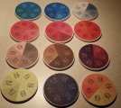
I think the vendors people on this forum mostly use are from the US and China. But I fully understand wanting to get the chips within the EU, as the shipping is reasonable and you won’t need to deal with importing/customs. Pokershop.de has a presence on this forum as well, as @pokersepp is a forum vendor. With ceramics I would be mostly concerned about how the colors end up looking in person compared to how they look on your screen. The color wheels I mentioned would be a big help (example below) or at least a small test run, before the whole 500 chip order. Not sure which vendors offer these options.

E32C90BE-B4D0-47F4-8B1B-CC530F0597F4.jpeg

I'm looking to buy a set of 500 chips, or so that they fit in one case. Don't expect to be having more than one full table, so with 10k starting stacks of 12/12/5/6 for 10 players I'd need;

120 x t25
120 x t100
50 x t500
60 x t1000
= 350 chips

+15 x t1000 for coloring up t25 and t100
+5 x t5000 for coloring up t500

totals to 370. Of course there should be room for rebuys, chips missing and what not, but what should the remaining 130 chips be?

Most people here store their chips in racks instead of cases, but quality racks aren’t really available within the EU apart from other chippers. It’s certainly a good idea to have extras of your custom chips, because any lost or broken would get expensive to replace. I think your breakdown looks fine, people tend to use more T500’s than really necessary for NL/PL and 30 would be the minimum I’d want for the starting stacks for those games. If you want to include the extra chips in the case, then maybe something like this would work.

130x T25
130x T100
60x T500
90x T1000
90x T5000

That would include ten extras of each denom, and not counting them you easily have T50k in chips per person.
 
Do you know the "how to" stuff regarding this, as in should I just expand the now existing 2D circle to include the thickness of the chip with the rolling edge and all of its possible printouts or how should

Ceramic chip manufacturers offer design templates for their faces and rolling edges so you can use in your chosen design software. Most of them will require a file in Adobe Illustrator format or something that is easily convertible to that.
 
Good evening,

New versions;


v29export.png

V1

v29b_export.png

V2

First one is just the same, with how I understood rolling edge design. 1k and 5k chips changed color.
On second the pink in T25 changed to something slightly less aggressive, and 5k red changed to a bit more "subdued" (I think I'll be keeping the red in one form or another). @surfik @Swisstopher

The color wheels I mentioned would be a big help (example below) or at least a small test run, before the whole 500 chip order.
I believe it's at this point quite much, I should be able to see how they actually appear.

Most of them will require a file in Adobe Illustrator format or something that is easily convertible to that.
Did I get the rolling edge idea correct, atleast in theory? Not sure about Adobe Illustrator format, but a google search revealed that a .pdf could be converted into .ai. Those I can get from Inkscape.


130x T25
130x T100
60x T500
90x T1000
90x T5000
This was helpful, the way I'd have done it would have probably been quite dumb. Tyvm.
 
It may or may not be difficult to do a progressive image that is 5 chips high, only because it requires you to do 1/5th of the image height spaced equally 5 times around the perimeter. It is usually easier to divide by 4 or 8. But you can always test it out.
 
It may or may not be difficult to do a progressive image that is 5 chips high, only because it requires you to do 1/5th of the image height spaced equally 5 times around the perimeter. It is usually easier to divide by 4 or 8. But you can always test it out.
dang, apparently ignored that ratio you mentioned..

new try tomorrow I guess. Your input has been very valuable, thanks!
 
These look great! I personally don't love the shade of green. It's too olive for me. Maybe something lime or even evergreen. But if you like it, go with it.

I got samples of mine and the reds were the toughest to match. They all printed darker than showed on my screen.

The rolling edge will be a lot longer than you've shown. I forget the ratio of the length to height of the rectangle, but it's like 30 to 1. You'll want more artwork on the edges so you can count chips in a stack from across the table.

Excellent start though.
 
My one suggestion would be to remove the space in the 1000 and 5000. Right now it looks like "1 000" and "5 000".

To me the 1 in "1 000" comes off looking almost like part of the design around the edge of the chip, like two arrows pointing inward, instead of looking like a 1. It might not look like that to other people, but I figured I'd share it.
 
These look great! I personally don't love the shade of green. It's too olive for me. Maybe something lime or even evergreen. But if you like it, go with it.

I got samples of mine and the reds were the toughest to match. They all printed darker than showed on my screen.

The rolling edge will be a lot longer than you've shown. I forget the ratio of the length to height of the rectangle, but it's like 30 to 1. You'll want more artwork on the edges so you can count chips in a stack from across the table.

Excellent start though.
Thanks!!
I will see how the green looks "live", and maybe make some adjustments. I'll keep it if it is around similar. I tried more saturated colors, but to me that didn't seem as nice on screen at least.

I am not sure if I understood correctly what you meant with the length of the rolling edge, but looking at your chips it seems like the length of the rectangle is around 3 x the diameter of the chip in the image? In any case, you are right, for the edges more artwork is probably needed.

Did you pull the trigger already, the nuke theme is awesome!


Right now it looks like "1 000" and "5 000".
be the grammar police and suggest a comma.

It's no matter what you do, you'll never get away from the grammar authority, in this case especially. Let me elaborate..
In Finland, and I believe in Sweden too for instance:
- a thousand separator is a spacebar
- decimal separator is a comma

Central Europe I believe uses:
- thousand separator is a dot
- decimal separator is a comma

And then we have you fellows for whom
- thousands are separated by a comma
- decimal separator is a dot

Now that we have the legal obligations defined we see, that one does not simply evade the police. Still, I do trust my chances better with the American grammar police than with the Finnish linguistics-KGB, hence the spacebar stays.. :D
 
These look great! I personally don't love the shade of green. It's too olive for me. Maybe something lime or even evergreen. But if you like it, go with it.

I got samples of mine and the reds were the toughest to match. They all printed darker than showed on my screen.

The rolling edge will be a lot longer than you've shown. I forget the ratio of the length to height of the rectangle, but it's like 30 to 1. You'll want more artwork on the edges so you can count chips in a stack from across the table.

Excellent start though.
I’m not sure about having artwork on the side, surely it will only work if chips are stacked in correct order like a puzzle? Once mixed in a game impossible surely?
would some form of spots/ stripes work better? That’s what I see on most ceramics? Tikki kings, Nevada Jacks etc
Just a thought
 
I’d use 1000 instead of 1 000 / 1,000 / 1.000 on the chip, and with curved text it would probably look best. If any G-popo show up, just send them to ol’ @mipevi :ninja:

The rolling edge design idea is a bit tricky, I’m fairly certain someone has used it before but can’t recall who, when or where… A more traditional approach might work better during games. Assuming you put each four segments 90 degrees apart on all chips, it’s not enough to simply rotate the chips into place to align the pattern, but you need to make sure none of the chips are upside down (and looking at chip faces when stacking them, you won’t know). And of course you’ll need multiples of four in stacks, or a picture won’t be complete. But if you’ve made a mock-up of how the chip stacks are likely to look during games (picture pieces scattered with some chips upside down) and still want this feature, by all means go with it.
 
Last edited:
I've ordered mine, but I don't have them yet. I agree a lot of the time there will be partial pictures in stacks. Think about how the edges look without the graphics being aligned. If they still look good, then why not? On mine, the edge graphics look pretty good on their own, or unaligned in "dirty" stacks. So I went with it. It's a personal preference though. I should get mine next week, so I'll let you know how it works out.
red3.png
Slide10.PNG
Slide8.PNG
 
I am not sure if I understood correctly what you meant with the length of the rolling edge, but looking at your chips it seems like the length of the rectangle is around 3 x the diameter of the chip in the image? In any case, you are right, for the edges more artwork is probably needed.
It's 3.14159265359, if I'm not mistaken. :)

The rolling edge is just a rectangle wrapped around the edge of the chip. So the height is roughly 3.5mm and the length is 3.14159265359 * the diameter of the chip. The chip diameter is roughly 39mm, so the ratio of the rectangle length to height is around 11 * 3.14159265359. I found an exact number of pixels somewhere on the internet, but I don't remember. I used BrPro and they helped me figure all this out.
 
Evening,

Let's see what we got today..

v39-sidegraphics.png


---

v39-betThePot.png


---

v39-canIgetaCount.png


To be fair, mixing them up in dirty stacks seems to be a bad idea on paper.
However, when kept tidy it seems they function just fine. I just probably went a bit over the top with the side design..
Well, counting a dirty stack is not that easy with any chipset i reckon, although this sure wouldn't make that any easier.


It's 3.14159265359, if I'm not mistaken. :)

The rolling edge is just a rectangle wrapped around the edge of the chip. So the height is roughly 3.5mm and the length is 3.14159265359 * the diameter of the chip. The chip diameter is roughly 39mm, so the ratio of the rectangle length to height is around 11 * 3.14159265359. I found an exact number of pixels somewhere on the internet, but I don't remember. I used BrPro and they helped me figure all this out.
I don't know how these chips would work on print, but I could just enter the size of the chip in mm to Inkscape, then scale from there. I suppose the scalability is the key factor here?

On mine, the edge graphics look pretty good on their own, or unaligned in "dirty" stacks. So I went with it. It's a personal preference though. I should get mine next week, so I'll let you know how it works out.
I'm looking forward to see how they are irl!

p.s. the one thousand is "1000" again.
 
Hmmm. I think you may have misinterpreted the rolling edge capabilities. Let's dial it back one notch.

Right now, as you have it, you have 4-5 separate rolling edges, which is not efficient and potentially very expensive. I don't think you want 4-5 separate chips for each denomination.

First, divide your dog head graphic into 4 parts, top to bottom. We'll call the parts A B C and D.
Second, let's designate the denomination. I'll use the # sign (with the # changing based on the chip denom, of course)

One rolling edge template will look like this: A # B # C # D #
Eight elements (4 graphic, 4 number) spaced evenly on the template. Every chip of each denom has the same rolling edge. When you stack them right, you will see four full height complete graphics that are offset by 1 chip height as you rotate the stack.

See?
Not sure if I understood but to put it out in a more concrete manner, would it be something like this around the chip;
ears - 25 - nose - 25 - jaws - 25 - throat - 25
 
Evening,

Let's see what we got today..

View attachment 772555

---

View attachment 772557

---

View attachment 772558


To be fair, mixing them up in dirty stacks seems to be a bad idea on paper.
However, when kept tidy it seems they function just fine. I just probably went a bit over the top with the side design..
Well, counting a dirty stack is not that easy with any chipset i reckon, although this sure wouldn't make that any easier.


I don't know how these chips would work on print, but I could just enter the size of the chip in mm to Inkscape, then scale from there. I suppose the scalability is the key factor here?


I'm looking forward to see how they are irl!

p.s. the one thousand is "1000" again
Hmmm. I think you may have misinterpreted the rolling edge capabilities. Let's dial it back one notch.

Right now, as you have it, you have 4-5 separate rolling edges, which is not efficient and potentially very expensive. I don't think you want 4-5 separate chips for each denomination.

First, divide your dog head graphic into 4 parts, top to bottom. We'll call the parts A B C and D.
Second, let's designate the denomination. I'll use the # sign (with the # changing based on the chip denom, of course)

One rolling edge template will look like this: A # B # C # D #
Eight elements (4 graphic, 4 number) spaced evenly on the template. Every chip of each denom has the same rolling edge. When you stack them right, you will see four full height complete graphics that are offset by 1 chip height as you rotate the stack.

See?
Post in thread 'The Club House add on $2.50 chip' https://www.pokerchipforum.com/threads/the-club-house-add-on-2-50-chip.63775/post-1264586

check out those from @Rhodeman77 for examples.

1631059343904.png
 

Create an account or login to comment

You must be a member in order to leave a comment

Create account

Create an account and join our community. It's easy!

Log in

Already have an account? Log in here.

Back
Top Bottom