First Attempt at Design (1 Viewer)

Buge

Flush
Joined
Dec 23, 2019
Messages
1,318
Reaction score
2,700
Location
Long Island
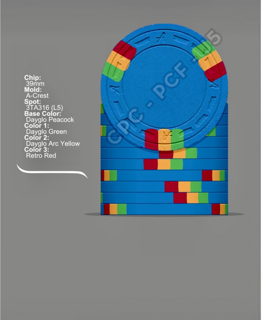
Hey guys, I am looking to design myself a CPC tournament set with T25 base. This is my first attempt at designing a set and wanted to get input/opinions on colors. I obviously don’t want any issues of dirty stacks and would like the chips to easily be identified in a splashed pot. The inlays will be coming soon and will have a white background. Any help is appreciated!
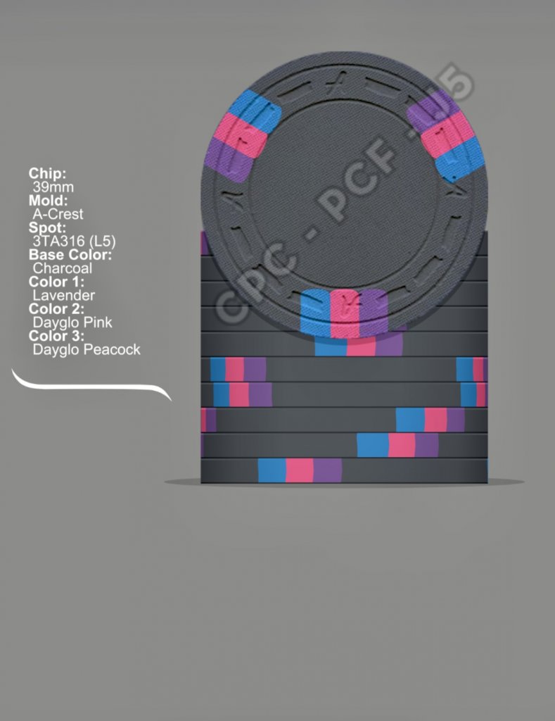
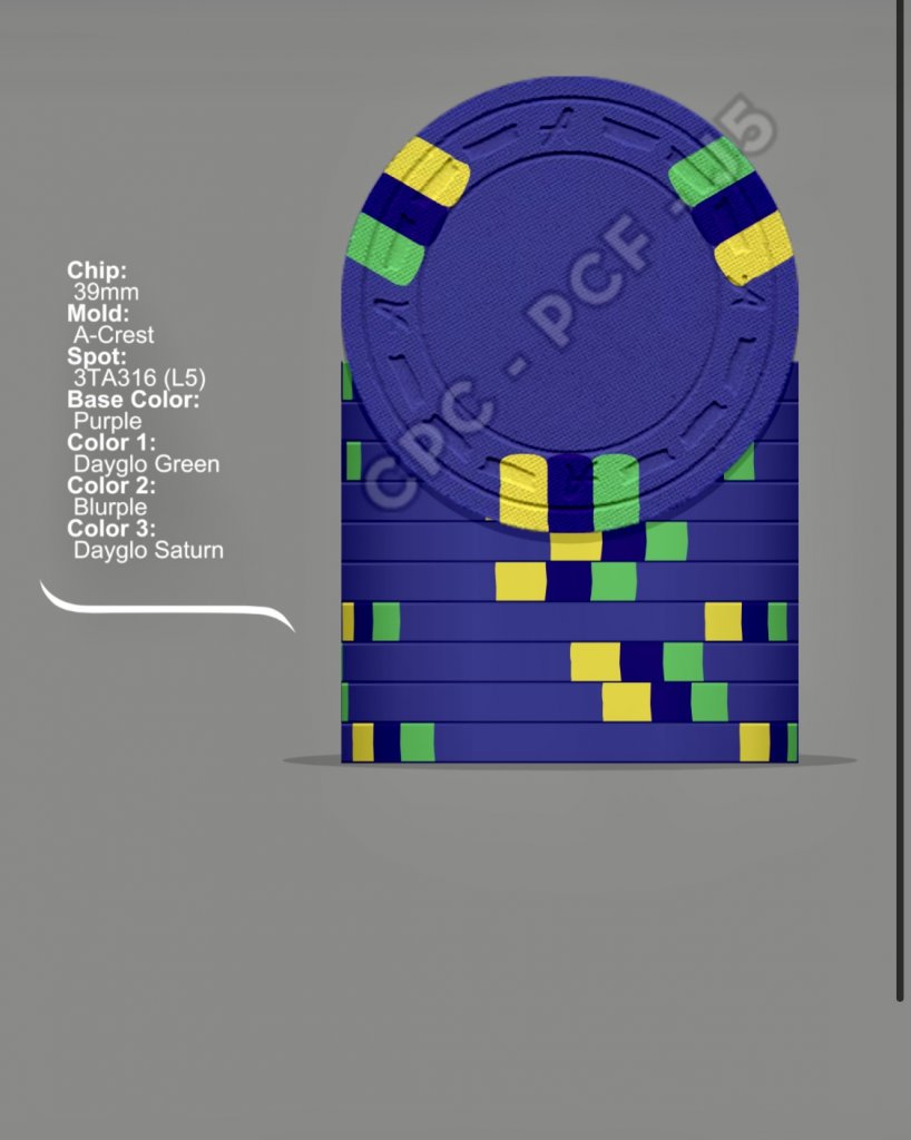
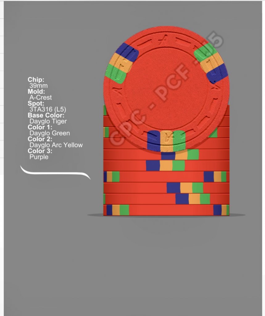
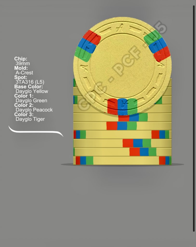
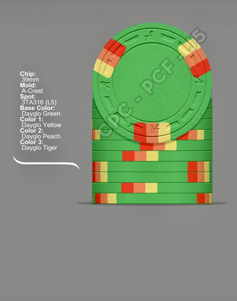
DG Green - T25, Charcoal - T100, Purple - T500, DG Tiger - T1k, DG Yellow - T5k, DG Peacock -T25k
AD08A28A-380F-4549-A300-028E6B08C817.jpeg
17C584FD-C2EA-46B0-B375-6DFAF7D250F4.jpeg
F77C8443-295E-4CFE-9A0A-1C1C2B5E3155.jpeg
62386A5F-A4E0-4DCE-8596-46EEA1479C2F.jpeg
31F4F3FC-1385-4E1E-BAD2-485C142AB038.jpeg
5DEEC52D-E95C-4228-A842-53A1C9F77EBB.jpeg
 
Maybe put the lavender in the middle? It might be hard to make out on the charcoal. I love each chip though!!
 
I really love the first three. Do you have a CPC color sample yet? I think the Purple and Blurple may be a bit too close to distinguish the difference between the base color and the edge spot on the T500. I see you are planning to have white inlays, I recommend putting a placeholder in there just so you can get a better feel for the entire chip.
 
I really love the first three. Do you have a CPC color sample yet? I think the Purple and Blurple may be a bit too close to distinguish the difference between the base color and the edge spot on the T500. I see you are planning to have white inlays, I recommend putting a placeholder in there just so you can get a better feel for the entire chip.
Great thinking. I will put the white inlay in. The purple chip is the one I’m having the hardest time designing
 
My first thought was "there's a lot of red, yellow, and green for the edge spots". To me, it's a bit repetative.

But, maybe you are going for a pattern/design that I'm not picking up.
 
Do you have samples on hand? That will change your opinions of what colors you like for sure.

T25 - I'd change peach to arc yellow if you're going for a gradient sort of look, peach and tiger are a little too close in real life

T100 - I like this chip (new version)

T500 - Blurple and purple might be a bit too close, maybe use retro lav instead of blurple? Also dg saturn is awful in real life, dg yellow would be way better here if you want a floro yellow look

T1000 - I like this chip, but I would avoid using the same colors in adjacent value chips. This goes for purple and the dg green

T5000 - I don't like dg yellow as a base color, I think it's better for spots. I'd go with canary for a base color. Also the primary color spots are a little clashing for me.

T 25000 - this is my favorite chip in your set, nice color combo

Overall I'd try and vary the colors more. If you're going to use green on all but one chip, I'd want to use some of the different shades for variety.
 
Updated T25. Will work on the others. I like DG yellow in person but I can see what you are saying about edge spots.
919C9C8D-5E71-4C3C-AB1E-C55B93033A9A.jpeg
 
I’m apparently in a different camp. I cannot provide input on spots until I see the inlay design. Having white on the label is good, as color matching print to chip is rough. But I personally cannot start talking sport until I see the full picture. I wish you the best of luck in the meantime!
 
I may just get rid of the yellow all together and use the DG peacock as my 5k and forget about the 25k. I haven’t put a 25k into play anyway... I just like more chippies :rolleyes:
 
I’m apparently in a different camp. I cannot provide input on spots until I see the inlay design. Having white on the label is good, as color matching print to chip is rough. But I personally cannot start talking sport until I see the full picture. I wish you the best of luck in the meantime!
I will post inlay as soon as it’s completed :)
 
Don't know if you have any budget constraints, but be aware that CPC charges a 12-cent premium per chip for
DG base colors
 
They're great. I think that with this spot pattern, the base color is prominent enough that you're not going to run into any dirty stack issues (which in my opinion are overblown here, anyway.)
 
My first thoughts as scrolling through this thread were, "That looks nice. I like that.", and after looking over them again I still like them. I'd change the mold if I were you, but that's a personal preference. Otherwise, they look good to me. :tup:
 
I really like that lavender T500. As I was scrolling through the thread I was thinking of suggesting it as it provides more contrast to the charcoal T100. The three shades of blue edge spots look grand!
 
1607308454453.png


Great inspiration for 3 edgespot colours. My fav of the lot so far!
Edit: Photo credits Chipguide
 

Create an account or login to comment

You must be a member in order to leave a comment

Create account

Create an account and join our community. It's easy!

Log in

Already have an account? Log in here.

Back
Top Bottom