knightstand77
Pair
Merry Christmas!
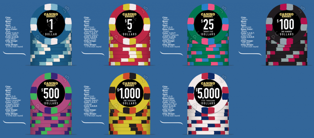
About a year ago I played around with some designs, got some feedback, had the files made and placed my order: 10,000 chips (casino party business).
Once the chips were in house, I was very pleased with what I had but I felt some tiny things could be tweaked a tad.
The first was that the edge spots ate up a lot of the chip. Almost too much I felt as the base color was getting lost in all the colors and it made the chip look very busy.
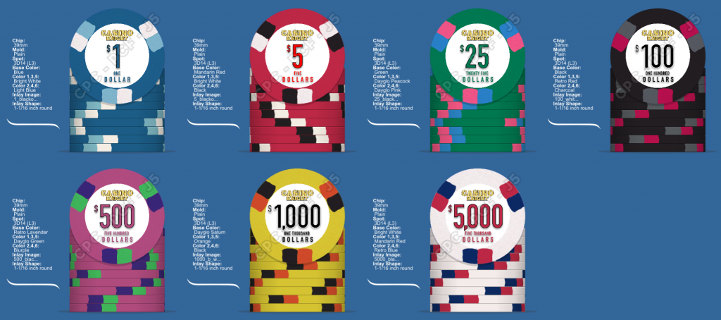
Solution: Go from 4 edge spots down to 3. Issue solved and new chips will still blend in pretty well the others when stacked.
The other issue was the faux inlay. These are smooth ceramic chips and I felt the black inlay made the chip look too dark. I want it bright and lively. So I changed up the fake inlay from black to white & made the denomination match the base color, too. It also has a nice outline around it to make it stand out a bit more. I may end up tweaking it a bit to add a fading gradient, from the base color to white. If you've seen the Deja Vu or High Roller Poker club designs, that's my inspiration.
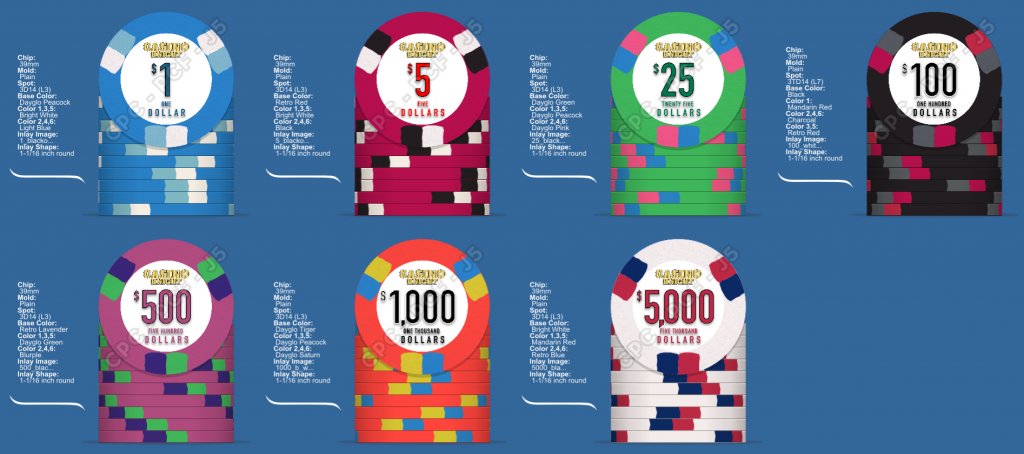
The next is the colors. The base colors are fixed (maybe? Dayglo colors really make them pop!) but I can handle tweaking the 5 & 25 a little. I think the others look pretty sharp.
In my initial post for feedback, someone mentioned white and yellow don't go well together and I should have heeded that! It looked fine on a computer screen, but not so much in your hand. Same with the blue on green $25 chip.
Images below!
Last edited:
