You are using an out of date browser. It may not display this or other websites correctly.
You should upgrade or use an alternative browser.
You should upgrade or use an alternative browser.
Feedback on label design (2 Viewers)
- Thread starter joshuagb
- Start date
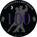
I like it. Personally I would enlarge and lengthen the text to make it more visible and lose the est. and the moon.
Also are the denoms color matched? If not I would try a lighter color to stand out more, maybe yellow?
Also are the denoms color matched? If not I would try a lighter color to stand out more, maybe yellow?
I'm with stocky... Imo, the est. 2015 is too small and it won't read well... The font of the Medialuna is also not large enough for being the name of the card room... Just as a suggestion, i'd lose the est. 2015 (per stocky) put Medialuna on the top portion with a larger font and card room on the bottom with the same font. You could shrink just a bit the dancers so it could fit between the text. I'd also make the denoms a little bolder. Just suggestions of course... I think it's a great start and I like where it's going...
links_slayer
4 of a Kind
I dig it and think you're off to a great start. I'm not a huge fan of the font but don't have any suggestions off the top of my head (besides trying a bunch of different options). I would move the text in from the edge a bit. I would also suggest printing them off in real size to see if all elements will be read-able - not sure if the designs at 3- and 9-o'clock will be legible or just look like fuzzy dots when printed.
Great design, I agree with all the comments so far. Increase the font, move it away from the edge, etc... Best advice is to print them out to see what they look like.
atomiktoaster
Full House
All good comments, though I think you have to keep the moon, since it's the "Halfmoon" cardroom.
Really like the theme, think it's going to be cool. As others have said I wonder if the purple is too dark to be easily readable on the dark background.
I like the moon, if it ends up being too small maybe you could shift things around a bit and make it a touch bigger?
I like the moon, if it ends up being too small maybe you could shift things around a bit and make it a touch bigger?
Mental Nomad
Full House
I agree with much of the above - it's a beautiful start to the theme.
Definitely print it actual size to get a feel; I agree the font is small. The est. 2015 may be unreadable because of the size, and depending on the chip printer, may simply be completely unreadable because of fine detail.
I do think you should keep the moon element; important to the theme - if you can't fit it well, consider two labels - tango dancers one side, the half moon on the obverse.
I also agree that the denom color lacks contrast, but I wouldn't agonize over that too much until you've got it mocked onto chip colors. You'll probably end up re-working it, anyway.
Nice design. I think I would outline the demon font in white instead of black. I would put Medialuna on the top and Card Room on the bottom to replace EST 2015. I think I would also make the moon a little bigger and maybe rotate it a little clockwise.
This is great feedback. Thanks so much for your suggestions. I'm going to incorporate some of these things and post another version soon. I agree that the moon would be good to keep. I was initially thinking of making the denomination colors correspond with the chip color -- but it wouldn't work with the black chip for the 100 since it's on a black background. So that purple theoretically would correspond with the edge spot color. Not really wedded to any of it.
manamongkids
Full House
are you planning to use a black background on all of the designs?
if so, you could consider replacing the two flowery designs on the sides of the denominations by moons instead.
or finding another way to incorporate the moon in another way, possibly making the moon yellow on all denoms, maybe a very faint shade of yellow
if so, you could consider replacing the two flowery designs on the sides of the denominations by moons instead.
or finding another way to incorporate the moon in another way, possibly making the moon yellow on all denoms, maybe a very faint shade of yellow


manamongkids
Full House
this one, flip the moon and you'll be close. it just looks unnatural for some reason

I agree with MaK... I like this one the best also... And in my opinion, already an improvement from your original design... A couple other things you may want to try:
- Increase the font size for the text even more
- Move the Medialuna and Card Room away from the border a little more also
- Equalize the distance of the numerals
You may also try different fonts to see which one go better with the curved text and your theme... Unfortunately I don't have a suggestion here")
I think it's looking VERY promising...
- Increase the font size for the text even more
- Move the Medialuna and Card Room away from the border a little more also
- Equalize the distance of the numerals
You may also try different fonts to see which one go better with the curved text and your theme... Unfortunately I don't have a suggestion here
I think it's looking VERY promising...
Here's a couple other versions, incorporating several of the suggestions.
View attachment 6021/QUOTE]
this one, flip the moon and you'll be close. it just looks unnatural for some reason


The first one looks best I think. For the 2nd, if you rotated the moon so that it's facing upwards like a smile it might look better, but I kind of don't like it because Media and Luna aren't the same number of letters so it looks asymmetrical.
manamongkids
Full House
Also, question to commentors. Is card room one word or two?
Card Room or Cardroom?
Card Room or Cardroom?
Rush4Rod
High Hand
this one, flip the moon and you'll be close. it just looks unnatural for some reason
Or instead of flipping the moon, you could try flipping the silouette of the dancers and put the moon on the left to see how that might look too.
Mental Nomad
Full House
Also, question to commentors. Is card room one word or two?
Card Room or Cardroom?
Both are in common use.
http://en.wikipedia.org/wiki/Cardroom
A cardroom or card room is a gaming establishment that exclusively offers card games for play by the public. The term poker room is used to describe a dedicated room in casinos that is dedicated to playing poker and in function is similar to a card room.


tommythecat
Flush
The left chip looks awesome.
manamongkids
Full House
Far left one definitely. I think youve come a long way in 24 hours. I suggest shrinking the silouette of the dancers in the back so it doesnt overlap under the wording on the top and bottom. hopefully that makes sense.
Mr Tree
Straight Flush
+3 for leftmost. Also make sure to print these out and see how they look in actual size
Far left one definitely. I think youve come a long way in 24 hours. I suggest shrinking the silouette of the dancers in the back so it doesnt overlap under the wording on the top and bottom. hopefully that makes sense.
I will try shrinking the dancers to see how it looks. For some reason, I don't hate that foot being beneath the "C", but I'll shrink and see which I like best. The feedback has been great and has really helped me refine this idea. Planning to print out some this weekend.
I'm also looking for another motif to use ... something a little more simple.
Mental Nomad
Full House
Crazy idea: two inlays.
One side is exactly as you see here, but no dancers or moon.
Other side is the dancers and moon, but no words or fleurs.
One side is exactly as you see here, but no dancers or moon.
Other side is the dancers and moon, but no words or fleurs.
Crazy idea: two inlays.
One side is exactly as you see here, but no dancers or moon.
Other side is the dancers and moon, but no words or fleurs.
Is it possible to do this with CPC?
Mr Tree
Straight Flush
Is it possible to do this with CPC?
Lol second time today I've answered this exact question with a pic of my chips, but...

Yes.
Similar threads
- Replies
- 15
- Views
- 504
- Replies
- 30
- Views
- 780
- Replies
- 46
- Views
- 2K
- Replies
- 28
- Views
- 950