Gameface
Two Pair
I think he was talking about the older version of the $5 in the OP...Very frustrating. Been looking for 5 minutes and still cant find the penis.
I think he was talking about the older version of the $5 in the OP...Very frustrating. Been looking for 5 minutes and still cant find the penis.
Ok. With regards to the current mockups I think they look awesome.I think he was talking about the older version of the $5 in the OP...
Very frustrating. Been looking for 5 minutes and still cant find the penis.
I like the red ring, too. A white ring will get completely lost on the white chip; and, since your text and snow and mountain outline are all white, there will just be too much white with the ring added on. Keep it red.
Oh wow. Yah thats good. Just like the little mermaid vhs cover. Very sneaky.If you squint (and really want to see it), the A in Colorado...
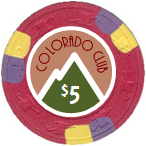
I like the red ring. I think it helps make up the retro look, and it gives you a little extra room to work at the base of the label.
You can extend the word "The" half way up into the green of the mountain, extend "Colorado" into both the red ring area (left side) and the green mountain (right side), and enlarge the word club 'til overlaps the red ring on the right side of the chip. That will close up some of the space between the main text and the elevation text, making the latter appear more a part of the main text.
... maybe.(n) :thumbsdown:
I'm REALLY liking that color matching!Maybe spot-matching (ish)?
View attachment 159850
I’d still like to see no ring
View attachment 159852
Maybe I've been looking at ring versions for too long but that seems a little unfinished to me.

Maybe make a promo label too for some named peaks, just to have a few deeper customizations... elevation number obviously changed on those.
Very frustrating. Been looking for 5 minutes and still cant find the penis.
Hahahaha I’ve finally spotted the penis. Love your theme and inlay, although I’m probably a fan of the white ring or colour matched versions rather than the red.If you squint (and really want to see it), the A in Colorado...
I like it, nice and simple without being boring.
Personally I think the "The" looks tacked on, and not part of the Colorado Club "logo" feel. Perhaps if it were tucked above the CO in Colorado?
I'm also not a big fan of the "Elev 5280" part... while it's true that something is needed in that area, the text is too small and//or thin as it is now.
My 2¢ anyway.
I think "the" and "Elev 5280" are going to get lost at that size. Not many printers will be able to resolve that fine of a line.
I'd also consider switching the outer ring to white. I like the way it brings the inlay together in the earlier iteration.
Start with your zipper, and keep your search to that general area.Very frustrating. Been looking for 5 minutes and still cant find the penis.
Very nice! A much better execution of what @Kensco was trying to suggest as well. What font are you using there?
Really like this iteration, though I like the single mountain simplicity a bit more. The rings work here too, as I imagine you used the dropper tool
To color match the spots perfectly, in execution though, the ring and slight color variance still scares me. Perfect font and layout of Colorado Club.
I would make the penis larger