Design Feedback - Colorado Club (1 Viewer)

BSteck

Full House
Joined
Feb 5, 2017
Messages
3,437
Reaction score
8,695
Location
Colorado
Hi all,

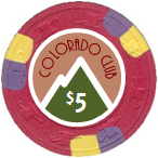
I've been working on mock-ups for a relabel project and would love to get some feedback on my initial design. The general vibe I was going for was kind of simple National Park'ish.

CO Club.png

And here are a couple of earlier iterations:
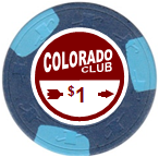
upload_2018-3-10_13-28-45.png
upload_2018-3-10_13-29-8.png


Any suggestions are welcome... Too simple? Drop the 'The'? Different denomination font?

Thanks in advance!
 
Wow, I really like the simplicity of that inlay design, much improved compared to the earlier versions imo. Personally, I think the "the" works, and the elevation is a nice touch.

Maybe a newbie question, but what chips are those you're re-labeling? I really like the colours and edge spots, especially that $1 and $20
 
Simple with a theme and easy read numbers . Home run in my books!
 
I think you need a horizontal snow line on the large peak. Other than that I think it looks great! Very reminiscent of travel ads from the 1950's-60's.

You could replace your "$" with a snowflake.... :sneaky:
 
I really like the $5, but I don’t understand why you’re using the outline of a penis instead of the letter A.
 
Maybe a newbie question, but what chips are those you're re-labeling? I really like the colours and edge spots, especially that $1 and $20

Thanks! Chips are Cleveland $1, California Bell $1, Casablanca $5 and Garden City $1k oversized.
 
I think you need a horizontal snow line on the large peak. Other than that I think it looks great! Very reminiscent of travel ads from the 1950's-60's.

You could replace your "$" with a snowflake.... :sneaky:

Yep. I feel the retro, too. Very nice!

Before you pull the trigger on those; maybe drop the currency symbols to be level with the tops of the denoms and then increase the size of both. My old eyes always appreciate larger denoms
 
Yep. I feel the retro, too.

Thanks! That's exactly the vibe I was after.

Good suggestions on the denom changes.... here's one with a little fatter font. I can't push it much bigger and have it still work for the three-character 25¢ and $20 - but I think it's much more readable now.

Font Change.png
 
I like it, nice and simple without being boring.

Personally I think the "The" looks tacked on, and not part of the Colorado Club "logo" feel. Perhaps if it were tucked above the CO in Colorado?

I'm also not a big fan of the "Elev 5280" part... while it's true that something is needed in that area, the text is too small and//or thin as it is now.

My 2¢ anyway.
 
Great design so far. How about the outline circle as a neutral black or white?

upload_2018-3-10_16-35-7.png
upload_2018-3-10_16-35-35.png
upload_2018-3-10_16-36-43.png


Yah... I was (and still am) a bit concerned with the brown'ish red outline clashing with the chip colors, but I think it loses some of its retro National Park vibe without it.
 
I think the "The" looks tacked on
That's probably because it was... :whistle: :whistling:

How about a little slanty to the The? Definitely better... still iterating... thanks for all the suggestions.

The.png
 
Like it all except that red ring.

Maybe color match it to the chip it’s for? Otherwise white looks best to me.

I do prefer the snowcap mountain on the last chip, maybe just snowcap the higher denoms, like higher elevations?
 
Maybe make a promo label too for some named peaks, just to have a few deeper customizations... elevation number obviously changed on those

Just thinking outloud.
 
I like the red ring. I think it helps make up the retro look, and it gives you a little extra room to work at the base of the label.

You can extend the word "The" half way up into the green of the mountain, extend "Colorado" into both the red ring area (left side) and the green mountain (right side), and enlarge the word club 'til overlaps the red ring on the right side of the chip. That will close up some of the space between the main text and the elevation text, making the latter appear more a part of the main text.

... maybe.(n) :thumbsdown:
 
I like it, nice and simple without being boring.

Personally I think the "The" looks tacked on, and not part of the Colorado Club "logo" feel. Perhaps if it were tucked above the CO in Colorado?

I'm also not a big fan of the "Elev 5280" part... while it's true that something is needed in that area, the text is too small and//or thin as it is now.

My 2¢ anyway.

This x2.

I think "the" and "Elev 5280" are going to get lost at that size. Not many printers will be able to resolve that fine of a line.

I'd also consider switching the outer ring to white. I like the way it brings the inlay together in the earlier iteration.
 
I like the red ring, too. A white ring will get completely lost on the white chip; and, since your text and snow and mountain outline are all white, there will just be too much white with the ring added on. Keep it red.
 

Create an account or login to comment

You must be a member in order to leave a comment

Create account

Create an account and join our community. It's easy!

Log in

Already have an account? Log in here.

Back
Top Bottom