Dealer button design (1 Viewer)

T_Chan

Full House
Site Vendor
Joined
Apr 25, 2013
Messages
4,568
Reaction score
13,794
Location
Vancouver
Looking to buy a batch of 60mm buttons from OWPS. Seen a lot of good examples but I could use some feedback for the design.

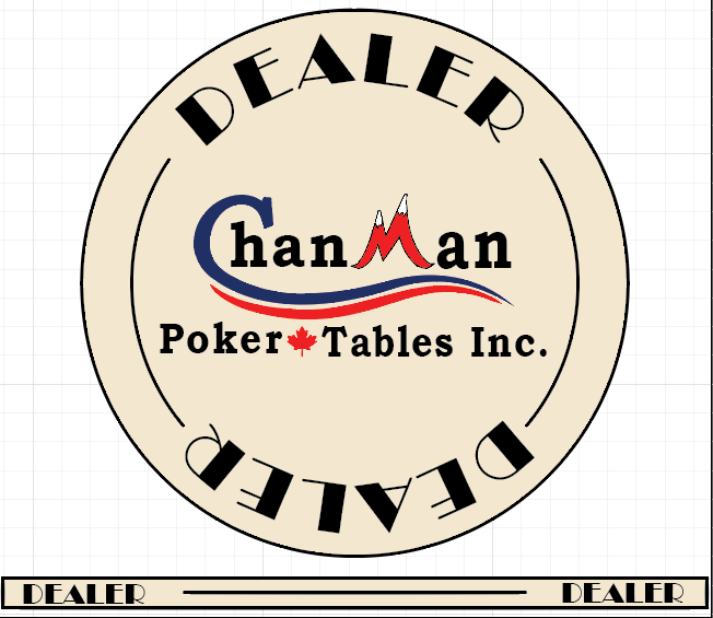
What I've come up with so far. I don't want too much clutter, KISS right?

v1
Screenshot 2017-04-28 16.03.52.png
 
Last edited:
Nice swag for your business. Keep it simple as to not crowd your logo. Keeping the branding whole is great for establishing and growing a brand!
 
My 2c... While I love the Art Deco type font, I don't think it really jives with the more organic flow of your business logo. Maybe more like the chip in your avitar?
 
Why not keep the logo consistant with you avatar and your webpage? This provides a consistent message and helps strengthen your brand.

If the way the logo shows on your website is correct use it. If it changed to the wording on the bottom then perhaps change the logo on the website.

This would be my critique while wearing my marketing hat. Also make sure the logo stands out more than the words Dealer. I am okay with a difference in the font but it should be more subdued compared to the fonts in your logo as to not draw attention away from your logo.

Is this your current logo?
0515de_2e7cf3ae01554d3b92f9a877e9553a86-mv2_d_3110_1819_s_2.png
 
Why not keep the logo consistant with you avatar and your webpage? This provides a consistent message and helps strengthen your brand.

If the way the logo shows on your website is correct use it. If it changed to the wording on the bottom then perhaps change the logo on the website.

This would be my critique while wearing my marketing hat. Also make sure the logo stands out more than the words Dealer. I am okay with a difference in the font but it should be more subdued compared to the fonts in your logo as to not draw attention away from your logo.

Is this your current logo?
View attachment 95860

My current logo is the top portion, the Chanman Poker (maple leaf) Tables. The "& more" is often swapped out with "Inc." or "& Rentals" depending on who the promo item is targeting.
 
That version looks more integrated to me.
 
I am liking the look of this one except no McDealerface of course. I like that you made the font size of "Dealer" about the same size or just slightly smaller than "Poker Tables". Now the Logo is the first thing that draws the eyes and not the word "Dealer". ChanMan is now more prominent and I like it!

David
 
What if you did an all black edge and black border on the face about to where the contour lines are, lose the 'DEALER' on the face, and just have an alternating 'DEALER'. On the rolling edge in white(cream?). So the only thing on the face is your logo, there's not going to be any mistaking what the buttons for...
 
On the rolling edge you probably want to flip the word "Dealer" 1/2 the time. So that there isn't an UP side and a DOWN side.

I like having Dealer in the face.
 
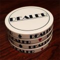
This horseshoe is the one I was thinking of..obviously your logo in the middle but below are a few more ideas
GB-HORSE-BW.jpg

gcop---b.jpg

looking at the Aces, Terribles, and Bennies with black borders
20141228_080508_zpsaec1a94c.jpg


just remembered one more style......TBC
 
never mind found it but looks similar to your first one
 

Attachments

  • IMG_3520.jpg
    IMG_3520.jpg
    26.4 KB · Views: 119
I'm not a far at all of having "Dealer" twice on each side... certainly no need to have any text on the face that is upside down to the logo.
 
I'm not a far at all of having "Dealer" twice on each side... certainly no need to have any text on the face that is upside down to the logo.
Looking at it I would agree now. What you could do is do the "Dealer" on the bottom facing the same direction as the logo and then you can push the logo up a bit with the words" "Poker tables" closer to center but not in the center. It helps fill the top and balance the chip from top to bottom.

David
 
Major design note: a black outer ring that goes all the way to the edge will not look good unless the rolling edge is also black, as it will bleed from the face over to the edge. Look at all of the example buttons in post #24 -- they all have the same-color transition from edge to face, for a reason.
 

Create an account or login to comment

You must be a member in order to leave a comment

Create account

Create an account and join our community. It's easy!

Log in

Already have an account? Log in here.

Back
Top Bottom