Dbxela design thinking out loud (card mold) (1 Viewer)

Dbxela

Sitting Out
Joined
Jan 17, 2022
Messages
38
Reaction score
42
Location
London
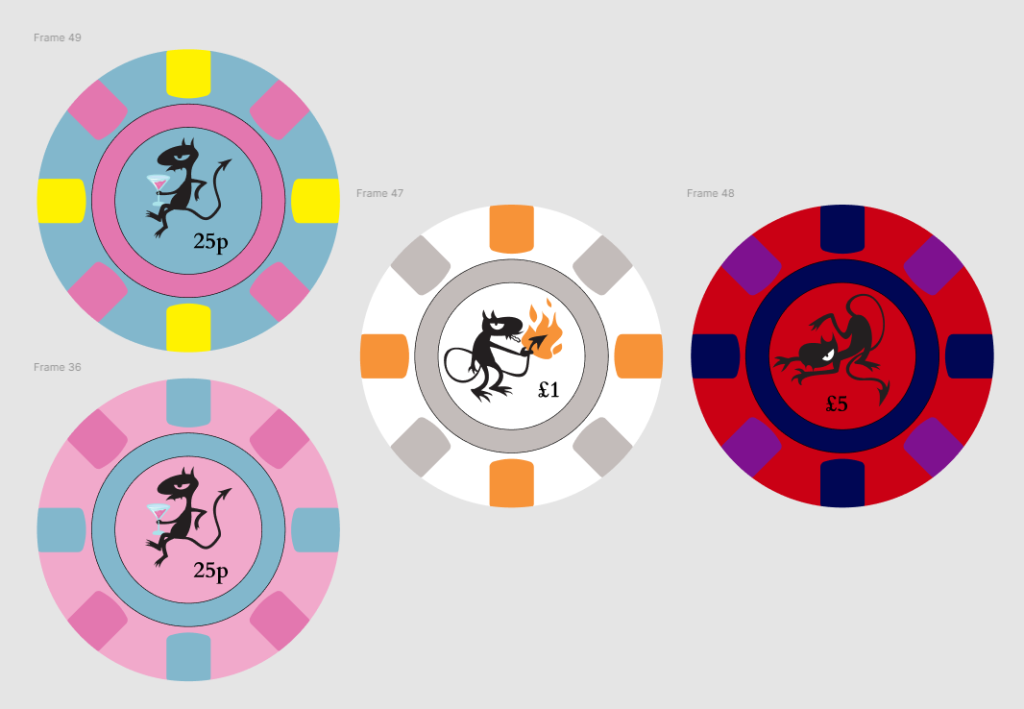
I started assuming I'd end up very similar to the Aces set. Then I made a Miro board and added all the images from card mold pron threads, and a few others. Then started sorting thing into preferences. Realised all the top spots were @SeanGecko Hardwells and variants. Noticed the 'King of Card Molds flair', Ok makes sense, probably a great source for inspiration.

A few more iterations and I'm here. Luci sets the right mood of degeneracy, colour style is quite Hardwell, but I want a Vegas/trad 1 and 5 (and 25/100 if I ever make them). Made the blue frac after I worried the pink was too close to red. Almost all chips on the table will be white, so that's the focus. But the fracs should stand out in the blinds, maybe look a bit cheaper/cheekier. We're low stakes, so the 5 is big, should be imposing when it comes out :D.

1645189948266.png

Any thoughts appreciated. I may well put a name around the inlay band, but I'm in Figma and curved text is a bit of a pain, so I'll get to it later.
 
I'm not sure I'm a fan of the stripes on the red. The other chips and stripes have nice contrast, but the red chip just isn't doing it for me. Otherwise, I like them. Only other criticism may be that the text for the denomination may be too small, but I'll leave that one to the experts. I'm new here.

Edit: Also, I like it with the name.
 
The little dude is awesome! I agree it needs some sort of text. I'm a big fan of designs that don't use text, but generally speaking that works best for designs that have patterns or shapes rather than figures. The dude is calling out for some sort of context to explain and/or enhance his presence - adding the name of club / cardroom / casino is perfect, but other text would work as well.

A couple of examples for inspiration:

1645241532871.png


1645241641492.png


1645241770228.png


1645242213291.png
 
Thanks for the feedback. I knew I was struggling with colours on the £5. There's a Weller-Hardy with a kind of pink-beige something like this that might work. I hadn't found many 5's I liked. These colours are not too far from the Aria as well, so maybe its the right area.

1645260432887.png

So maybe some kind of extra tagline within the inner inlay, or a cardroom name at the top of the ring, and a slogan at the bottom like Midnight Jazz Club.
 
I like that red chip much more than the other one. And I don't think you need any more text than what you have. Bowler's Cardroom is enough; keeps it simple, but adds just enough.
 
Can you try orange ring with grey text on the middle one? Or maybe white text if that doesn't work?
 
1645381471524.png

Yeah, the text is better on the last one. There's something about the spot-orange picking out the flame in the inlay surrounded by grey and black that means I'm still between them.
 
Actually as more minutes pass, I think the orange ring is moving into the lead :):tup:
 
Orange with white text is my favorite. Doesn't fit the pattern of the other two chips, but definitely looks the best IMO.
 

Create an account or login to comment

You must be a member in order to leave a comment

Create account

Create an account and join our community. It's easy!

Log in

Already have an account? Log in here.

Back
Top Bottom