Customizing 43mm Ceramic Hybrids (Inlay feedback) (1 Viewer)

B2rad

Pair
Joined
Nov 9, 2021
Messages
107
Reaction score
112
Location
US
So I'm working on a custom ceramic 43mm cash set and I've done all kinds of inlays and gone back and forth and really don't know where I want to go with this hah.
I like a simplistic and minimalistic looks and don't want it to be overly complex, but want it to be somewhat cohesive with the chip and not be "boring".

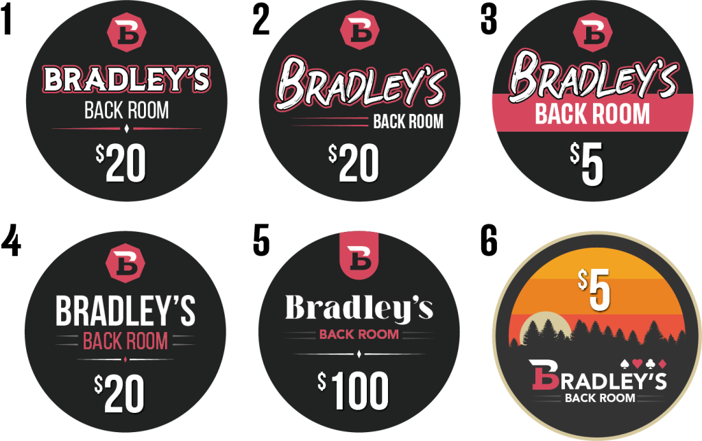
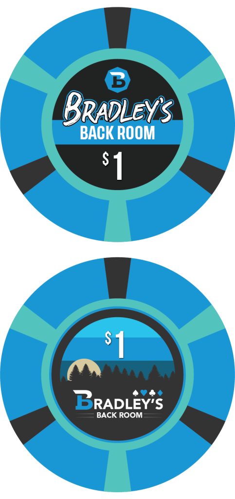
I've attached some ideas so far I've made for inlays and an example of a couple on my $1 chip.
I know 6 seems kind of random, but wanted to get an idea of what a non-black image would be like.

Would appreciate any and all criticism and ideas.

FYI there's no outline on the red "back room". I'm not sure why it exported like that, but nothing is outlined besides the obvious ones.
Asset 1@6x.png


Asset 2@6x.png
 
I like 6 as well, it really pops, but doesn't really go with the name.
That's my only qualm with this. I might consider changing it to a mountain/river scene since there's a river that runs through where I'm from, but still doesn't really fit the name I guess? But I suppose it doesn't really have to as much as the people using the chips would recognize what it is meant to refer to.
 
I was thinking Bradley's Backyard with the nature theme. But if you want to stick with the name, you could still do a simplified yet graphical design. What hobbies do you have? Do you have an actual "back room" (man cave/garage/basement, poker room, etc) and does it have any theme to it? I could picture (to be cliched) a glass of whiskey and a cigar, or something. The B design kind of looks like a sports logo. Favorite sport?
 
Oh I like Bradley's Backyard. I'm not completely set on the name, we just have called where we play "the back room" just referencing the back side of the house where we play so it was my immediate go to as simple as it is I liked it. No theme to it unfortunately that I could play from. The B was my stylized logo for "BB", red being the b within the B which it may not immediately read as but I liked the stylized look either way as a two tone option. I might play around some with the Backyard idea and a more graphical scenic look and see what I can come up with.

I live by the seacoast on the east coast so I've been thinking about trying to swing that into it somehow too. Trying to work out an interesting name for that.
 
Last edited:
#4 - I like the clean and simple - and you can color match the red on that with the chip color.
 
Oh I like Bradley's Backyard. I'm not completely set on the name, we just have called where we play "the back room" just referencing the back side of the house where we play so it was my immediate go to as simple as it is I liked it. No theme to it unfortunately that I could play from. The B was my stylized logo for "BB", red being the b within the B which it may not immediately read as but I liked the stylized look either way as a two tone option. I might play around some with the Backyard idea and a more graphical scenic look and see what I can come up with.

I live by the seacoast on the east coast so I've been thinking about trying to swing that into it somehow too. Trying to work out an interesting name for that.

Brad's Chowder House :)
 
I like the custom 'B' built into the core font, the sunset colors (though I assume these colors would shift to match each chip?), and the silhouette design of #6 above all the other options for sure. Red stripe from 3 as runner up.
As for the name, I don't think it's a huge leap to just use Back Room with the trees design personally, especially if its a recognizable vibe from the area your game is at.
 
Went a little nuts designing these, not 100% on the 20 or 100 but I really like the others so far.
Asset 37@4x.png
Asset 38@4x.png
Asset 39@4x.png
Asset 40@4x.png
Asset 41@4x.png


Complicated thing with all the edge spots would be dirty stack problems but I think the 5 and 100 are different enough.. Still may change up the design on the 20/100 anyways... but not sure quite yet. Any thoughts for the design or what I should change? I'm pretty happy with most of them so far but may make alternate versions with one of the text only inlays as well and order a small version of those as well.

Asset 43@6x.png
 
Last edited:
Added the rolling edge to the post above to see if I'd run into issues with dirty stacks, doesn't seem like I would? Any thoughts on the designs or color choices? The Easter feel of the 20 somewhat bothers me so I may have to play around with some other color options there. I originally had an 8V design on the 20.

Edit: Changed the 20 and 100 more. I think I'm happier with these. 20 got a full change and 100 changed colors, as well as changing the denom font.

Here's the full current lineup atm:

Asset 129@6x.png
 
Last edited:
Like the non traditional edge spots, particularly the 5 but the 20/100 are a little busy in my opinion.
 
Can you give us a 20 with the orange and teal marks shorter?? maybe 2/3 the size?

What do you think about a Cali set? You could toss out the red 5, set the yellow to 5 and the black to 20 and a star is born! Use red for the 100 or don't and use a White chip instead!

Also I really like the Black gradient label with the Purple highlights. What do you think about that label on all of the chips and the highlights and denom to match the base chip color?

Also mock up a 'Boom Boom Room' because that is just asking for all the fun!
 
Last edited:
Like the non traditional edge spots, particularly the 5 but the 20/100 are a little busy in my opinion.
I agree. I put it down for a few days and went back to the drawing board to try to come up with something less complex but I also didn't really want something "completely traditional" either.
Can you give us a 20 with the orange and teal marks shorter?? maybe 2/3 the size?

What do you think about a Cali set? You could toss out the red 5, set the yellow to 5 and the black to 20 and a star is born! Use red for the 100 or don't and use a White chip instead!

Also I really like the Black gradient label with the Purple highlights. What do you think about that label on all of the chips and the highlights and denom to match the base chip color?

Also mock up a 'Boom Boom Room' because that is just asking for all the fun!
I like the idea of a Cali set but I just love that red chip so much!
I'll definitely play around a bit with the inlays, though I do really like each chip having it's own inlay match the palette of the chip.
The more I play with different designs the more I change my mind on things..

Asset 130@6x.png
Asset 131@6x.png
Asset 133@6x.png
Asset 134@6x.png
 
Of these last mockups, I'm surprising myself by liking the right-most $20. @Machine's recommendation to shorten the orange/teal makes a difference, and the thicker brown makes it look a little more even around the edge. You do lose the "star" shape of the previous $20 design, but it's more balanced.

Do slightly prefer the bear claws on the previous $100, but I think this purple/green version fits better with your other chips, which to me has a more "industrial" (for lack of a better term) feel.
 
that 100 is solid! What if you made the heart / diamond green? Or spade / club green? (I'm betting just the heart / diamond would look best)

I like the second 20, I was going to suggest making the black brown marks shorter as well but I think it does well without the black brown.
 
Of these last mockups, I'm surprising myself by liking the right-most $20. @Machine's recommendation to shorten the orange/teal makes a difference, and the thicker brown makes it look a little more even around the edge. You do lose the "star" shape of the previous $20 design, but it's more balanced.

Do slightly prefer the bear claws on the previous $100, but I think this purple/green version fits better with your other chips, which to me has a more "industrial" (for lack of a better term) feel.

So the one with the biggest brown spots? I actually came to like that one myself. The smaller edge spots are less aggressive and it balances out the chip face imo. I do have a soft spot for the bear claws but I had to let them go since they felt a little out of place. Maybe it is because of that "industrial" look? The chip colors kinda look like cogs when you consider the base chip color, like the red and new black one for example. Not sure if that makes sense.

that 100 is solid! What if you made the heart / diamond green? Or spade / club green? (I'm betting just the heart / diamond would look best)

I like the second 20, I was going to suggest making the black brown marks shorter as well but I think it does well without the black brown.

I'll definitely try the green. I had just kept the purple from before but definitely gonna give that a try to see the contrast.
I'm pretty torn between that one and the one to the right of it. It almost feels naked compared to the next one though since the chips all feel pretty "busy" but that's the point of a ceramic, right? ;)

New hundo is fire
Thanks man. I really dig it actually.
 
WHERE ARE WE WITH DESIGN / ORDER! I demand to know! :)
 
These are really cool chips!

I think I'd prefer the green accents on the $100 as well. For the B and the diamond and heart. Pulling the green rather than the purple from the accent colors.
 

Create an account or login to comment

You must be a member in order to leave a comment

Create account

Create an account and join our community. It's easy!

Log in

Already have an account? Log in here.

Back
Top Bottom