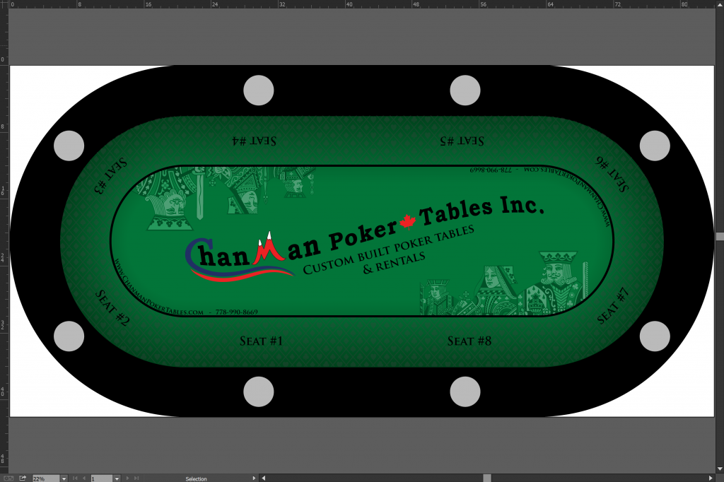
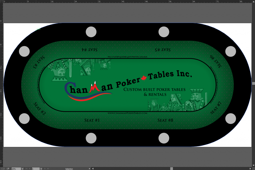
I think they would look better without the card faces. Just a little “busy” imo.
You are using an out of date browser. It may not display this or other websites correctly.
You should upgrade or use an alternative browser.
You should upgrade or use an alternative browser.
Custom rental felt feedback (1 Viewer)
- Thread starter T_Chan
- Start date
I would also prefer the larger logo that is in V1, but again without the royals like you have in v5.
If you have 15 tables, why not do 3 different colors in sets of 5 to show more options for potential table buyers. 5 Green tables, 5 Silver(like the table logo on your trailer) and 5 blue or red to go with your logo.
As far as table numbers, i have seen 3 versions. I have seen a six foot pole with seat number sign attached to it that the pole was duct taped to dealers chair. 2nd version is 5"x5" hard plastic card that slides into table rail next to dealer and is removable. most player friendly was table number signs were hung from ceiling centered above table.
+1 to make sure seat 1 is left of dealer position
If you have 15 tables, why not do 3 different colors in sets of 5 to show more options for potential table buyers. 5 Green tables, 5 Silver(like the table logo on your trailer) and 5 blue or red to go with your logo.
You see? Great minds really do think alike!
The different colors is a good idea. My thought was a different unique color for every table, but a few colors would be good. Blue, green, red/burgundy and maybe one with shades of grey.
One more:

I would like to keep the court on the layout, or something else so that the felt isn't too plain. If it's too much graphic, then maybe I'll add something else like some suits or something but I would like to have something in the space rather than nothing.
I would like to keep the court on the layout, or something else so that the felt isn't too plain. If it's too much graphic, then maybe I'll add something else like some suits or something but I would like to have something in the space rather than nothing.
The different colors is a good idea. My thought was a different unique color for every table, but a few colors would be good. Blue, green, red/burgundy and maybe one with shades of grey.
And a gold/brown one!
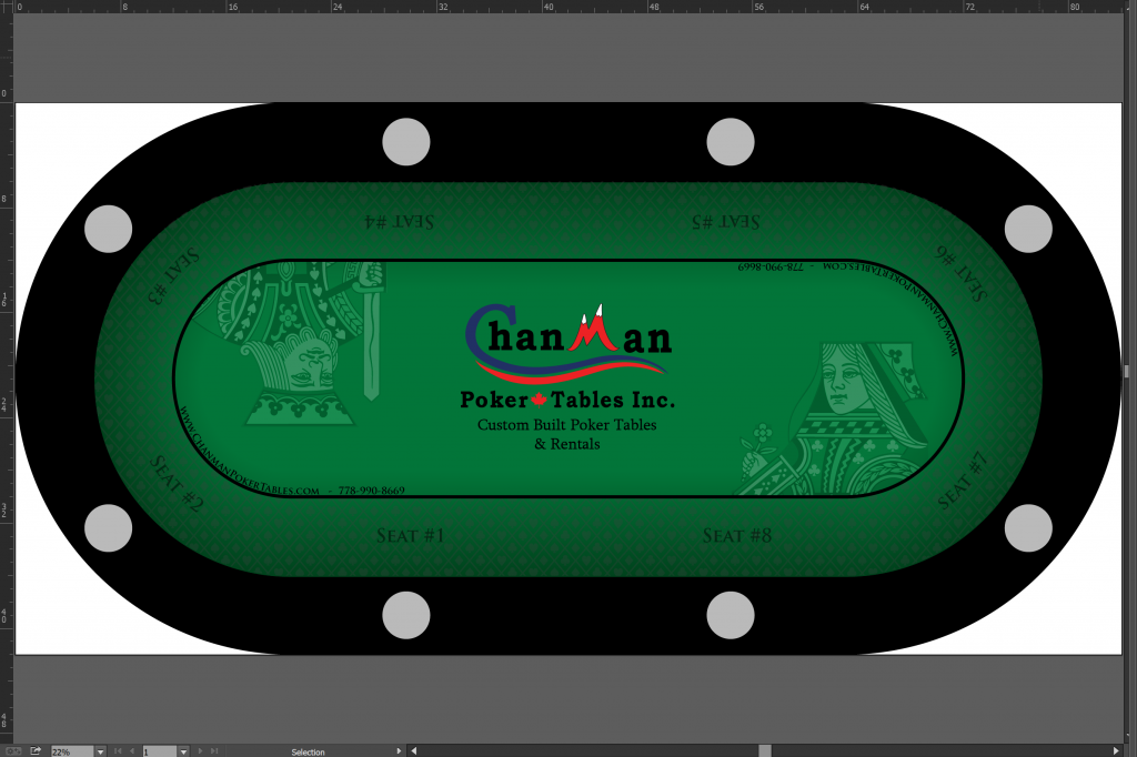
I like the swoosh logo with no courts.
Perfect! Nice and clean. Draws the eye to your logo.
Not a fan of the seat numbers but I understand. I have been running a weekly tournament for the last 10 Years. Players still ask where seat one is. I do like the idea of a Seat 1 Card that can be slipped under the rail.
beaver
Two Pair
This one is great. Maybe put the websites on the opposite corners of the oval, might make it look even cleaner and more evenly spread out.
You like the courts so you should keep them on there, even though some of our personal preference is to not have it.
Not a fan of the seat numbers but I understand. I have been running a weekly tournament for the last 10 Years. Players still ask where seat one is. I do like the idea of a Seat 1 Card that can be slipped under the rail.
Better to have something external like a card than something permanent on the felt, I would think. The cupholder idea could still work, ya know! =)
I like this one and I would use 50% opaque on the Seat numbers! That would be the final thing to make the logo pop!

I like this one and I would use 50% opaque on the Seat numbers! That would be the final thing to make the logo pop!
View attachment 146331
I'm with David on this, the opaque courts are better, and I like the 2 courts as opposed to the 6. The opaque seat numbers is a good idea as well.
- Joined
- Nov 7, 2014
- Messages
- 2,136
- Reaction score
- 2,342
- Location
- Northern NJ and NY/Long Island Areas
It looks good, my nitpick would be the Court people are too big ( massive, huge..  )
)
I would leave the court figures off. Like many have said it makes the layout a bit busy.
Center your logo in the middle and add a call to action.
If it was me, I’d do business cards that are also seating cards at the table. Leave a brochure or rack card at each seat. If you want seating numbers, sneak them in subtly so they don’t distract from your logo.
If you’d like some help PM me. Graphic Designer by day.
Not business cards. Business CHIPS!
If it was me, I’d do business cards that are also seating cards at the table. Leave a brochure or rack card at each seat. If you want seating numbers, sneak them in subtly so they don’t distract from your logo.
If you’d like some help PM me. Graphic Designer by day.
Thanks for the offer, I think I'm almost there though in terms of a final design. The seating numbers on the felt is something I'd really like to keep. I've put them at a 60% opacity to hide them a bit more while still being functional. I considered shrinking down the font but it's only 1.6" tall text as it is.
Not business cards. Business CHIPS!
If I did that I think I'd lose more money than I make at each rental event! Those things are pricey... I'd love to do it though.
Better to have something external like a card than something permanent on the felt, I would think. The cupholder idea could still work, ya know! =)
My biggest issue is that things go missing. My table tents, card ranking sheets, seating cards, etc... I also don't like anything extra on the tables that has to be removed. When players sit down at their seat stuff tends to get discarded, thrown across the table to another seat, on the floor or in the garbage. I would really like to put the table numbers on the felts as well but as others have mentioned, that's going to make different problems for me.
I explored the idea of something in the cup holders before as well but unless it noticeably sticks out, I could see people just putting their drink in the cup holder without noticing. If it is nice and big, then it's something extra I need to bring around with me that takes up space.
I think these are the last two candidates:
Option A:
Seating numbers at 50% opacity
Option B:
Courts at 20% opacity, seats at 50%
The second one would work for me if it were my business and trying to market my business. I still think the full court works since you set the opacity to 20%. This lets the logo pop! Also setting the seat numbers to a lower opacity let’s the eyes focus on your logo and allows the seat numbers to be seen and not stick out.Thanks for the offer, I think I'm almost there though in terms of a final design. The seating numbers on the felt is something I'd really like to keep. I've put them at a 60% opacity to hide them a bit more while still being functional. I considered shrinking down the font but it's only 1.6" tall text as it is.
If I did that I think I'd lose more money than I make at each rental event! Those things are pricey... I'd love to do it though.
My biggest issue is that things go missing. My table tents, card ranking sheets, seating cards, etc... I also don't like anything extra on the tables that has to be removed. When players sit down at their seat stuff tends to get discarded, thrown across the table to another seat, on the floor or in the garbage. I would really like to put the table numbers on the felts as well but as others have mentioned, that's going to make different problems for me.
I explored the idea of something in the cup holders before as well but unless it noticeably sticks out, I could see people just putting their drink in the cup holder without noticing. If it is nice and big, then it's something extra I need to bring around with me that takes up space.
I think these are the last two candidates:
Option A:
Seating numbers at 50% opacity
View attachment 146466
Option B:
Courts at 20% opacity, seats at 50%
View attachment 146467
mashoo
3 of a Kind
Option B
Option B looks pretty great. I would personally prefer the SMALL CAPS font for the subtext beneath the logo, and grammatically speaking, "Custom-Built" would be hyphenated. But unhyphenated probably has a cleaner look. Overall, hit the print button!
Option A
Either one looks good to me. I'm leaning toward option B, because most people like to see a big graphic.
manamongkids
Full House
seat is redundant, remove the word seat and just keep the numbers. looks way cleaner this way and you can also be a little more creative with the type of number you select
Another reason I like the full court graphics it show what you can do on custom cloths. Anyone can do a plain cloth with a logo. The court shows something more that you can do.
Not sure i love the seat numbers there. What if theres a dedicated dealer? who wants to sit on the other side to see floor person? that would change where #1 is.
Unless theres a dealer tray cut out i dont think a fixed numbers for the table would work.
I like the logo though,
And i like this one the best so far... but would have your web address or phone number under the main logo

Unless theres a dealer tray cut out i dont think a fixed numbers for the table would work.
I like the logo though,
And i like this one the best so far... but would have your web address or phone number under the main logo
I like the single court figures. I think I would remove the # sign from each seat.
maybe even something like ..
SEAT
1
-- edit (the 1 is centered under seat, but this board removes the spaces)
or just SEAT 1
One other nit-picky thing, and maybe it is just me.
I would have the seat numbers BETWEEN the cup holders (especially without a dedicated dealer). having your drink right in front of your chips can be a pain. This also puts seat 1 in the center of the table.
Mark
links_slayer
4 of a Kind
having your drink right in front of your chips can be a pain.
Absolutely not a pain at all. In fact, I prefer having it there because it never gets in the way and never gets bumped by elbows/forearms (mine or my neighbors).
Then again, I also like to shuffle behind so....
Similar threads
- Replies
- 5
- Views
- 371
- Replies
- 0
- Views
- 110
- Replies
- 13
- Views
- 516
- Replies
- 19
- Views
- 1K
