You are using an out of date browser. It may not display this or other websites correctly.
You should upgrade or use an alternative browser.
You should upgrade or use an alternative browser.
Custom Poker Chips : Cash Set 4 Suits (1 Viewer)
- Thread starter Hisoka
- Start date


Mr Tree
Straight Flush
I like the design, but I think the denoms need to be bigger. On an actual size inlay what you currently have printed will be microscopic.
Unfortunately the roman mold is deader than disco. Fortunately this one would work on several different molds. Maybe MD50?
Unfortunately the roman mold is deader than disco. Fortunately this one would work on several different molds. Maybe MD50?
Last edited:
links_slayer
4 of a Kind
I would do club -> diamond -> heart -> spade
I like the design concept but would be worried about how legible everything would be when actually printed.
p.s. Welcome aboard!")
I like the design concept but would be worried about how legible everything would be when actually printed.
p.s. Welcome aboard!
Mr Tree
Straight Flush
I also think the colors and edgespots could better showcase the inlay. Maybe someone who is better than me could mock some up.
I also think the colors and edgespots could better showcase the inlay. Maybe someone who is better than me could mock some up.
what do you mean ? the colors doesnt fit well with inlay ?
Mr Tree
Straight Flush
what do you mean ? the colors doesnt fit well with inlay ?
I think the colors need to pop more with this inlay. Just an example

this edgspot is ugly to me ^^
in fact a dont want to change the colors, i think they are perfect to me...
i m still wondering about the inlay... i should probably increase the letters for denom, thats true...
Do you know the specification for the file submitted to CPC factory ? i suppose its a 300dpi resolution, which dimensions ?
Mr Tree
Straight Flush
Just a quick try on my phone but here is a more standard progression. Of course you should use whatever makes you happy but I feel your current choices aren't showcasing a well designed inlay very well
Also Links is correct if you are going to do a suit progression it should be
Clubs---diamonds---hearts---spades


Also Links is correct if you are going to do a suit progression it should be
Clubs---diamonds---hearts---spades
links_slayer
4 of a Kind
this edgspot is ugly to me ^^
in fact a dont want to change the colors, i think they are perfect to me...
All that matters in the end is that you are happy with your choices. Good luck with this project and please be sure to post plenty of pics once the chips arrive!
thanks for all this quick and interesting answers a real community of passionnate chips geek
its funny how i was worried about my inlays, but finaly its the colors and progression that sounds weird ^^
and, about the progression : clubs / diamond / heart / spades, its an order which came from bridge , not about poker, true ?
a real community of passionnate chips geek its funny how i was worried about my inlays, but finaly its the colors and progression that sounds weird ^^
and, about the progression : clubs / diamond / heart / spades, its an order which came from bridge , not about poker, true ?
Mr Tree
Straight Flush
thanks for all this quick and interesting answers
its funny how i was worried about my inlays, but finaly its the colors and progression that sounds weird ^^
and, about the progression : clubs / diamond / heart / spades, its an order which came from bridge , not about poker, true ?
It doesn't really play out in poker but spades is still considered the high suit. It's not a huge design flaw but it would tilt me a little. I agree with Links that I would just swap out the order quickly.
Mr Tree
Straight Flush
As for colors they are yours so the biggest rule is for you to be happy.
However with cash sets there are two standardized color progressions Vegas and Cali.
For Vegas it is
1 - white
5 - red
25 - green
For Cali it is
1- blue
5 - yellow
25- purple
Of course it looks like you are using 20s. The cali 20 is usually black, not sure what a vegas 20 is.
On a custom set of course you can always use non traditional colors. To me personally your inlays and colors don't synergize well, but maybe others will disagree.
Last edited:
It doesn't really play out in poker but spades is still considered the high suit. It's not a huge design flaw but it would tilt me a little. I agree with Links that I would just swap out the order quickly.
The order clubs / diamonds / hearts / spades (spades = highest) is applicable in poker. One example is when the lowest card determines who acts first in 7-card stud, when suits break a tie (same rank).
Las Vegas $20's are often but not exclusively yellow.
Last edited:
And many Vegas $1 chips are blue.
- - - - - - - - - Updated - - - - - - - - -
Certainly nothing wrong with the chip colors or spot choices in the OP. Roman mold not available any longer, but several molds would work well with this design.
Changes I would make:
- enlarge and embolden the denomination on each chip (way too small)
- enlarge and embolden the text on each chip, and move it away from the edge
- the suits need some type of edge treatment so that they don't get lost in the black inlay background (especially spade/clubs)
- change the suits progression to clubs-diamonds-hearts-spades (smallest-to-largest denomination)
The fancy curli-ques probably won't be recognizable any anything but smudges. Print out your proposed inlays in real-size, tape them to real chips, and view them on your poker table from a distance. The results will be very educational.
Mental Nomad
Full House
and, about the progression : clubs / diamond / heart / spades, its an order which came from bridge , not about poker, true ?
The order of the suits is shared with bridge, but it does matter in poker.
In poker, suits never factor into the showdown - they do not change the ranking of the hands.
But suits do determine play order.
In stud games, the lowest card shown brings in the first bet. For this, a deuce of clubs is lower than a deuce of diamonds.
On the next round of betting, the highest showing hand leads the betting... and if two people have the same ranked hand (such as KT and KT), then high suit decides who leads (KsTd leads instead of KdTs, because spade is higher than diamond.)
Even in Hold'em, suits determine play order... for the very first round, when you draw cards for first deal! High card gets the dealer button, and rank ties are settled with the suit order.
- - - - - - - - - Updated - - - - - - - - -
What could i change ?
Is the mold "Roman" still possible at asm factory ?
Thanks a lot ^^
First, I think this is a beautiful start. I think the color progression is fantastic, if non-standard.
I like the 1, 2, 3, 4, spot progression - even if the 4 is a half-pie. Works beautifully, and I like the edges in stacks.
I reflexively feel the need for the "proper" suit order of clubs, diamonds, hearts, spades - but I can suppress that urge if the color contrasts are important to you, but I think a red heart on the 5 and the black spade on the 20 will work fine. (The other two suit colors remain the same.)
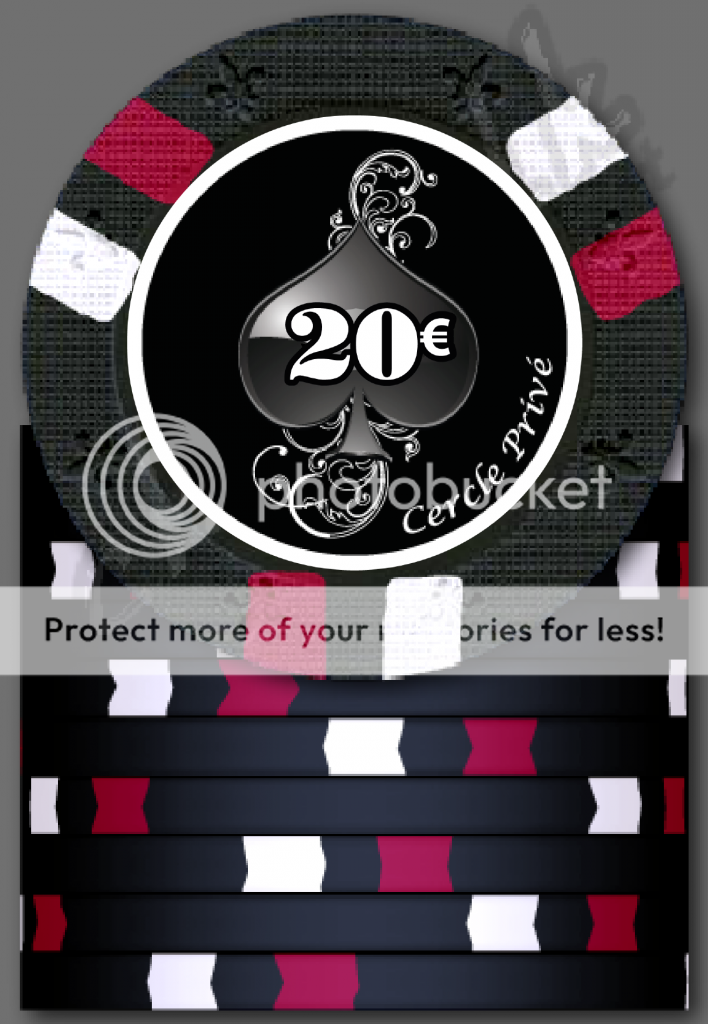
The one change I would make is the denominations; either bigger, or out of the art. If you make the art slightly smaller, perhaps you can offset the denom into the upper-left corner? Or perhaps you can write "Cinq Euro" and "Vingt Euro" in the same font as "Cercle Prive?" This is problematic for the club, of course...
The last thought that occurs to me is that perhaps the contrast between the black field of the inlay and the two black suits is not great enough. Would you consider making those with a red field, instead? Or white?
Unlike button games (Hold'em, Omaha), the card suits are also a factor when awarding an odd chip in a split or tied pot:
In Razz, the odd chip is awarded to the player with the lowest card by suit (all seven cards are used).
In Stud Hi/Lo, the high hand is awarded the odd chip in a split between the high and the low hands. However, the odd chip between tied high hands is awarded to the high card by suit (using all seven cards), and the odd chip between tied low hands is awarded to the low card by suit (using all seven cards).
Mental Nomad
Full House
The fancy curli-ques probably won't be recognizable any anything but smudges. Print out your proposed inlays in real-size, tape them to real chips, and view them on your poker table from a distance. The results will be very educational.
I agree that this test is valuable - but I disagree that the flourishes are worthless if not visible from a distance. They are beautiful up close, and will look different across the table, and you should test this, but I think it will look fine.
My real concern is with the clarity of the printing... I don't think the fine flourishes would come through on a ceramic chip, and don't think it will even look good on an insert with a matte finish. I think you need to use gloss, and that you should ask for a scanned proof of the first prints to make sure that the printing is capturing the look you want.
- - - - - - - - - Updated - - - - - - - - -
However with cash sets there are two standardized color progressions Vegas and Cali.
For Vegas it is
1 - white
5 - red
25 - green
For Cali it is
1- blue
5 - yellow
25- purple
Of course it looks like you are using 20s. The cali 20 is usually black, not sure what a vegas 20 is.
For what it's worth, Atlantic City (NJ) colors are:
1 - white
5 - red
20 - yellow
25 - green
But, as others have said, for a custom set, I agree that you're free to do anything at all that you wish!
Quicksilver-75
4 of a Kind
Good luck. Love the idea.
SAMPLES!!!???
I'd like two sets!
SAMPLES!!!???
I'd like two sets!
little modifications :


I ve tried to increase the denom and the flourishes. I ve had an overlined letters effect... it seems a little better.
And of course ive changed the sacro order ^^
Change the design of flourishes per suits, seems more accurate in this order.
I hope there is enough visibility...
I ve tried to increase the denom and the flourishes. I ve had an overlined letters effect... it seems a little better.
And of course ive changed the sacro order ^^
Change the design of flourishes per suits, seems more accurate in this order.
I hope there is enough visibility...
Krony
Two Pair
Nice inlays, could maybe try colour matched denoms to bring them out a bit ? as the club and spade might be hard to read.
Krony
Two Pair
do you mean put denoms in red or other color ?
Possibly yea or try make them stand out a tad more.
You should stick with your first design, second design is way to busy IMO.
My suggestion would be to make the denom bolder/larger and to use a black outline.
Make the white outer circle a tad larger and go with FDL mold.
Something like that:
My suggestion would be to make the denom bolder/larger and to use a black outline.
Make the white outer circle a tad larger and go with FDL mold.
Something like that:

Mr Tree
Straight Flush
You should stick with your first design, second design is way to busy IMO.
My suggestion would be to make the denom bolder/larger and to use a black outline.
Make the white outer circle a tad larger and go with FDL mold.
Something like that:
This is pretty good advice. One common nugget is to physically print out your inlay at the same size it will be on a chip. That will give you a good idea what the finished product will actually look like.
Krony
Two Pair
+1 for the original inlay, also if you use the FDL mold can go upto 1" or even 1 1/16" inlays which will make the text bigger and more readable.
Similar threads
- Replies
- 25
- Views
- 977
- Replies
- 16
- Views
- 615
- Replies
- 6
- Views
- 308