Custom Cloth Design Input Needed - Input on this design (1 Viewer)

bsdunbar1

4 of a Kind
Joined
Jun 1, 2015
Messages
5,819
Reaction score
18,235
Location
LaVista, NE
I have 2 new tables in the works and am working with T_Chan to get some cloths made.

I think the posts on here when people have solicited everyone's input has left the end result with a better looking cloth then what was started with.

So..... I'd like your input on the design we have so far.

I am pretty much set on the color scheme and a betting line, everything else is fair game.

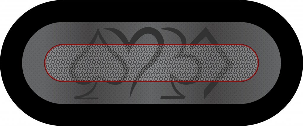
I like the large suits, but I don't know if they look cheesy or not. I think it may look too plain without them since my poker room doesn't have a name or a logo to use on the table.

Pick it apart and give me your ideas/suggestions/likes/dislikes, etc.

Any and all suggestions are greatly appreciated.


Thanks
Bill

#1
#1.jpg


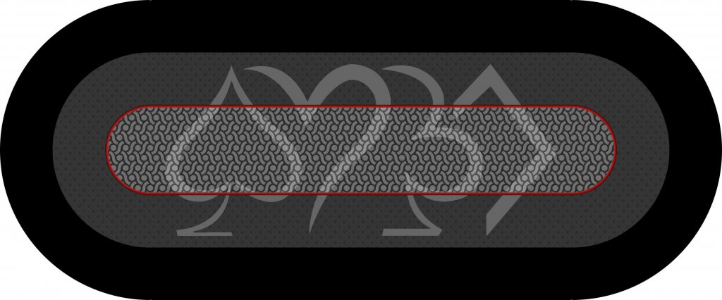
#2 Dark Suits
#2.jpg


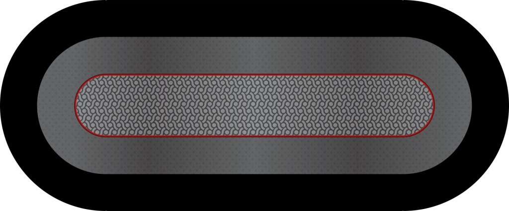
#3 Darker Outer & Lighter Suits
#3.jpg
 
I have 2 new tables in the works and am working with T_Chan to get some cloths made.

I think the posts on here when people have solicited everyone's input has left the end result with a better looking cloth then what was started with.

So..... I'd like your input on the design we have so far.

I am pretty much set on the color scheme and a betting line, everything else is fair game.

I like the large suits, but I don't know if they look cheesy or not. I think it may look too plain without them since my poker room doesn't have a name or a logo to use on the table.

Pick it apart and give me your ideas/suggestions/likes/dislikes, etc.

Any and all suggestions are greatly appreciated.


Thanks
Bill

#1
View attachment 95186


#2 Dark Suits
View attachment 95188


#3 Darker Outer & Lighter Suits
View attachment 95189

I like #3 the most and if I were doing the design I'd want to see them spaced out more. I love felts that have ghosted/shadowed images. Here's a thought - you said two tables - how about two suites on each?
 
Here's a thought - you said two tables - how about two suites on each?

Thank you for the feedback.
Yes I am doing 2 tables. I have always had matching tables but thought once we get a final result maybe swapping the light & dark colors on the two of them.
 
I like the design of the suites, but don't like how it goes over the betting line. I like to see the design stay within the betting line. I ageee with @CraigT78 about spreading it out too, make the suites go edge to edge of the betting area.
 
I don't mind the ghosted suits going outside the betting line, but you have to bear in mind that they won't be visible once they're at chips on the table. So you only get to enjoy seeing them as suits when the table is empty. With chips on board, you won't see suits, even when there's no pot. That can be fine - it will look great between games.

Also, I think the interior pattern is too strong to use with those ghosted suits. Too much contrast and too busy, so it distracts too much.
 
Also, I think the interior pattern is too strong to use with those ghosted suits. Too much contrast and too busy, so it distracts too much.

I had this same apprehension and thought the pattern in the middle might need to be lightened up a bit.
 
I agree with keeping the ghosted suits inside the betting line. Also agree that the middle is too busy to use with the ghosts. So my suggestion is use the darker grey from table three as the center with the lighter grey race track and then reverse for the other table and use the proper color of ghosted suits with each
 
I'm skeptical of the gradient on the outer part of the felt. It'd likely look way different in real life but I don't feel it's something that needs gradient lines. Also, I'd want the inside of my betline area to be a flat color with as little pattern or graphics as possible to increase visibility of chips in the pot. This is just me. I've never designed a felt. :)
 
So for my it's

Larger suites>>>>>>>>>>>smaller suites

Either way the center needs to be a solid color - too much going on, I find myself distracted.
 
I think that's going in the right direction - what says the OP?
 
I have to be honest that I always have a design issue with table layouts that only read from one side of the table. It would mean a lot of work on the 4 suit design but what about rotating every other suit 180 degrees. Then there would not be a top or bottom to the table.
 
YES, i'm liking it.
Man if i could buy all you guys a beer I sure would. Bless my wife but she can't picture our house if i asked her what it would look like lime green!
 
I have to be honest that I always have a design issue with table layouts that only read from one side of the table. It would mean a lot of work on the 4 suit design but what about rotating every other suit 180 degrees. Then there would not be a top or bottom to the table.

This was discussed with another friend of mine but like Mental Nomad said, once you are playing they are large enough that I don't really know if the orientation would matter.
I like the way these suits fit together with each other and if you start separating them or moving them i'm affraid they would lose the subtle effect of laying on top of each other and lose the reason 1/2 of the suit is missing.
 
I have to be honest that I always have a design issue with table layouts that only read from one side of the table. It would mean a lot of work on the 4 suit design but what about rotating every other suit 180 degrees. Then there would not be a top or bottom to the table.

I was thinking something like having 2 sets of the suites, the smaller version inside the betting area but one side would be reversed. That way the design can be wider since it will be doubled and have both sides of the table being able to see the design.
 
I was thinking something like having 2 sets of the suites, the smaller version inside the betting area but one side would be reversed. That way the design can be wider since it will be doubled and have both sides of the table being able to see the design.

I thought about that but was worried about losing the wow factor, similar to putting it inside the betting line above.
Similar to this?

Trop-Table-Template2.5.jpg
 
If I was fiddling with this, I would try a solid red for the felt, a solid black for the bet area (matching the bumper), and then two sets or suits either mirroring the black and red where appropriate, trimmed in white, or grey through out. As an alternate I would go with a red bumper, black felt and red betting area.

Because the bet area is a solid and not just delineated, I am guessing the suits could overrun it to good effect.
 
Appreciate all the feedback.
I think i'm set on the single large suits in the center. I really like the pattern in the center but have to agree it may be too much where all the action is taking place.
Feedback on this clear center and this non-traditional suits pattern on the outside?

Thanks
Bill

V12a.jpg


suits1a.jpg
 
Last edited:
Appreciate all the feedback.
I think i'm set on the single large suits in the center. I really like the pattern in the center but have to agree it may be too much where all the action is taking place.
Feedback on this clear center and this non-traditional suits pattern on the outside?

Thanks
Bill

View attachment 95359


View attachment 95361
I know this isn't my project - but IMO this is the best design yet. If it were me, I might try some subtle color in the center to give it some pop - but that's just my own taste talking. I REALLY like the non-traditional suit pattern, berry cool!
 

Create an account or login to comment

You must be a member in order to leave a comment

Create account

Create an account and join our community. It's easy!

Log in

Already have an account? Log in here.

Back
Top Bottom