Custom Ceramic Cash Set - Mock Up (1 Viewer)

DrBill

3 of a Kind
Joined
Jul 22, 2020
Messages
612
Reaction score
617
Location
Florida
After much thinking.... I have decided to start out with a custom ceramic set through @ABC Gifts and Awards rather than going with casino chips sets, mixed sets, pre-existing customs, or even relabeling a set. I will eventually get more sets within those categories (Bud Jones and CPC Rounders to name 2), but I believe this is how I want to start, especially after seeing the Windy Crest chips by @CraigT78 and taking budget into account. Planning to order 1,000.

I put together this first draft on Illustrator. I'm probably going to make the black dashes on the edge of the 1 skinnier as well as the blue dashes on the 5, but I just didn't know how (not very good with Illustrator haha). Also may change the font of 'Riverside Poker Tour' and 'Jax, FL' to look more stencil like.

Open to feedback.
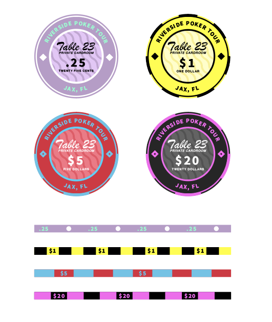

First Design.png
 
My first and immediate feedback is to keep the same font color for the centers. The black and then white just sticks out at me. Otherwise I like the concept and think this a great start!
 
Shouldn't the frac have a currency symbol: $.25, $0.25, or 25c?

I think the systematics of the colors of outside text, inside text and the decorative squares and circles etc. could be strenghtened. Sometimes they are the same, some times they have two different colors, sometimes three.

Maybe you could use a darker contrast color on the quarter.

The number of stripes on the rolling edge does not always match the number on the edge of the face. Maybe they are not supposed to, but it could look a little odd when made. Another possibility could be repeating the decorative element on the face of the chip and on the rolling edge - e.g. circle, lozenge, square, bar.
 
My first and immediate feedback is to keep the same font color for the centers. The black and then white just sticks out at me. Otherwise I like the concept and think this a great start!
I would ungroup the dollar sign from the value.
Align the value to centre, then space the $$ accordingly.

Looking good otherwise.
I prefer a 25c or 0.25, but that’s personal preference
Shouldn't the frac have a currency symbol: $.25, $0.25, or 25c?

I think the systematics of the colors of outside text, inside text and the decorative squares and circles etc. could be strenghtened. Sometimes they are the same, some times they have two different colors, sometimes three.

Maybe you could use a darker contrast color on the quarter.

The number of stripes on the rolling edge does not always match the number on the edge of the face. Maybe they are not supposed to, but it could look a little odd when made. Another possibility could be repeating the decorative element on the face of the chip and on the rolling edge - e.g. circle, lozenge, square, bar.

I love the advice guys!! Fixed some of things that y'all mentioned! I definitely agree with most everything that was suggested... my only problem is that I can't seem to solve the changing colors thing without making one of the chips look worse. I can't do white text in the 1 chip and I can't do black in the 20.

Keep em coming if y'all can think of anything!


Design 2.png
 
I think these look sick. I love chips with the value on the sides as well
 
If you plan on having the .25, 1, and 20 all on the table at the same time, you're gonna have a hell of a dirty stack problem with those 3 together. I love the direction of the .25-5, but there's too many repeating colors when you add in the 20. I suggest breaking into a new colorway for the 20 and leave the rest as is.
 
If you plan on having the .25, 1, and 20 all on the table at the same time, you're gonna have a hell of a dirty stack problem with those 3 together. I love the direction of the .25-5, but there's too many repeating colors when you add in the 20. I suggest breaking into a new colorway for the 20 and leave the rest as is.
You literally read my mind on that! I got some samples and realized that real quick. I plan on making the 20 Green/black rather than pink/black.
 
Is it hard to create these in illustrator? I’d love to try this myself but have never used illustrator before. Any tips?
 
Is it hard to create these in illustrator? I’d love to try this myself but have never used illustrator before. Any tips?
I honestly have very very little experience in illustrator and did these mostly by trial and error. I’m sure there are quicker ways to make something like this than what I did, but I mostly just had a vision of what I wanted, and then went to YouTube to learn any actions on illustrator that I didn’t know how to do in order to accomplish what I wanted.

The biggest thing I would say would be to make layers, and make sure everything is symmetrical and centered.
Well bravo to you cause you did a fantastic job I will look into it. Thanks for the tips!
 

Create an account or login to comment

You must be a member in order to leave a comment

Create account

Create an account and join our community. It's easy!

Log in

Already have an account? Log in here.

Back
Top Bottom