Critique this line up (2 Viewers)

bsdunbar1

4 of a Kind
Joined
Jun 1, 2015
Messages
5,819
Reaction score
18,234
Location
LaVista, NE
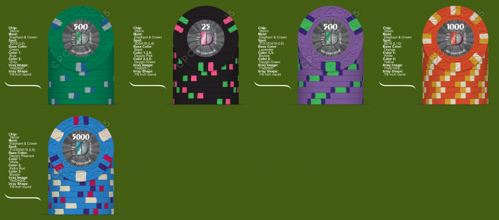
Looking for feedback on this line up. Good/Bad/Ugly.
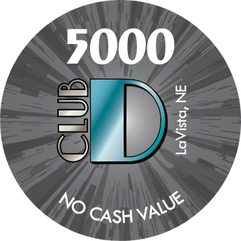
The denoms will be the standard denom, I just put the inlays I had that closest matches the D with the chip. I would color match the D to the individual chip, but these are close. I may also use a solid background.
Also may go with Circle Square mold, I have to get samples of both.
Tell me what you think.....
fd723b5d-f2f7-4f46-a661-061230d69641.png


TheD5000 Label.jpg
 
Re the 25 - Blue spots on a green base often provide limited contrast. Be careful w/that combination, lest you be left with an ineffective/virtually non-existent spot.
 
Green chip in urgent need of contrast.
Black chip fine, but you got the DG Green on the next one too, so I tweaked it according to my taste.
Lavender chip exquisite, but I switched to Retro Blue for the thin spots, since I had to use the Blurple on the Green chip.
Orange chip is the only base color I 'm suggesting a change to DG Orange for better contrast (and a nicer color IMO). No need for 8D18, both progression-wise, and in order to save you some money.
DG Peacock blue chip looked busy IMO, but you might like something somewhat busy for the top chip, so I 'm proposing the slightly more expensive but more symmetrical 6DSA18 spot pattern (Level 10 instead of 9).
My 2c. Tried to remain loyal to your starting point.
Excellent starting point anyway. Good Luck! :)
bsdunbar1.png
 
Too different IMO, spot-wise,for something that's not "other", ie a frac in a cash set, or a bounty chip in a tourney set.
However, CPC Green goes well with Light Blue (very close to Grey) if you would like a 314 version.
 
I like the 312/3916 spot idea. I'd get some yellow on it though to brighten it up.

Your first mockup is heavy on the green, and you don't really have a bright yellow in there
Screenshot_20190506_084752.jpg
 
T25 Changed for more contrast
T100 Removed green, added yellow
T500 Changed just to save a buck
T1000 I like it even if it is expensive. It is a workhourse chip and in play a lot.
T5000 changed to make it less busy

ClubD.png
 
Last edited:
CPC orange is a bit dull for me, but if that's what you prefer, go for it. The green chip is fine because it is a lower denomination and should be more plain. Circle Square is a nice mold. My samples have less texture compared to other molds but more than diamond square and the crowns.
 
CPC orange is a bit dull for me, but if that's what you prefer, go for it. The green chip is fine because it is a lower denomination and should be more plain. Circle Square is a nice mold. My samples have less texture compared to other molds but more than diamond square and the crowns.
After looking at the orange closer I had already changed the base of the T1k to Dayglow Tiger.
 
T25 Changed for more contrast
T100 Removed green, added yellow
T500 Changed just to save a buck
T1000 I like it even if it is expensive. It is a workhourse chip and in play a lot.
T5000 changed to make it less busy

View attachment 284752

I like this lineup a lot, especially the 100 and 500. I'm trying to picture the 1k "in real life", the orange/yellow tones look different in person, and often what jives in the chips designer doesn't "match" in person. If you don't already have one, get a color sample!

DG tiger is awesome, but I don't think it would look right with the white/yellow spots, if you switched the base you'd likely need to find different spot colors.
 
I'm trying to picture the 1k "in real life", the orange/yellow tones look different in person, and often what jives in the chips designer doesn't "match" in person. If you don't already have one, get a color sample!

DG tiger is awesome, but I don't think it would look right with the white/yellow spots, if you switched the base you'd likely need to find different spot colors.

This is my favorite chip of the bunch, but only if the colors end up like I imagine them to be. I'll probably resort to others' completed chips to see how they look.
I definitely will be paying attention to the oranges/yellows in TriHonda's chips in a couple of weeks @ MTTD.
 
There have been a lot of changes behind the scenes. I'm not ready to throw the complete line up out there for critique. This one i am having trouble deciding on the base color.
T25 - Regardless of the Spot selection, it will fit with the rest of the set trust me, I'm trying to decide between these color choices.

Left One - I really like this one best, but it some real life pics people have posted the Dayflo green looks way lighter than on screen.
Right One - I am fine with it but i am also afraid in real life the grey/green isn't enough contrast?

So based on your experience with these colors what are your thoughts?

285157
 
First off, since I'll never be able to decide on a custom set for myself I need to justify the purchase of these samples, so pics attached (flash/no flash).

I agree with WedgeRock, even if you go DG Green. I don't think the gray has enough contrast with the green. I like the green on the right more than the DG green.
Only other thing that I'll mention, and it might just be an OCD thing, but when I was mocking up sets I tried to either stay all DG colors or all weighted for base color. The brass flakes are noticeable, and they get more noticeable with shuffling and wear. I kinda liked the set matching as it wore down rather than having some brass flakes on some chips and not others.
 

Attachments

  • IMG_1141.JPG
    IMG_1141.JPG
    213.5 KB · Views: 146
  • IMG_1142.JPG
    IMG_1142.JPG
    205.2 KB · Views: 175
I have eliminated the dayglo green, it is just too light.
I also gave up on the grey spot and replaced it with bright white.
I think i'm down to Light Green or Green, with these spot colors.
Thoughts?


285180
285181

T25_3.jpg
T25_4.jpg
 
I have eliminated the dayglo green, it is just too light.
I also gave up on the grey spot and replaced it with bright white.
I think i'm down to Light Green or Green, with these spot colors.
Thoughts?


View attachment 285180View attachment 285181
View attachment 285182View attachment 285183

I like the top right here best. Light green base with a darker green spot and white spot looks badass, IMHO. The blue spot looks good, too. I prefer a lighter green base to a darker green base myself, so top row > bottom row in my book.
 
I like the light green with the dark green spots as well.
Does the addition of some blue goes better with the rest of the line up though?
The T25 & T5000 won't be on the table at the same time so I am ok with both having the same blue & bright white spots.


285202


285203
 
Me too^^
@bsdunbar1 I see you 've decided to go expensive on the spots. IMO, 6D18 looks better than 8D18. If you still need one of the latter, reserve it for the top value chip.
At any rate, make sure to see all color combos in person before pulling the trigger!
 
Me too^^
@bsdunbar1 I see you 've decided to go expensive on the spots. IMO, 6D18 looks better than 8D18. If you still need one of the latter, reserve it for the top value chip.
At any rate, make sure to see all color combos in person before pulling the trigger!

If I were gonna do both 6D18 spots and 8D18 spots I would make with first three 6D18 and the last two 8D18, or add a T25k and do half and half!
 
I would actually prefer all 8D18's, i just made the T25 & T100 6D18's to break it up a bit.
We don't get many 5k's in play on a weekly basis, the T100 & T1000 are the workhorses.
 

Create an account or login to comment

You must be a member in order to leave a comment

Create account

Create an account and join our community. It's easy!

Log in

Already have an account? Log in here.

Back
Top Bottom