Crazy Albert’s Poker Palace (Draft Only) (1 Viewer)

Bad Toad

3 of a Kind
Joined
Jul 26, 2016
Messages
546
Reaction score
831
Location
Albuquerque, New Mexico
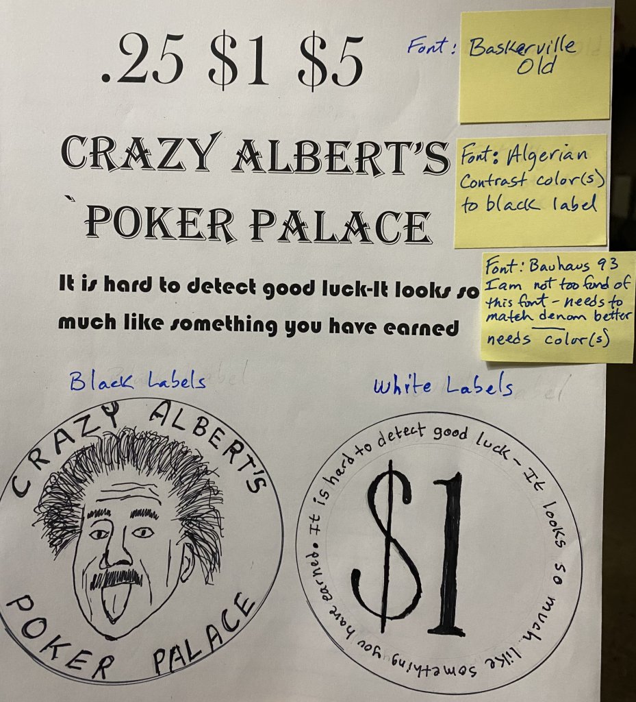
I’m making a short handed cash set using butterscotch quarters, off white dollars and black fives. Einstein colors. Here are sample sketches with some notes. Please feel free to drop some comments and suggestions
83377436-2F76-43A4-ADEF-22511EF87151.jpeg
 
Curious of the saying will be legible. Seems like a lot of text.

If the photo doesn’t work, would you be willing to use a similar non-photo version that provides the same feel? (I don’t have the vocabulary at the moment, but I’m thinking either a drawing or solid-color computer art likeness of sorts)
 
I agree on both points. The quote is just so appropriate for poker that I have to try it. The image is what I want to use, but the version is negotiable for sure.

Thanks
 
Oh- you didn’t indicate what type of chip. If you are putting this on a flat ceramic chip, you’ll have better luck with visibility. If this is going on a textured 7/8” inlay, it may be very tough to see. Worth a shot- mock something up and see.
 
You’re doing amazing! Have you seen the stuff that happens here? A simple idea, a lot of questions, input, testing, improving, and out of that has come some incredible stuff. You have some core concepts, and pulled in some folks to help iterate.
 
You’re doing amazing! Have you seen the stuff that happens here? A simple idea, a lot of questions, input, testing, improving, and out of that has come some incredible stuff. You have some core concepts, and pulled in some folks to help iterate.
Agree with this. I think this is a cool concept for a chip set.
 
How about taking the quote (in gray) and letting it take up the whole inlay and overlaying the denom in black? Big enough then?
 
The general rule when designing with type is to limit the typefaces to two.
Use more fonts if needed (bold, extra bold, italic, oblique), but limiting the whole design to only two typefaces keeps the whole thing more consistent.
There are definitely exceptions to this, but its a good guideline to start with.
 
I agree. The yellow note mentions the quote needs to more match the denomination, just thought it looked different but too different.
 
Yeah, Baskerville is such a classic, I'll bet it looks great if used for the quote.

I really like the idea for these chips, good luck with them!
 

Create an account or login to comment

You must be a member in order to leave a comment

Create account

Create an account and join our community. It's easy!

Log in

Already have an account? Log in here.

Back
Top Bottom