CPC Mockup Base Color Advice (1 Viewer)

303Mike

Two Pair
Joined
Dec 15, 2020
Messages
338
Reaction score
695
Location
Richland, WA
Trying to finalize tourney set (T25, T100, T500, T1000, T5000, T25000)
Looking for a few suggestions from folks who have mocked up similar colors. I'm concerned the "blurple" T500 will be too close to the T100 bases of either "black" or "charcoal". Should I lighten the T500 to "purple" or "Lavender"? From sample set pictures, not sure I'm a fan of either of those colors. Does anyone have any pics of their actual T100's and T500's?
Thanks in advance.

with theses colors together?
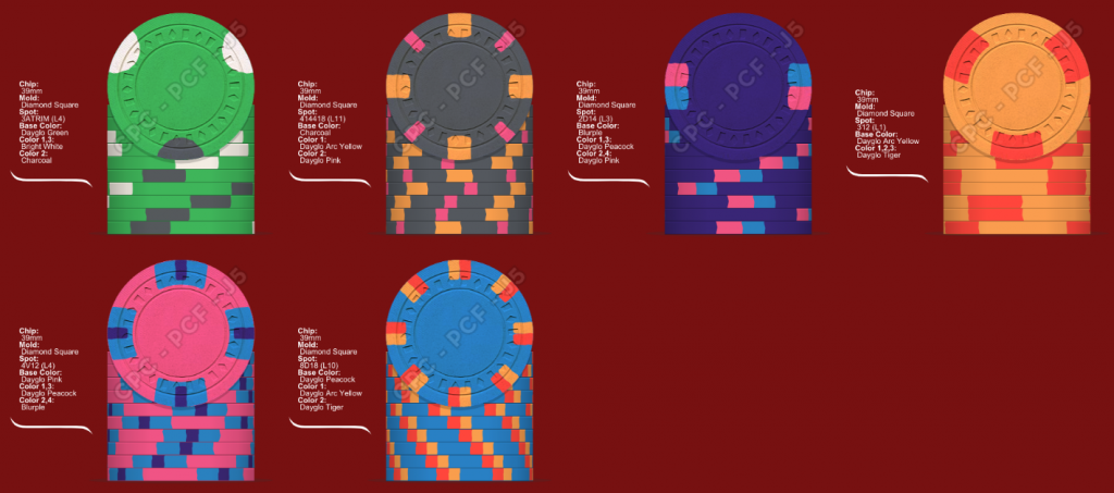
Set #1.png
 
I'd recommend getting your own cpc sample set if you don't have one already. There is no substitute for the real thing. Photos will always have a variance in color from what the actual chips look like.

A sample is cheap compared to the cost of a full cpc set.
 
I'd recommend getting your own cpc sample set if you don't have one already. There is no substitute for the real thing. Photos will always have a variance in color from what the actual chips look like.

A sample is cheap compared to the cost of a full cpc set.
Agreed, get samples.

And for the OP, yes Blurple is to close to Black in my opinion. Blurple looks awesome on the designer, but in real life it's pretty dark.
 
+1 for samples! And yes, blurple and black are too close. Not a fan of the lavender color. Retro lavender is great though
 
Agree 100%. I was very happy to get a sample set from a member here. There is nothing quite like over laying the chips on one another when planning colours. So far I like what you have put together. However for me your T1000 chip is a no. But again that is just my taste. I have had lots of good advice in helping me plan my choices both from the forum and from family members. Don't let anyone push you off of a combination if you really like it.
 
Blurple next to charcoal is fine, especially if the edge spot colors create more separation through contrast. But you can't do your blurple chip and that hot pink chip in the same lineup. That's a bad idea. I would avoid creating chips where colors are shared across denoms as much as possible.

Also, your spots should progress across denoms. You immediately go right to the 4D418 spots on the charcoal chip. That's a fairly "advanced" or "progressed" edge spot. Then you drop down to the 2D14 spots on the blurple chip. That's regressing, not progressing. Try to make the spots flow across the set with a gradual progression. Or you can do all chips with the same spot pattern too if you like (all tri-moons for instance, or all quarter pies).
 

Create an account or login to comment

You must be a member in order to leave a comment

Create account

Create an account and join our community. It's easy!

Log in

Already have an account? Log in here.

Back
Top Bottom