CPC Edge Spots (1 Viewer)

Point was... Ben saw a lot of breakage shipping samples of his the white/rainbow chips. I don't know if you saw the same thing. His samples were add-ons, and there were only 2 chips in the add-on sample set, the rainbow chip wasn't as secure. Never-the-less, I heard of no breakage of the chip that traveled with his Rainbow (supernova) chip, which supports the theory that some spot patterns are more vulnerable than others.
 
This one might be doable. Mix of 8D18 and 414.
Punch out holes with the 8D18 or 814 on chip base, punch out Retro Red spots with 414 and DG Peach/DG Yellow spots with 4D18. Does not punch out more base material than the existing/available spot pattern.

4d18414-100-mock-mystery.png
 
This one might be doable. Mix of 8D18 and 414.
Punch out holes with the 8D18 or 814 on chip base, punch out Retro Red spots with 414 and DG Peach/DG Yellow spots with 4D18. Does not punch out more base material than the existing/available spot pattern.

View attachment 108700

I cannot guarentee - but I'd say that's possible, and would be a Level 10 chip.
 
...but a 3rd color of clay that they have to mix.

Fair enough. (Does that still count though when you already make use of edge spots with the same color on another chip?)
If I can get it made this way I think it's worth the extra $$$, and I finally would have spots/colors down for every denom.
Not quite what I had in mind but at least not butt ugly.

When I find some time to contact CPC I'll still ask about the other spot patterns as well.
Still have to finish inlays though, will take care of that first. Main denoms are already done but some extra non-set designs I want to have made alongside still have their label in the hand-drawn sketch stage. Anyway going to take me two and a half more months until I have the funds together if no unexpected expenses come up.
 
This one might be doable.
I created and sent requests for lots of spot patterns I thought would be doable... answer was always "can't do it". Hope you have better luck.

nex said:
But L10? The 8D18 already is a L10, this one has a couple less small/fragile 1/8" spots less to punch/fill in but thebulkier/apparently easier 1/4" instead.
If, and it's a big if, David agreed my guess would be L14. 8D18 is L10 but I am assuming it's double punched using 4D18. Your chip would require a second different punch as well as an additional color... more steps, more colors, more work.

I was bound and determined to get something off the grid and was desperate towards the end. Best I could come up with was this but using a three color 1/4pie. Just the one color change of one "pie" bumped it two levels to an L13.
IMG_2289.jpg


When I find some time to contact CPC I'll still ask about the other spot patterns as well.
If you ask what other spot patterns are possible the answer will be "everything we can do is in the CDT" 100% of the time... only way you have a shot is to offer specific requests.
 
Step 1: Send your life's savings to CPC
Step 2: Tell him you want a particular spot pattern, never seen before
Step 3: David rejects a half-dozen designs before you find one that is possible
Step 4: Agree that you won't order too many
Step 5: Prepare to be ridiculed by David for all of eternity
Step 6:
DSC01077.JPG


This is a road I know, a little too well.
 
Step 1: Send your life's savings to CPC
Step 2: Tell him you want a particular spot pattern, never seen before
Step 3: David rejects a half-dozen designs before you find one that is possible
Step 4: Agree that you won't order too many
Step 5: Prepare to be ridiculed by David for all of eternity
Step 6:
View attachment 108735

This is a road I know, a little too well.

I'll take one.
 
I tried and failed but pics from TGD meetup suggests I just didn't try hard enough :)
Step 1: Send your life's savings to CPC
Step 2: Tell him you want a particular spot pattern, never seen before
Step 3: David rejects a half-dozen designs before you find one that is possible
Step 4: Agree that you won't order too many
Step 5: Prepare to be ridiculed by David for all of eternity
Step 6:
View attachment 108735

This is a road I know, a little too well.

Re-read step 1 ;)
 
Duh, I forgot one thing... the amount of black around the edge is going to be fairly low with any of those spot pattern ideas.

With all the red-orange-ish spots, it might get too close to the looks of my $5 (base red, spots DG arc yellow/DG tiger) when only looking at the edges in bad lighting conditions. Now given that I probably just can't use those three colors in combination for the spots because of this issue, I probably won't need to try getting a custom spot pattern. The alternative would be to use charcoal, gray and white spot colors, but that would result in a rather bland color scheme that's not really worthy of a high denomination, and certainly not worth over $5 per chip for me.

I've tested my $5 design against a 6A18 black base with retro red and DG saturn as well as DG orange and DG saturn spots and I believe that would still work. With a 414418 it already gets worse, albeit not as much as with the tri-color patterns, but well why drop the extra bucks for an inferior result. What really sucks though is that I can't use the 4 Points shaped inlay with 6A18 (and neither 4 Notch). Scallop and Cog are already in use for lower denoms, Clover looks like poop, and Hub's premium is ridiculous while also looking like poop. Leaves only Tri-Moon - which however I also already have in use on the one higher (and highest) denom.

And for the higher-denom Tri-Moon chip I have the problem that there's no really good looking edge spot patterns with 8 spots around the edge where I could use the 4 Points inlay shape instead (neither does 4 Points look good on that chip's base color in the first place).

What do you think?
I mean of course it breaks some patterns going with the same inlay shape on two chips while the rest has unique shapes, and yes of course ultimately it's me who has to like the outcome. Also, the chip's base color is black and so is the inlay's background color, so the shape would only be visible when taking a close look. (I still want it to be shaped, not just a round inlay, simply because it is a higher denomination and all the other chips $5 and up have a shaped inlay too.)
But are there any other arguments pro/contra re-using an inlay shape in a set?
 
The alternative would be to use charcoal, gray and white spot colors, but that would result in a rather bland color scheme that's not really worthy of a high denomination, and certainly not worth over $5 per chip for me.
I certainly don't consider this bland:

gf9Ldkr.jpg


And it even stands out amongst those with colour:

o8fXeYf.jpg
 
Yes, this one looks nice. Because the inlay is what does the most to it, and it fits well with the rest of your denominations having a similar coloring scheme as in "broad spots of multiple colors visually close to the base color" (roughly).
But: It also does not stand out from the rest in any significant way. Could have been a $1 denomination just as well and an uninformed third party would likely not notice.

Mine has a less prominent, mostly black and white inlay across all denominations.
My other denominations' edge spots are not this strictly following an overarching pattern either. They are loosely following an edge spot progression scheme, but only three are uniformly colored with similar shades. Two others use thin bright spots of colors different from the base color to help make them stand out a bit more as there were no fitting spot colors of the same shade as the base color for those that would have made them look equally good as the aforementioned three. Same thing with a black $100. A $100 with charcoal/gray/white spots simply looks bland next to those.
 
Last edited:
...it fits well with the rest of your denominations...
To clarify, this HOF set was the creation of PCF members bmichaelhorn and Johnny5.

But: It also does not stand out from the rest in any significant way.
Agree to disagree... the rest are saturated in colour whereas the $100 is not. The spot choice is also significant because it incorporates the 1/4 pie in addition to the 414 spot. Within the context of the set, it would stand out to me even as a $1 chip.
Mine... A $100 with charcoal/gray/white spots simply looks bland next to those.
If you believe that for your set then you are right, as that's all that matters. (y) :thumbsup:
 
This one might be doable. Mix of 8D18 and 414.
Punch out holes with the 8D18 or 814 on chip base, punch out Retro Red spots with 414 and DG Peach/DG Yellow spots with 4D18. Does not punch out more base material than the existing/available spot pattern.

View attachment 108700
Nice call. Doable and Level 11. Think I may need a small add on to my current order :D

David Spragg said:
Yes it could be done.
Difference between 414 and 4D18 is 5 levels, so it would be 8A14 + 5 levels = Level 11.
 
To clarify, this HOF set was the creation of PCF members bmichaelhorn and Johnny5.


Agree to disagree... the rest are saturated in colour whereas the $100 is not. The spot choice is also significant because it incorporates the 1/4 pie in addition to the 414 spot. Within the context of the set, it would stand out to me even as a $1 chip.

If you believe that for your set then you are right, as that's all that matters. (y) :thumbsup:


Just my opinion. I haven't seen The Boulevard set before, but my jaw dropped. And the $100 chip definitely stands out.

The Boulevard set is amazing.
 
I've checked out every set listed in resources and a lot of the gallery as well, so I did see this one earlier.

It certainly does look great all in all. There are minor weaknesses I see with it but not severe, and some of them not objective but subjective/personal taste.
The thing is however, nothing about its design will really help me with my set as I'm following very different design principles.

For Boulevard, the design center of gravity is the inlay - for my set, the spots are going to do most of the work to make the chip look good instead.
Boulevard's theme allows for a lot more color combinations than mine, and has an entirely different color scheme in the first place.

Agree to disagree... the rest are saturated in colour whereas the $100 is not. The spot choice is also significant because it incorporates the 1/4 pie in addition to the 414 spot. Within the context of the set, it would stand out to me even as a $1 chip.

Grayscale shades also are a form of color though. It's about brightness. Try converting the whole image to grayscale (= simulate very bad lighting conditions) and you see what I mean:
boulevardbw.jpg

The $100s barely stand out, and that only a little because of the slightly higher brightness of the Bright White spots, neither does any other chip. They all blend.

I mean, hey okay, some people like uniformly colored/spotted chips. But I prefer to be able to quickly and easily tell them apart in a splashed pot, and that's where they have a weakness. The human eye/brain considers objects similar primarily by color and shape, and Boulevard makes it very hard to distinguish the chips by shape alone. It nearly fully relies on color.

Neither does the 1/4 Pie+414 spot really make the chip stand out. Given the large inlay that covers most of the chip body including the "ends" of the edge spots going to the center of the chip, all you see is a relatively thin border, which kills nearly everything that would normally make the spot pattern pop out. Compare these without looking too closely:
boulevard-spotdifference3.png

A little more charcoal around the edge on the one, a little less on the other, but not that much. For my personal taste definitely not worth the price hike from L2 to L9.

I think this set is one of the less good examples of what happens when you as a designer value form too much over function for objects that are meant to be worked with. Less good example because here, it was just overvalued a little bit, and there are examples with a more grave effect. You can still tell the chips apart by color, but it's made significantly harder than it would have to be because of the very similar spot patterns on all of the chips.

Better example off the top of my head would be the Finder sidebar in Mac OS X "evolving" (more like degenerating) from 10.6 Snow Leopard to 10.7 Lion:
This does not have anything to do with poker chips but there are some similarities in the use case.

- An ideal operating system / software product is easy and fast to work with to enable the user reach his intended goal in the shortest possible time. (Among other things.)
- An ideal poker chip set is easy to work with as a dealer (who has to quickly identify what's in the pot) and to a lesser extent the players as well (quickly find out how much they and the other players have). (Among other things.)

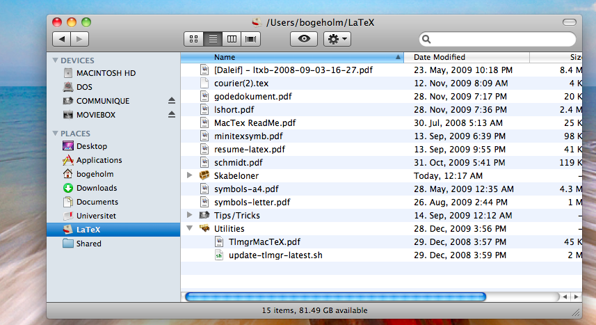
Now compare the sidebar here:
CL5dM.png


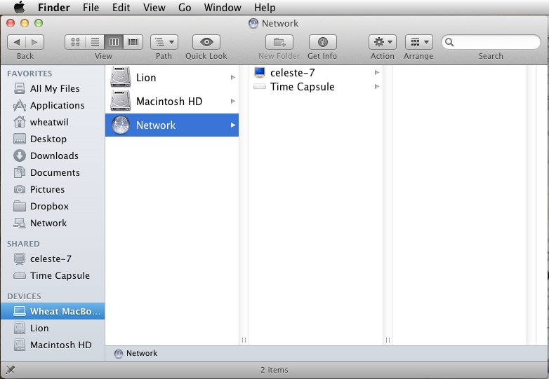
with the sidebar here:
5Q8TI.png

primarily the entries listed under Places/Favorites.

While in the first version you were quickly able to spot your desired sidebar item without actually having to read the label next to it (makes it faster -> efficiency!) because you could easily identify items by shape and color combined, in the second version you are severely slowed down because color was entirely cancelled out. You only have the shape left for identification, which already significantly worsens the time the eye/brain needs. You have to resort more and more to reading the label, which makes the process way slower. This is a feature I use on a daily basis when working with my machines, I have experienced the effect it has myself.

Well, this is what happens when you have a designer on crack running free with barely any restraining. (Steve Jobs - who was into design and user experience himself - worked like a gatekeeper, weeding out all the dumb ideas Jony Ive had and letting only the stellar ones pass through. Tim Cook on the other hand is a bean counter at heart and apparently has no concept at all about good design or UX and only cares about if it sells or not - which unfortunately is pretty much always the case as Apple's marketing has always done and keeps doing a stellar job at creating hype zombies.)

If you are an Apple fanboy and were offended by my slight rant: Please don't get me wrong here, I'm not a hater. I used to love their products and still use a lot of them. Mac Pro with two cinema displays, two MacBook Pros, iPod classic, Apple Keyboard on any machine I work with Mac/PC/whatever, and only recently retired an iPhone. The Macs still run 10.6 as that version really was the pinnacle of OS X. I just don't buy any new ones because they are objectively inferior for my needs, and it unfortunately looks like Apple is not going to reverse their course anytime soon. I feel like this company really has to nearly die once more to have a chance to get back to sanity, just this time they wouldn't have any Steve to beg to come back.
 
Last edited:
I've never witnessed so many words typed about a set or mock-up that has yet to be revealed.

You are going to see it, no worries... in due time :)
I just don't want to spoil you guys in advance. The first impression is everything, so the more unfinished stuff I show, the more biased will your judgement be on the final version.
 
The thing is however...

All kidding aside, my eye was immediately drawn to the $100 chip in the black and white photo. Same goes for the 3 chip mockup that immediately followed... honestly. And while your grayscale image is used to simulate very bad lighting conditions, reality is very different under actual very bad lighting conditions. In reality, most DG colours used in a set will appear to be quite bright in very bad lighting conditions. All other weighted/non-weighted colours blend though, including bright white.

That said, I was merely trying to point out that White + Charcoal do not a bland chip make. You don't agree... that's cool. It's your money so your opinion is the only one that matters. Your explanation however doesn't change my opinion. I'm sure your set will be outstanding and I look forward to seeing it. (y) :thumbsup:
 
That said, I was merely trying to point out that White + Charcoal do not a bland chip make. You don't agree... that's cool. It's your money so your opinion is the only one that matters. Your explanation however doesn't change my opinion. I'm sure your set will be outstanding and I look forward to seeing it. (y) :thumbsup:

I didn't say a black+white chip is bland per se. I said it is not really flashy, and since it isn't, it will look bland in my set next to the other denoms I already have designed.

Edit: Plus, I would claim you are already a bit biased, or say, not so good for reference, as you are into chipping and therefore have an eye for such things. I come from the software development world where the goal of any UI/UX designer is to make the software usable even for absolute degenerates, simply because we cannot realistically expect any user of our software to be a pro with the same mindset we developers have. In the same spirit, I'd want "non-conoisseurs" playing with my chips to also be able to use them well and quickly tell them apart.
 
Last edited:

Create an account or login to comment

You must be a member in order to leave a comment

Create account

Create an account and join our community. It's easy!

Log in

Already have an account? Log in here.

Back
Top Bottom