CPC Customs Featuring Oakland Street Art (Cash) (1 Viewer)

wickwack

Sitting Out
Joined
Oct 29, 2019
Messages
33
Reaction score
76
Location
Oakland, CA
This is a follow up to an older thread. The design has changed a lot, including the decision to build separate sets for tourney/cash, hence new threads for the separate sets. Thanks to the various chippers who have provided great advice and encouragement.

My overall vision: to me, a cash game should have a light mood: playful, even a bit silly. I chose murals to fit that mood, and chip colors to match, with a light, pastel aesthetic. I'd love to hear any thoughts / criticism / suggestions. I'll be taking the next few weeks to make sure of the mural / color / edge spot choices.

Options I considered but rejected:
  • Having the murals on only one side, with denomination on the reverse (see original thread). As-is the chips might be too busy? But I didn't like the feeling that the chip would be split: half of it is a piece of art, the other half a poker chip.
  • Having edge spots be less varied: 1/4 PIE - 3D14 - 4D14 - 6D18 - 8D18, or even just 1/4 PIE - 3D18 - 4D18 - 6D18 - 8D18. I do like the 1/4 pie on the chip that's worth a quarter.
Note about the $25: I have a pic with better colors (the background is more purple than blue), but it's low-res. I'm hoping to get a better photo myself.

The murals:
  • $0.25: Rise And Grind by Illuminaries
  • $1: "Oakland Treehouse" by Griffin One
  • $5: Part of the "Alice Street Mural Project" by Desi Mundo
  • $25: "Beacon Frequency Reader" by Joshua Mays
  • $100: "Chinatown Dragon Mural" by Thomas Wong, John Hina, Jose Garcia, and Sylvia La

Tourney set: https://www.pokerchipforum.com/threads/cpc-customs-featuring-oakland-street-art-tourney.51758/
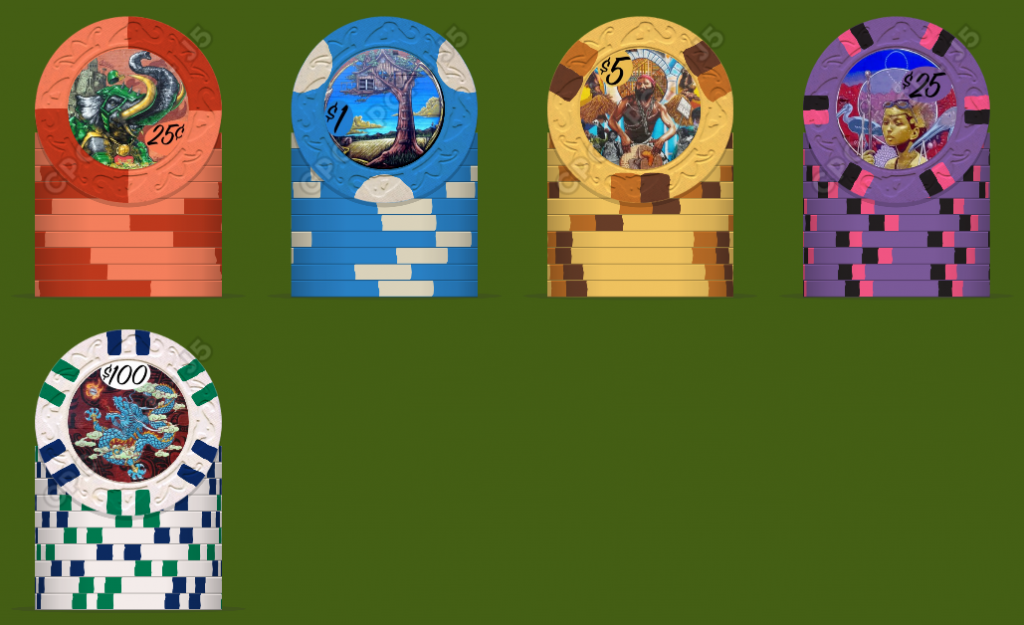
157-b56-all_signpainter_with_currency.png
 
One thing I have to say is the denoms get lost almost too easily in the current mockups.
Agreed. I'll probably hire someone to help with that; I think font choice, size, colors, etc. can all have an impact on this. Of course it's tricky; because in some large way I want the denoms to get lost (cause I want to see the art).

I did consider having denoms only on one side, and murals only on the other side.
 
I did consider having denoms only on one side, and murals only on the other side.

That is a better idea, and I'd do it that way. It will keep the art intact/untouched and also have a clear denomination on the other side.
I would also like to see "Oakland" or "City of Oakland" where the denom is.

Something like this...

1579584409262.png
 
Love this idea. Would love to see a Diego or Orozco, lol. Please keep us updated. I'd love to have a sample set of these when all is done.
 
Im not so sure the denominations must stand out. If your idea is to not have it be a "poker chip" then perhaps either leave it out, or keep it fitting over the artwork. Though I would reverse the color of the 100 denom so that the "100" is white while the circle is great or black. I'm pretty sure I will be in the minority here.
 
I can dig it! Super interested to see how some of the more intricate designs come out. That $1 is really pretty, loved the visionary chip from the tourney set.

Edit - Would love a sample (if you’re doing that) when they’re made.
E861FD6E-38AF-4C1D-8012-E56EBEBAEFCD.jpeg
 
Last edited:
Shouldn't the inlays be as big as possible with these elaborate designs? But that would require another mold.

And maybe a straight banner in the chip color, with black/white lettering for the denoms would work, but would have to try that out.
 
This is a follow up to an older thread. The design has changed a lot, including the decision to build separate sets for tourney/cash, hence new threads for the separate sets. Thanks to the various chippers who have provided great advice and encouragement.

My overall vision: to me, a cash game should have a light mood: playful, even a bit silly. I chose murals to fit that mood, and chip colors to match, with a light, pastel aesthetic. I'd love to hear any thoughts / criticism / suggestions. I'll be taking the next few weeks to make sure of the mural / color / edge spot choices.

Options I considered but rejected:
  • Having the murals on only one side, with denomination on the reverse (see original thread). As-is the chips might be too busy? But I didn't like the feeling that the chip would be split: half of it is a piece of art, the other half a poker chip.
  • Having edge spots be less varied: 1/4 PIE - 3D14 - 4D14 - 6D18 - 8D18, or even just 1/4 PIE - 3D18 - 4D18 - 6D18 - 8D18. I do like the 1/4 pie on the chip that's worth a quarter.
Note about the $25: I have a pic with better colors (the background is more purple than blue), but it's low-res. I'm hoping to get a better photo myself.

The murals:
  • $0.25: Rise And Grind by Illuminaries
  • $1: "Oakland Treehouse" by Griffin One
  • $5: Part of the "Alice Street Mural Project" by Desi Mundo
  • $25: "Beacon Frequency Reader" by Joshua Mays
  • $100: "Chinatown Dragon Mural" by Thomas Wong, John Hina, Jose Garcia, and Sylvia La

Tourney set: https://www.pokerchipforum.com/threads/cpc-customs-featuring-oakland-street-art-tourney.51758/

View attachment 395515
Nice! I love the colors line-up and the edge spots, in addition to the general concept.

For the $ 1 chips, it seems to me that there are "GRI" (Gaming @Rhodeman77 International) restrictions. Be careful ;)
 
Thanks for the comments! Please check out the tourney thread too (https://www.pokerchipforum.com/threads/cpc-customs-featuring-oakland-street-art-tourney.51758/).

Shouldn't the inlays be as big as possible with these elaborate designs? But that would require another mold.
Yes, I'm definitely considering that. The tourney set is on fleur-de-lis, with 1 1/16" inlays. I like the mood of E&C for the cash set, but the more I think about it I think it may need a larger inlay.
 
I wonder what the denominations would look like in white (or red or black) sans-serif lettering bold in words (e.g., "TWENTY-FIVE CENTS"; "FIVE DOLLARS"; etc), printed on a circle at either the top or the bottom of the chip -- depending which fits the mural.

Not sure it would be an improvement, but that's something I would consider trying.
 
Yes, I'm definitely considering that. The tourney set is on fleur-de-lis, with 1 1/16" inlays. I like the mood of E&C for the cash set, but the more I think about it I think it may need a larger inlay.

Yeah its a toughy, I love the mold as well, but especially for these inlay designs I would def reconsider. Then again, I've never held CPC chips in person so I'm hardly able to give accurate advice.
 
Yeah its a toughy, I love the mold as well, but especially for these inlay designs I would def reconsider. Then again, I've never held CPC chips in person so I'm hardly able to give accurate advice.
I think my second choice for mold would be hourglass. I do want to see the clay, so if it has to be a larger inlay I want the mold to catch the eye. That said, if it was all about the murals, I suppose I would go with ceramic but I hate the feel of ceramic.
 
Love the idea, it looks very cool

however, street art is still covered under regular copywrite stuff... especially if it is commissioned
 
I wonder what the denominations would look like in white (or red or black) sans-serif lettering bold in words (e.g., "TWENTY-FIVE CENTS"; "FIVE DOLLARS"; etc), printed on a circle at either the top or the bottom of the chip -- depending which fits the mural.

One tweak to what I said before, I think I'd add a black outline to the text to make it stand out a bit more. Messing around with inkscape, here's what the 25 cents & $1 might look like: (I used chip backgrounds I had from before from the PCF color guide page.)

25-example.png
1-example.png
 
Last edited:
here's what the 25 cents & $1 might look like: (I used chip backgrounds I had from before from the PCF color guide page.)
That's awesome I think I see real potential there. I had thought of that but assumed the result would be hopelessly muddy. Those look pretty darn good.

I like what I have too, though. It keeps the denom a bit less prominent.
 

Create an account or login to comment

You must be a member in order to leave a comment

Create account

Create an account and join our community. It's easy!

Log in

Already have an account? Log in here.

Back
Top Bottom