You are using an out of date browser. It may not display this or other websites correctly.
You should upgrade or use an alternative browser.
You should upgrade or use an alternative browser.
CPC custom set - feedback appreciated (1 Viewer)
- Thread starter PsychoFeather
- Start date
What denoms for which chips?
The black to me should be 100.
I would scrap the purple. To me purple is always a 500.
I don't like the blue. Kind of looks like some inspiration from the Jack 2 and doesn't look like it goes with this set.
I like the pink, but as a 50 cent frac. The edge spots to me also make more sense for a frac.
I think it's OK to get inspiration from sets, but I wouldn't flat out copy them.
I don't love the 100 there, especially since there is already plenty of pink. Since you aren't going with traditional colors, maybe try an arc yellow, dg peach, or dg tiger there? I always like their look next to more purple chips. I also am not a huge fan of regular blue and the set could also use a splash of green somewhere, in my opinion.
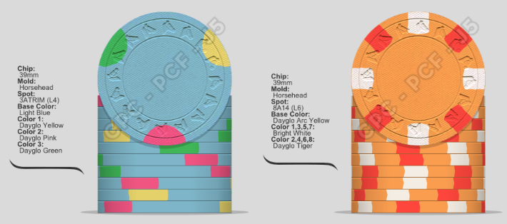
I did these real quick for the 1 and 100, respectively, but I would need an actual color sample in hand to have an opinion. Maybe some butterscotch on the 100 instead would have a better contrast.

Edit - I meant to use imperial blue on the 1 but don't have time to fix.
I did these real quick for the 1 and 100, respectively, but I would need an actual color sample in hand to have an opinion. Maybe some butterscotch on the 100 instead would have a better contrast.
Edit - I meant to use imperial blue on the 1 but don't have time to fix.
I would also throw around the denoms a bit. I like to have a progressive spot pattern with more complex spots for the higher denoms. I really like the blue and black chips. I would keep the 1 as is, or possibly peacock, do a arc yellow 5, use the black as 20 and then do a white 100
detroitdad
Royal Flush
I see lots of dirty stacks in your future.
GetUrShineBox
Flush
Too many blues, grays, purples, pinks in all of the chips. each chip is great on its own but together it won't work.
PsychoFeather
Pair
Hmm, thanks for the feedback! Will play around with something for the 100, something with white and yellow seems to be the consensus, maybe some greenI don't love the 100 there, especially since there is already plenty of pink. Since you aren't going with traditional colors, maybe try an arc yellow, dg peach, or dg tiger there? I always like their look next to more purple chips. I also am not a huge fan of regular blue and the set could also use a splash of green somewhere, in my opinion.
I did these real quick for the 1 and 100, respectively, but I would need an actual color sample in hand to have an opinion. Maybe some butterscotch on the 100 instead would have a better contrast.
View attachment 786358
Edit - I meant to use imperial blue on the 1 but don't have time to fix.
PsychoFeather
Pair
Thing is I want a Highly played black and that for my cash games would be a 5 or possible 1. Hence why I went with black for 5I would also throw around the denoms a bit. I like to have a progressive spot pattern with more complex spots for the higher denoms. I really like the blue and black chips. I would keep the 1 as is, or possibly peacock, do a arc yellow 5, use the black as 20 and then do a white 100
PsychoFeather
Pair
Would a green 25 and yellow/white 100 work? I really really wanna keep the 1-5 (blue and charcoal, most played chips at my Home games)
Nothing wrong with non standard colors. I would go for a bit more contrast between the two though. Perhaps something like this:Thing is I want a Highly played black and that for my cash games would be a 5 or possible 1. Hence why I went with black for 5
Or to not repeat the dg pink too much:
In any case, be sure to get a color sample set and take your time and play around with different colors A LOT. You will end up doing plenty of tweaks along the way.
PsychoFeather
Pair
For sure! Got a sample that I am playing around with. I like the orange on the 1’s.Nothing wrong with non standard colors. I would go for a bit more contrast between the two though. Perhaps something like this:
View attachment 786464
Or to not repeat the dg pink too much:
View attachment 786465
View attachment 786466
In any case, be sure to get a color sample set and take your time and play around with different colors A LOT. You will end up doing plenty of tweaks along the way.
Once my internet comes back I will do another iteration of the set with a new 25 and 100.
i'm nobody
Flush
I love non standard colours. Just remember you are the one paying for the chips so make sure you are happy with them.For sure! Got a sample that I am playing around with. I like the orange on the 1’s.
Once my internet comes back I will do another iteration of the set with a new 25 and 100.
The $1 chip is great and I like what @Eriks has done.
The other chips all look very dark. I would brighten up the black chip no matter what and I do agree that there is potential for dirty stacks.
Looking forward to seeing this evolve. Good luck
PsychoFeather
Pair
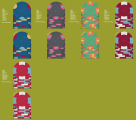
Alright, another mockup, I really wanted to keep the charcoal 5, its just way to pretty to be put to the sideline of being a 100 and barerly seeing play in my home games.
as for the colors, I decided to stick to a green 25 and a red 100 (out of the ordinary). The pure red is quite dark while the mandarin red is a little brighter. However, I kinda like the idea of darker chips with brighter edge spots which is the theme we can see in the other chips. Any additional feedback is appreciated. Will prob revise these again but I am quite happy with the look. But that could all change once I mock up the hotstamp.
that brings me to another question, how would I go about mocking something like that up?
Attachments
You guys probably know quite a bit about that part: @Coyote @Thomacetti @AK Chipthat brings me to another question, how would I go about mocking something like that up?
The grumpy old man will persist with his progessive edge spot agenda and suggest:Alright, another mockup, I really wanted to keep the charcoal 5, its just way to pretty to be put to the sideline of being a 100 and barerly seeing play in my home games.
as for the colors, I decided to stick to a green 25 and a red 100 (out of the ordinary). The pure red is quite dark while the mandarin red is a little brighter. However, I kinda like the idea of darker chips with brighter edge spots which is the theme we can see in the other chips. Any additional feedback is appreciated. Will prob revise these again but I am quite happy with the look. But that could all change once I mock up the hotstamp.
that brings me to another question, how would I go about mocking something like that up?
PsychoFeather
Pair
You are right, I was just trying to avoid the extra charge of it being a more difficult pattern. but since I was thinking just a single barrel then it doesnt hurt that muchThe grumpy old man will persist with his progessive edge spot agenda and suggest:
View attachment 786515
chipinla
4 of a Kind
- Joined
- Apr 12, 2018
- Messages
- 7,327
- Reaction score
- 21,504
PsychoFeather
Pair
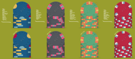
Thank you! I can't see myself moving away from the design as I just love how the aurora star 1's look, but I do agree that your mock up looks more uniformed with the rest of the set, also, my red 5 changed to the above pictureView attachment 786793First off, do what YOU like but since you’re asking, I’m personally not a fan of the tri-circle spot pattern with this set. Not even really a fan of it at all actually. But doesn’t feel like it fits here. I would lean towards something like this with whatever type of color combo you like. Then maybe try swapping the edge spot pattern on your 3rd and 4th chip.
PsychoFeather
Pair
That red chip is my favorite.This is my latest mock up
The blue I could maybe get on board if the base color was lighter, but as someone else said the spots just don't look right with this set.
The green doesn't flow for me. I know you're trying to have it like the AS T25, but I saw a comparison photo on here of someone that did the same and you could tell it just felt fake. I don't know how else to explain it.
PsychoFeather
Pair
I have since then changed the blue to a brighter blue. as for the spot pattern, I agree it sticks out, but I don't know if thats a bad thing to me I personally kinda like it (but thats ofc subjective)That red chip is my favorite.
The blue I could maybe get on board if the base color was lighter, but as someone else said the spots just don't look right with this set.
The green doesn't flow for me. I know you're trying to have it like the AS T25, but I saw a comparison photo on here of someone that did the same and you could tell it just felt fake. I don't know how else to explain it.
as for the green, I agree, it can never really look like the real deal. but I had to implement a green somewhow as otherwise dirty stacks was bound to happen most likely.
I love the red ship as well! if it wasnt so expensive all chips would have that pattern
Similar threads
- Replies
- 12
- Views
- 681
- Replies
- 17
- Views
- 746


