CPC Cash Set Idea - Watergate Lounge - Looking for feedback (1 Viewer)

vennythekid

Sitting Out
Joined
Jan 7, 2022
Messages
14
Reaction score
41
Location
USA
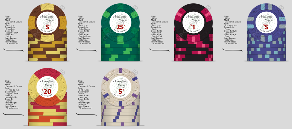
Hey all, been lurking a while and I finally wanted to do a custom set. I was (heavily) inspired by the Siam Imperia set; the E&C mold is my favorite! I borrowed the colors and E&C mold because they work so well together. I love the classic/timeless aesthetic, but I don't have any ties to the Thailand theme, so I wanted to make it my own.

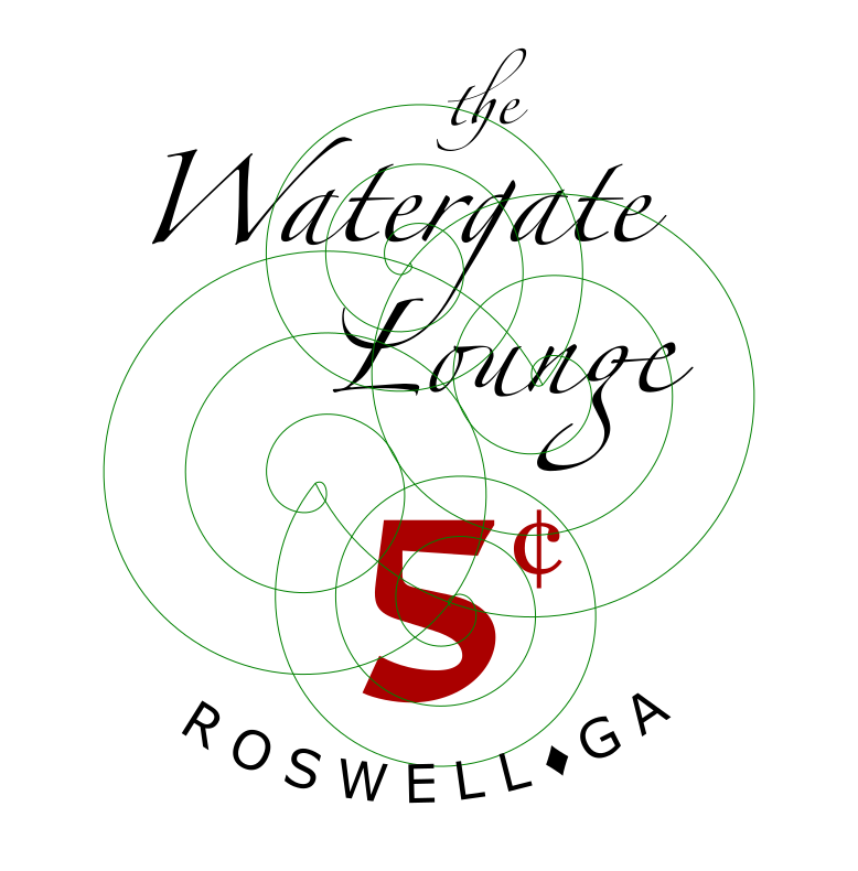
I don't love the title typeface I used, it's not as heavy/bold as I'd like and it's just a bit generic. Suggestions welcome. I do my own lettering occasionally so I could hand draw a typeface if I saw good inspiration.

The green design in the background is a placeholder for a light line art I'm probably going to hand draw, but I'm not sure what design to do. The house we play at is called "Watergate" and it's surrounded by creek, river, and woodlands, so that's where I'm drawing inspiration from.

Cash denoms are $0.05/$0.25/$1.00/$5.00/$20.00.

I'd love to hear your thoughts and ideas for improving the design!
watergate_lounge_5_cent.png
CPC_Watergate_Lounge_Imepria.png
 
Looks familiar! :)

Let me know if you want photos of splashed pot pr0n. The Siams are almost identical, only slightly different colors on the $20 chip.
 
I really like the whole lineup.

I agree with @redwine that the Green on Retro Green will get a bit lost. Maybe Green base with DG Green and Dark Green spots. Although I wouldn't worry about dirty stacks with the nickel and $20 being 5 chips away. They shouldn't really ever be in a pot together.

On the inlay I would find a bolder font for the name. And make the denom bigger. Try to see if you can view this at size on your screen. Inlays are actually pretty small. That type may get lost given the background design. Also, I would have that background design behind the name and denomination type.
 
That background and cursive font is a hard no from me… very confusing and will get lost.

Even on your new version “the” is so small and thin and I don’t think it’ll be visible. Looks nice but it’s going to be so small.
 
Hey all, been lurking a while and I finally wanted to do a custom set. I was (heavily) inspired by the Siam Imperia set; the E&C mold is my favorite! I borrowed the colors and E&C mold because they work so well together. I love the classic/timeless aesthetic, but I don't have any ties to the Thailand theme, so I wanted to make it my own.

I don't love the title typeface I used, it's not as heavy/bold as I'd like and it's just a bit generic. Suggestions welcome. I do my own lettering occasionally so I could hand draw a typeface if I saw good inspiration.

The green design in the background is a placeholder for a light line art I'm probably going to hand draw, but I'm not sure what design to do. The house we play at is called "Watergate" and it's surrounded by creek, river, and woodlands, so that's where I'm drawing inspiration from.

Cash denoms are $0.05/$0.25/$1.00/$5.00/$20.00.

I'd love to hear your thoughts and ideas for improving the design!View attachment 844172View attachment 844173
A nickel and a black dollar??? I like this proceed!

Also #TeamBlackDollar4Life
 
I like the concept, but have to agree with the others that the text and fine details on the inlay will get lost when printed. Those background circles might even disappear altogether.

If you haven't already, try printing these at the size they will be on the chip and seeing how they look "in real life". Often something that looks OK on screen is either too jumbled when printed or just disappears.

Good luck and keep poking at this. It should be a really nice set. It just needs a bit of refinement on the inlay (usually the most difficult part for me, and always the one that takes the longest.).
 
Bolden the swirls, put it all the behind the text? Turn opacity down to like 40%
For reference, my Arizona Club set has the lizard outlines as the "watermark" on the chip at 25% opacity. (brightness 191 of 255).

https://www.pokerchipforum.com/thre...r0n-of-over-200-sets.13031/page-2#post-213105

I was looking for something subtle that's "there", but not dominant.

Hopefully this gives you an real-world example of what CPC (well, ASM Maine when I had these made) fainter printing looks like.
 
Had some time to rework the inlay. Thanks for the advice to bold the text, especially the denominations, I think this looks a lot better.
 

Attachments

  • wbc_25c_final.png
    wbc_25c_final.png
    82.7 KB · Views: 74
Had some time to rework the inlay. Thanks for the advice to bold the text, especially the denominations, I think this looks a lot better.
Out of curiousity. Since your not curving “watergate”, maybe swap the 25¢ and Watergate Board and Card… just curious what it would look like. Or move Roswell, GA to the top… Think Terrible’s layout. It just looks uneven to me.
5FBB0F30-0B10-4E3C-BECB-6AED2446C4A1.jpeg
 
This does allow for the possibility of art on the card beyond just the logo, I kinda like this iteration!
How do you feel if the heron is flipped horizontally and looks right?
 
Another option: spots or base colors for the heron? I'm leaning heavily towards spot-colored herons, but the light-green is giving me pause.
heron_color_sample.png
 

Create an account or login to comment

You must be a member in order to leave a comment

Create account

Create an account and join our community. It's easy!

Log in

Already have an account? Log in here.

Back
Top Bottom