CPC Cash Set (Comments and criticisms welcome) (1 Viewer)

Samoth311

Pair
Joined
Nov 1, 2020
Messages
137
Reaction score
389
Location
Tallahassee, FL
This would be a 600 piece cash set (100/200/200/80/20). I'd love your input on the colors. I can't decide what I really want for the quarter. I've toyed with a light blue, orange, and everything else. I also wonder about the dark blue $1. I want a set that is colorful enough to be fun, but not garish. I'm keeping the spots on the $1s and $5s at a low level to keep costs down.

Also, thanks for everyone who gave help on how to create an inlay design in Photoshop. This is a crazy original design you've probably never seen before. ;) All criticisms and comments are welcome.
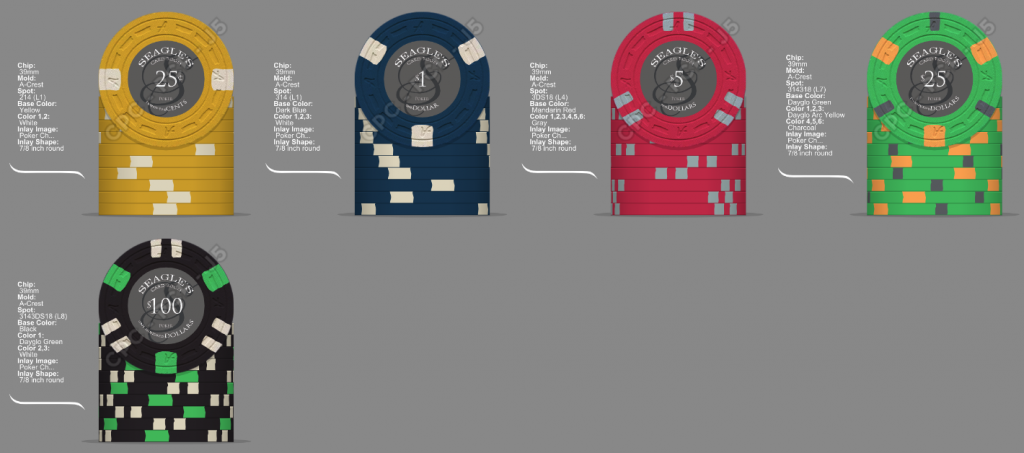
Set 1.png
 
Initial thoughts are I don't like the white spots on 3 of the chips. Throw in some pink and purple spots somewhere to brighten it up. Also, if you don't have a sample set, get one. CPC "yellow" is dark, I prefer canary or DG yellow.

Thanks, I'm going to grab the "rentable" sample set here pretty soon.
 
May want to look into changing the inserts on the frac and/or one so they are not both white. Maybe like DG Pink on the frac and DG Peach or DG Arc Yellow on the $1 could be decent off the top of my head. Likewise, your $25 and $100 both have DG Green; I do individually really dig both of these though.

Edit: Just saw you are getting samples, which for me, drastically changed my custom set colors once I got them in.
 
May want to look into changing the inserts on the frac and/or one so they are not both white. Maybe like DG Pink on the frac and DG Peach or DG Arc Yellow on the $1 could be decent off the top of my head. Likewise, your $25 and $100 both have DG Green; I do individually really dig both of these though.

Is the general rule that I don't want shared colors? I was thinking that some small overlap would help provide continuity.
 
Cool set!

I feel like the dg green base on the 25 looks out of place with the rest of the chips having weighted base colors. I think green or light green Would fit better. I agree that canary would be better on the quarter. Also, try a different spot color on either the 25¢ and $1. Maybe orange or maroon on the quarter, or pink or light blue on the $1?
 
DG Peacock, Retro Blue, and Light Blue are all good choices for a $1 or frac. But if you are using a black $100 don’t use retro blue, it is too dark.

also I’d recommend using 3ds316 instead of 3ds318 for the $5. It is only level 2 compared to level 4. That will save you about 50c/chip.
 
I like the start and the basis of what you have so far.

Definitely would look to mix it up in terms of the white spots and a different color for the $1. As mentioned, imperial blue or DG Peacock are fine alternatives. Maybe try a DG Peacock base with a DG pink edge spot for the $1?
 
Have you considered the frac with 318? all the other chips have 3 spots or multiples of 3.
Yeah, I was trying to follow some rule where lower denomination chips had less complex patterns. Maybe uniformity is better. That would, however, take these chips from L1 to L3.
 
So my first revisions eliminated all of the dayglo base chips. I actually like it more than I thought. If I went with the dayglo blue, I could also go back to the green as well. I've got both options here, along with a tri-moon for the fack. Honestly, the hardest part here is the spot color for the $1s. I don't care for the pink, and can't really use yellow. I'm interested to hear thoughts on the weighted vs dayglo base and spot colors for the $1s.

Set 3.png


Set 4.png
 
Would you consider an alternate color for the $100? Maroon, chocolate, charcoal?

For blue, look at the orange colors: orange, dg tiger, dg peach. Maybe light chocolate or butterscotch? Retro lavender & lavender could work, depending on the blue.
 
Last edited:
Do you have a chip price level in mind that you are trying to keep within? I see your edge-spot design are varying widely between levels which changes the cost significantly. Your 100 and 25 chip are fairly exotic in most designs lvl 3-4+

Here were some ideas I had when I made my set, with these rules in mind the design came easier because I had boundaries lol
- avoid repeating colours on the next denomination above and below
- Create a set of chips that are different and distinguishable with each edgespot while keeping to lvl 1 prices and my .25c chip is a solid which is also cheaper.

I see you wanted to be more exotic with your $25 and $100 chips... the edgespot pattern i put together below as an option example is all level 1 edgespots for your large volume chips with the $25 and $100 a small premium.

a62ef243-0304-466f-aab7-2fe4e8c6a1ea.png
 
Do you have a chip price level in mind that you are trying to keep within? I see your edge-spot design are varying widely between levels which changes the cost significantly. Your 100 and 25 chip are fairly exotic in most designs lvl 3-4+

Here were some ideas I had when I made my set, with these rules in mind the design came easier because I had boundaries lol
- avoid repeating colours on the next denomination above and below
- Create a set of chips that are different and distinguishable with each edgespot while keeping to lvl 1 prices and my .25c chip is a solid which is also cheaper.

I see you wanted to be more exotic with your $25 and $100 chips... the edgespot pattern i put together below as an option example is all level 1 edgespots for your large volume chips with the $25 and $100 a small premium.

View attachment 676454

Thanks and good thoughts. I want to stay under $1,500, and I'm there now. I'm only ordering 20 $100s so I was willing to get a more exotic. Maybe it's too much. I'll play with it.
 

Create an account or login to comment

You must be a member in order to leave a comment

Create account

Create an account and join our community. It's easy!

Log in

Already have an account? Log in here.

Back
Top Bottom