Color theory and edge spots (1 Viewer)

nlhenerd

Two Pair
Supporter
Joined
Jun 4, 2021
Messages
452
Reaction score
693
Location
Austin, TX
Heya Folks,

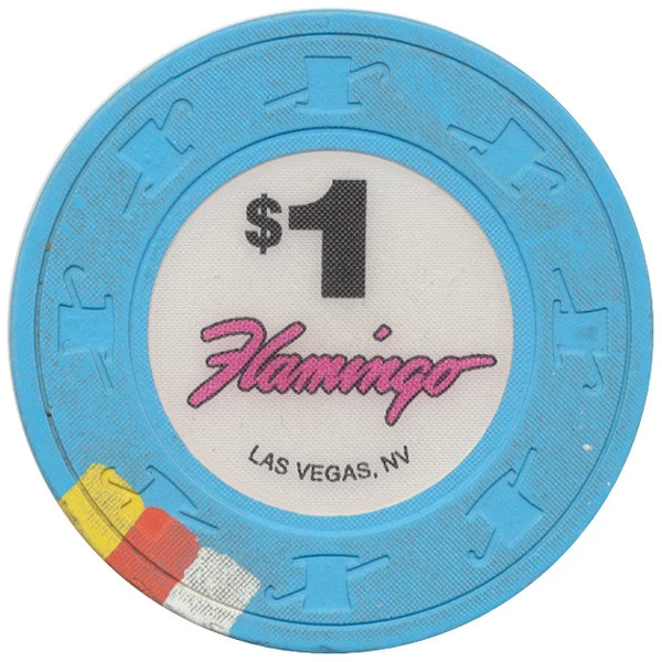
Do any poker chip designers think a lot about color theory? For example, in this Flamingo $1 chip, we see:
- light blue (logo color)
- yellow (complementary)
- orange (almost complementary to yellow, contrasts blue),
- white

1624731754806.png


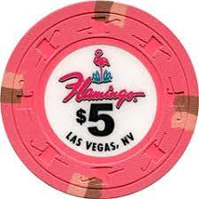
Then we've got this $5:
- pink (logo color)
- brown (almost complementary)
- another pink (same color, lower intensity?)
1624732153062.png


It looks like color decisions are all over the place. Does anyone consider color theory an important part of chip design? If so, how do you use it?
 
IMO, colors of base vs edgespot need to be complementary yet also good contrast. No point having edgespots that are hard to see.
 
I think in general people try to design their edge spot colors to contrast strongly with the color of the chip, so they'll often go with complementary colors for the chips and spots (check out this tool and the different colors that come up with complementary/triad/tetrad color groups: https://colorschemedesigner.com/csd-3.5/) and achieve contrast with brightness/saturation as well.

In your first example with the $1 chip with a base color of light blue, the warm colors (yellow/orange) pop with it because they're on the opposite side of the color spectrum. The orange is darker (a bit more saturated and less bright) so it contrasts well against the blue background and is immediately visible, and the yellow and white act as light accent colors to support/highlight the orange color and make the chips look more interesting. White and blue are traditional colors for $1 chips as well, which I think heavily factors into the color choices for these chips.

It looks like they opted for colors with less contrast in hue on the $5s, but the darker red/brown spots are still easily seen across a poker table because of contrast in brightness/saturation so the individual chips would still be distinguishable in a stack. In that case the pink is just supporting the darker edge spots and helping those stand out more by leading to a greater difference in brightness between the dark spots and the areas around them (almost like a reverse dropshadow). The red hue for the $5s is also a traditional choice that people have come to expect for that denomination.

It's also important to think about adjacent denominations (like $1s vs $5s vs $25s) to avoid color schemes that might lead to dirty stacks, so usually chips that appear next to each other in the progression avoid reusing any colors at all so that it's clearer which chips belong to which denomination. If the edge spots of my $25s for example are close to the background color of my $5s, it's possible that people could get the chips mixed up and think they're betting $5 when they're actually throwing in a $25 chip.

Chip colors are fascinating, and the more I get into them the more I think it's inevitable that I'll have to design my own custom set. :D Hope this helps! Cheers
 
Last edited:
I always thought Pharaohs were an interesting color example as they are an incredibly popular chip.

The pattern isn't totally consistent but they generally went with one adjacent spot color and one complementary spot color.

As an example green base, adjacent light green spot, complement pink spot.

I've noticed I typically like chips that follow this pattern.

It's not great every time but when you're trying to select colors it's an interesting path to take to try to generate some ideas.

1624742935777.png
 
I use the color wheel all the time when mocking up chips. I find its often the most helpful for getting good base/spot color combos. There are a bunch of different ways to use it (complementary, split complimentary, analaligous, etc),
depending on the theme/look/feel you're going for. It's one of the many tools at your disposal when designing a custom chip set.
 
I've never been wild about Pharaoh's mold or inlay.

But let's not bullshit each other. They hit the colors.

THEY HIT HARDER THAN MOST.
 
I think to answer your question, NO, most casinos dont care or give a thought to complimentary or contrasting colors in their chips.
 
I think to answer your question, NO, most casinos dont care or give a thought to complimentary or contrasting colors in their chips.

Most casinos probably don't, but I'm sure that actual hired designers do care. Whether anybody in the industry listens to them is another thing.
 
I’m in agreement with @JeepologyOffroad and wanted to elaborate. Color theory and other design rules are basic guidelines to help one reach aesthetically pleasing results. Meaning if you follow them you can reach an aesthetically pleasing outcome. HOWEVER, that does not mean that an aesthetically pleasing design must have followed those rules. And that is where people get confused. This also holds true for other arts and photography. It is just that in order to create an aesthetically pleasing result while breaking the rules you need an elevated sense of aesthetics, creativeness, and experience or some luck. I have never paid that much attention, but many of our favoirte chips don’t follow certain design rules. And I know for sure that many of the great or notable works of art broke the rules and took chances.

I know in designing my own sets I designed to my taste preferences with really the only other considerations being that I wouldn’t get dirty stacks (which I think is a concern often overcompensated for) and that they would be identifiable in low light.
 
I hadn't even considered the effect of edge spots on making it harder to detect dirty stacks. There's some super good info in this thread.

I do like the colors on the Pharaohs. I may have to emulate them a bit in my set. Top Hat and Cane (same colors as Atlantic Club for at least some denominations) also has a really nice edge spot scheme.

I think my big takeaways here are:
- Think about avoiding dirty stacks
- Consider edge spots that are a different saturation of the chip color combined with a bright complement or contrast color.
- Consider low light conditions
- Know the "rules" and maybe use them as a starting point, but also include some bluffs break some of the color theory design guidelines.
 
Know the "rules" and maybe use them as a starting point, but also include some bluffs break some of the color theory design guidelines.
This one, imo, can only really be done after experience and/or obsessing over it all
 
With design projects like this I like to avoid thinking in terms of "rules", and instead focus on the goals/requirements of the design.

People seem to get tripped up by the fact that the choice of edge spot colors and shapes involves a combination of aesthetic preferences ("art") and choices intended to support usability/utility ("design"), and seem to think that they should focus completely on one or the other. I think as long as you have a well defined list of functional requirements and approaches to meet those requirements (which I think you do) you can explore a range of aesthetic possibilities within those constraints. The reason my post was so focused on contrast is because at the end of the day, edge spots are meant to be seen, so edge spots need to stand out from the base chip color in one way or another, and that ultimately has to involve contrast in hue, saturation, or brightness (otherwise, they would not be visible at all).

I think the function of edge spots is generally to help players distinguish individual chips from a distance, determine quickly how much of each denomination they have, and add visual interest. As long as your choices support those goals, you basically can't go wrong.
 
You might look at color theory when thinking about labels and artwork. When it comes to the spots and the base colors, no, I don't think color theory is front and center. For casinos, it's a matter of the dealer or floor being able to look at the stacks and tell pretty quickly if something doesn't look right.

In your custom chip designs, you can certainly follow whatever design ideas make sense for you.
 
I think the function of edge spots is generally to help players distinguish individual chips from a distance, determine quickly how much of each denomination they have,

Yes, but primarily they are/were there so casino staff could recognize them, especially through CCTV eye in the sky (on a black and white CRT monitor, no less).
 
Yes, but primarily they are/were there so casino staff could recognize them, especially through CCTV eye in the sky (on a black and white CRT monitor, no less).
Good point, casinos' design requirements have evolved over time as technology has. It probably would've been more accurate if I had said that a function of edge spots is to allow people (not just players) to distinguish individual chips from a distance (and in low light conditions, and through low resolution displays).
 
Last edited:

Create an account or login to comment

You must be a member in order to leave a comment

Create account

Create an account and join our community. It's easy!

Log in

Already have an account? Log in here.

Back
Top Bottom