Casino Montreux tribute (1 Viewer)

200 Motels

Flush
Joined
Nov 5, 2014
Messages
2,213
Reaction score
1,863
Location
Canada - East-->
So I've scrapped the Flying Spaghetti Monster idea and decided to try a different concept.

Originally the FSM on the A mold made sense but I couldn't pull the trigger on a label that didn't have a brand with it and there were no brands I could think of that would not be preachy atheist stuff that didn't belong on a chip. So one of my heros if Frank Zappa. I was looking for something from his massive catalogue of work that I could use to brand my chips. Most of the names were either too silly or worse, had a color in the title (green hotel, purple lagoon, brown shoes, green rosetta). I learned eventually that having a color in the title makes sense if the word is that color, but it prevented visibility and also takes away from the actual color of the chip. (A green chip with the word "purple" on it).

So I was scouring the FZ forums, which I hadn't done in years. It got me listening to more and more Zappa concerts. I read that he had played in a venue that I new Pink Floyd and Zeppelin had played, called Casino Montreux. After reading up on this place I found out that it burned to the ground one night in the 70s during a Frank Zappa concert after someone brought a flair gun in. Then I read the the song Smoke on the Water was written about that exact incident which made me 'freak out'. I had realized what my new theme was.

One unfortunate thing though. It's still a functioning casino. However, it's actually called "Casino Barrière de Montreux" and their chips are in Euros and not dollars. They also use plastic and ceramic chips and not "American Style" clay. I'm hoping there won't be any copyright concerns.

Due to the theme change the mold (and price) will be changing too. FDL mold due to French being the most common language spoken in Switzerland. There are also a few Swiss municipalities that have the FDL in their arms crest.

Anyhow, without further a due, I present the Montreux Casino tribute set.
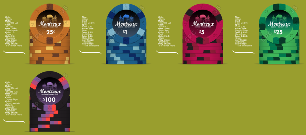
montrweb.png


1montrauxwtmk.jpg
 
Last edited:
So I've scrapped the Flying Spaghetti Monster idea

*blinks*

All those posts...but I get it. The whole Purple Lagoon thing was going to be tough to work around. Moving on...


Anyhow, without further a due, I present the Montreux Casino tribute set.
Great start!

A few bits of initial feedback for thought...
  • Currently the progression goes 4x, 6x, 3x, 4x, 3x. What about switching to 314 - 414 - 3d14 - 4d14 - 3ta316? Just keeps to every other spot being 3x or 4x.
  • I love the royal red as a base, but it will offer limited contrast with the red spot. Mandarin red would offer slightly more contrast.
  • Have you considered a maroon spot instead of black on the $5?
  • That hundo is pretty special. If you want a smooth progression from one side of the spots to the other, keep as is. If you're looking for each of the three colors to stand out, consider putting the orange spot in the middle.
  • Denoms look good, but *might* be able to be just one size bigger. Maybe. Maybe not.
I really like the overall look of the logo/brand, and the set as well. Good colors, appropriate spots/patterns for the theme. Nice work!
 
Love the new inlay design. Much better concept, IMO - especially if you ever have to sell them.

As far as the spot progression: 4, 6, 6 (grouped), 8, and 9. Works for me.

The $5 needs work color-wise. Seems like the reds are just too close, compared to the other chips' contrast, IMO.

LOVE the hundred. Ship it!

Really love this one overall. Great beginnings!
 
*blinks*

  • Currently the progression goes 4x, 6x, 3x, 4x, 3x. What about switching to 314 - 414 - 3d14 - 4d14 - 3ta316? Just keeps to every other spot being 3x or 4x.
The 614 $1 is my favorite other than the hundo. I'd really like to work around the $1 614. It would require the previous edge to be something less fancy as 614 and the higher denoms being even more fancy than 614.

  • I love the royal red as a base, but it will offer limited contrast with the red spot. Mandarin red would offer slightly more contrast
  • Have you considered a maroon spot instead of black on the $5?
Might go back to the pink and maroon edges on a retro red.

  • That hundo is pretty special. If you want a smooth progression from one side of the spots to the other, keep as is. If you're looking for each of the three colors to stand out, consider putting the orange spot in the middle.
I like the smooth progression. Putting the tiger in the center makes it look like a Nexgen Lucky Bee. :unsure:

  • Denoms look good, but *might* be able to be just one size bigger. Maybe. Maybe not.
I really like the overall look of the logo/brand, and the set as well. Good colors, appropriate spots/patterns for the theme. Nice work!

Good call. I'll give the above a shot and thanks for the great feedback.
 
Updated edges. Not sure if this progression makes any more sense.

314
614
4dsa316
8a14
3ta316

Updated colors for the $5 and $25. (ooo that $25)

Color matched the $1 $5 and $25 a bit more.

Increase the denom size to 36 from 30. (the $100 is 34 since it's an extra digit).

mont2.png
 
Last edited:
Nice design!!

Thanks.

You can probably tell that it is draws inspiration from The Boulevard set. When looking through all of the best designed chips, the linear gradient background inlay of The Boulevard seemed unique and felt I could make one of my own with out it being a rip off. Although the 1/4" edge spots and FDL mold are also in common, my mold choice works with the theme of the chip and only three of my chips have 1/4" edges...for now. :confused:

EDIT: I see that our quarter, dollar and $25($20) have the exact same edges. Not sure how I feel about that.

Here's the full rip off with 4/5 edges matching Boulevard. Looks nice. Too bad I didn't think of it first.

mont3.png
 
Last edited:
mont12.png


What I like about this version is the d14 chips (dollar and $25) are dark base with two lighter edges and the two 1/4" edged chips (quarter and fiver) are mid with a light and dark edge.
 
Last edited:
Just wanted to say that i like these much better than the other concept you were doing.

The latest mock-up looks great!
I prefer the darker green 25 from the previous mock-up. green with light green and white spots. Think I also like the spots on the 5 from the previous mock-up better, but the colors look great(y) :thumbsup:

My concern with the normal green is that it might look close to the blue in certain lighting but it might work with 8 lighter spots. Regarding the other edges 4DSQA316, I like them as well but they don't go with the rest of the edges. Not to say the $100 does...
 
My concern with the normal green is that it might look close to the blue in certain lighting but it might work with 8 lighter spots. Regarding the other edges 4DSQA316, I like them as well but they don't go with the rest of the edges. Not to say the $100 does...

I understand your reasoning. I guess you need to look on your color samples in different lighting and see how the different shades of green/blue works together. I wouldn't think this was a problem from looking at them on screen, but considering the spots are very similar and colors are fairly similar I see your point. I do not have the color samples so I'm not sure how the two compare irl.

About the fiver I dont see the problem mixing up the edge spots a bit, but this is probably only based on personal preference and degre/differences in OCD. I think the current fiver look a bit too 'simple' after that nice 6A16 1$. Maybe a 4D14 would be ok as a five(?) but I think I still prefer 4DSA316.
 
I like these colors. What about using the 3D14 on the quarter and 4D14 on the fiver. I think it makes a neat progression like the double spot splits into a single spot on the next chip.
I really like that progression as well, however, that is the exact progression of the Boulevard set. I may do it anyway but I'd like it to be unique.
 
I understand your reasoning. I guess you need to look on your color samples in different lighting and see how the different shades of green/blue works together. I wouldn't think this was a problem from looking at them on screen, but considering the spots are very similar and colors are fairly similar I see your point. I do not have the color samples so I'm not sure how the two compare irl.

Now that I compare them irl they're not that similar. I think I was still in Imperial Blue mindset which does look like Green, but normal Blue, not so much. I might work on the $25. Thanks. (y) :thumbsup:

About the fiver I dont see the problem mixing up the edge spots a bit, but this is probably only based on personal preference and degre/differences in OCD. I think the current fiver look a bit too 'simple' after that nice 6A16 1$. Maybe a 4D14 would be ok as a five(?) but I think I still prefer 4DSA316.

I think the broad stripes of wider edge spots make the nice flat FDL mold shine. Another thing with the 4DSA316 is I'd need (but not really) a 3DSA316 to go with it, and I am trained to see that edge spots as "the Sopranos" edge spot. I'm gonna stick with 1/4" edges. Unless of course I change the concept all around again and chose a different spot. It could happen. :sneaky:
 
mont18.png


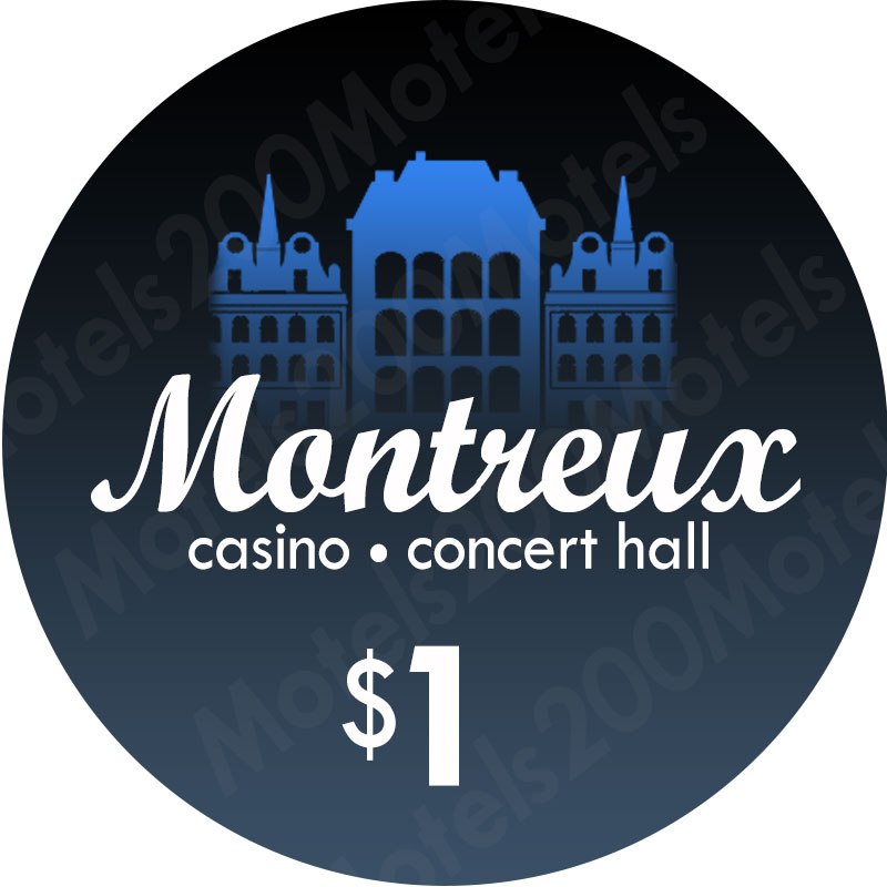
I recreated the ends of the buildings on the label. I also made the hotel on the dollar match Light Blue. The $25 edges to green base with dg edges. Allso check out the hundo label. I'm digging that or a purple hotel on the hundo label.

I think the gradient fade is like, totally ;) the smoke on the water. Maybe the dark part of the fade should start from the bottom to be smoke, and the lighter part to be 'fire in the sky'. :0 Woah. But that would not look as nice. Maybe it's a reflection from the water... maan... and so it's like... upside down.
 
Last edited:

Create an account or login to comment

You must be a member in order to leave a comment

Create account

Create an account and join our community. It's easy!

Log in

Already have an account? Log in here.

Back
Top Bottom