Monroe St. Card Room - First Design (1 Viewer)

HobokenNJ

Two Pair
Joined
Feb 6, 2019
Messages
299
Reaction score
524
Location
Hoboken
I'm not much of a designer, but I really liked the look of the Stardust Mansion chips. With that color scheme in the back of my mind, I downloaded inkscape and started playing around.

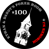
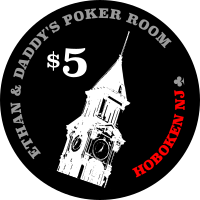
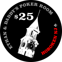
This is what I ended up with. The building is the tower at Hoboken Terminal in the great state of New Jersey.

I was thinking of maybe acquiring a small quantity of THC solids (white; red; green; black) as cheaply as possible to build a small cash set for me and my son. Even well worn chips would make my son's day with labels with his name of it.

Do you think what I've done will translate well to labels? Ideas for improvement? (As as aside, I'm not sure I would've believed you if you told me when I signed up for PCF, that one day I'd be up until almost midnight working on designing labels. Thank you?)

chip_1.png
chip_5.png
chip_25.png
chip_100.png
 
Is there a reason for the tilted tower? Kinda throwing me off. How about centering it slightly to the left, straight up and down, and put your denom toward the bottom right. Then have the text center wrapped, top and bottom.

Also, is there a way to reduce the grey text without compromising meaning? It outweights the red text a big much.

Just thoughts. Can’t wait to see the final outcome. Best to you and your son!
 
A photograph in negative is a very particular look. Make sure you want that.

The tilt is going to tilt people as already mentioned.

Personally, I would skip the red text. Limiting yourself to black/white makes color clashes between label and chips much less likely.
 
My son wanted a backside of the chips with the denomination. I also wonder if I should talk him into something more generic.... (I think I may be unsuccessful.)

Here's where things currently stand:

chip_1-front.png
chip_5-back.png
chip_25-front.png
chip_100-back.png
 
I’m not a huge fan of the Ethan and Daddy’s name. Ya, you son might be tickled with them for a few months, but will likely grow out of the Calling you daddy phase. Heck, I’d rather see them called Ethan’s room.. but that's just my opinion. These are your chips, so do what you like.

The reason to go with Paulsons is they somewhat hold their value. Personalizing them reduces that value, unless thendesign has universal appeal,

Cool design otherwise, but you might find the text being so small is harder to read. Eliminating “daddy” might allow for a bigger font?
 
Looking promising! I for one love seeing custom Paulsons. Great that you're working on these together.

How about removing the denom from the tower side altogether? I'm with Ethan on the large denom - maybe consider trying a red denom, while removing the thinner ring and aligning the text.
 
I’m not a huge fan of the Ethan and Daddy’s name. Ya, you son might be tickled with them for a few months, but will likely grow out of the Calling you daddy phase.

Yes -- I agree; I think I've talked him out of the original. Probably should've not shown him that version in the first place.
 
Did you have a blank template to use in inkscape?

I just started with a drawing a black circle.

EDIT:

1. Learning how to use layers really made things easier for me.
2. The "distribute & align" feature was also helpful.
3. As is the case with (what seems like) almost everything, there's a ton of videos out there on inkscape.
 
Last edited:
Here's an updated draft.

front_1.png
front_5.png
front25.png
front_100.png

back_1.png
back_5.png
back_25.png
back_100.png


Continuing my exploration with different colors:

front_1--dayblue.png
front_1--offwhite.png

front_5-orange.png
front5-red.png

front_25_daygreen.png


front_100-showboat.png
front_100-darkblue.png
 
Last edited:
Solid work so far with the updates and being willing to make changes.

Have you tried lowering the tower all the way to the edge so that there is no empty space underneath it? For some reason, I see a floating building upon first glance.
 
Grey text on black background might be a recipe for disaster. My advice would be to try to outline the letters in white or other bright colour to bring in more contrast. Otherwise it might be unreadable. It might look okay on a crisp mock-up on an HD monitor, but remember that the real inlay is less than 1" diameter.
 
If you haven't already, print them in real size and hold them at arm's length to see if you need to adjust sizing.
The denom’s on the backside should all be the same size in my opinion
Grey text on black background might be a recipe for disaster. My advice would be to try to outline the letters in white or other bright colour to bring in more contrast. Otherwise it might be unreadable.

Thank you for all the feedback. Unfortunately, my day job was in the way of further work on the design, but I do plan to play around with fonts and coloring to increase legibility in the near future.

I really appreciate the comments. PCF is almost certainly the friendliest / most-helpful forum I've been a member of.
 
Starting to narrow down color choices. I think I prefer the light blue for the $1. I'm having trouble with the green. Initially I was thinking v2, but v1 is starting to grow on me.

selection-1.png

selection-2.png

selection-3.png

selection-4.png


EDIT: V1 was selected.
 
Last edited:
Playing around with fonts and sizing and colors. Still needs tweaking, but wanted to see how these print.


front-1.png
front-5.png
front-25.png
front-100.png

back-1.png
back-5.png
back-25.png
back-100.png
 

Create an account or login to comment

You must be a member in order to leave a comment

Create account

Create an account and join our community. It's easy!

Log in

Already have an account? Log in here.

Back
Top Bottom