Cash game chip design, Miami Beach/Vintage Porsche (newbie) (2 Viewers)

bodaabod

Waiting List
Joined
Sep 26, 2017
Messages
9
Reaction score
6
Location
Miami
Hello all, i'm new to posting but not too new to the site. I've been watching with interest other's inlays and chip designs as i've been wanting to get into myself. I've been able to put a little more time into lately, and have come up with the inlay (with help) and chip design seen below.

I do have a color sample set, which has helped me in selecting colors that I would not have otherwise chosen b/c of the difference in look on a computer versus real life.

I'm working on different designs but thought to get the first one out there for some feedback.

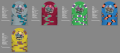
Basically, i have a cash game where i live in south beach, miami fl. Also, I enjoy vintage porsches, and thus thought to combine the concepts. Chip base colors were determined, 1) by what the poker group has become most familiar with, and 2) colors of old 911s that either friends own, i own, or i admire.

Denominations, again, work with what the group is used to and use, with room to grow.

As far as edge spots are concerned, i've just tinkered with what i thought blended well with the graphic and/or could provide some pop, going between what is below and the 3V12.

I truly like the B-diamond molds but recognize that it limits me to a 7/8" inlay (i'm not a fan of the bleed-over with the 1 1/16" but haven't seen many examples), which reduces the detail of the inlay.

So, with all that said, i'd appreciate input from the community. Again, I'm playing with the inlays and will be developing more in the future, but this is essentially the final product for my first iteration (I do have a daytime scene, but the night time is more dramatic).

Thank you in advance!
 

Attachments

  • MBPC1.png
    MBPC1.png
    341.2 KB · Views: 361
Your text appears to be too close to the edge... have you downloaded the artwork template near the bottom of the chip design tool? Have a look at that first as it contains the rules for inlay artwork.
 
Thank you...yes, i recently came across that file and will be working to adjust the edges if necessary.
 
Really like what you've got goin' on here - love the static edge spots combined with the, "Fuck it...my house, my base colors" attitude, and you've used plenty of bright colors to help match the Miami feel.

I'll briefly echo what other's have said already re: inlay size and detail. Obv. the design needs brought in some, but at 7/8" you will lose some detail on the image. I'm not a fan of 1 1/16" here, either. What about 1"? Not sure if that would bleed into the mold or not.

Re: the denoms. One, they're small and awkward/different - that could lead to questions from folks who are new to your game. As much as I love the artistic aspect of these, always keep in mind thaty they need to be functional. Easily discernable denoms are a part of that. It's okay to claim artistic license and stick with the design you have as long as you've acknowledged that potential issue and are okay with it, but at least see if there might be a happy medium. Maybe the circles can be stretched to ovals? Maybe the text can be made bigger? IDK...I'm not a graphic designer. And two, the white text on the hundo probably needs switched to a different color to contrast better against the yellow background.

I like the general direction as laid out. The frac is okay as is, but could stand to benefit from a little more pop on the interior spot color. I've used DG Peacock here, but any other DG color would probably also work. This *might* be a good spot for DG Saturn. The $1 is what objectively needs a tweak the most, as the exterior spot color simply doesn't contrast enough with the Red base. I've updated to DG Pink here. The $5 and $20 are great as is...left them alone. The hundo...DG Saturn...it might be me, but I always find this color extremely tricky to work with. I've switched it to a DG Yellow for the base and modified the spots to obtain a similar feel. You could go black or chocolate with the interior spot, but I've left it at maroon for now which seems to be a nice middle ground. Currently the exterior spot color is pink, but keep in mind that the lighter you go with the interior, the more a change to a different exterior spot color starts to become necessary. If you bump the interior color to Chocolate then I think DG Pink is the better match on the exterior, but it's also used as an exterior color against the Red base on the $1 and I'm trying to avoid using the same colors in the same positions (and the Red *needs* the DG Pink more than the yellow does).

porche beach.png
 
Great feedback already, thanks so much. Both you and Linkybabe are absolutely right, I need to be sure the size is appropriate. Unfortunately it is not recommended to do the 1" on the B-diamond mold. With regards to the denoms, perhaps making the "dollar" and "cent" symbols smaller, allowing for the denom numbers to be larger. Should definitely make a difference on 50c through $20, but the $100 still may be a bit tough...i'll play around with it. And really appreciate the color suggestions...you're right in that the dayglo saturn is tough...its almost a green yellow. I have a sample set from Key West and the $20 base color is the DS, and looks pretty cool, but on its own, its tough. Thought to go out on a limb here a bit with it....really would like a good "gold" but none of the shades of yellow are quite right so wanted to go with different. With that said, i do like the combo you put together. Much appreciated.
 
Unfortunately it is not recommended to do the 1" on the B-diamond mold
Pretty much any size inlay can be done on any of the molds, including a 1" on the B. The reason they say it's "not recommended" is because on some chips the inlay placement may drift into the mold recessions. Some people are cool with that, others aren't. It's a decision you'll have to make for yourself.

If I'm not mistaken, the Burning Benjamin's set by @Jambine used 1" inlays on the B mold. You can see how they look here: https://www.pokerchipforum.com/threads/burning-benjamins.12660/#post-203151
 
Very nice starting point on this design. Porsche/VW fan here myself. Denoms looks pretty cool and I'm thinking they would actually be sufficiently legible for my needs.

Can't help but imagine how awesome it would be if each chip design had a unique vehicle image, perhaps models of increasing desirability (say, from a 914 on the 50c up thru a pre-A 356 on the $100), or maybe photos of each of the actual cars you're drawing inspiration from. The repeated pic with different colors sort of makes me feel like I'm clicking a selection on Amazon and watching the color of a t-shirt switch around. :LOL: :laugh:

That really is a great idea...probably for a strictly porsche themed set that would be the way to go. here though, i'm paying homage to friends cars, and my own (if you look closely, the $1 is a targa...this is my car, which is a burgundy '71 targa...the rest are coupes).
 
Really like what you've got goin' on here - love the static edge spots combined with the, "Fuck it...my house, my base colors" attitude, and you've used plenty of bright colors to help match the Miami feel.

I'll briefly echo what other's have said already re: inlay size and detail. Obv. the design needs brought in some, but at 7/8" you will lose some detail on the image. I'm not a fan of 1 1/16" here, either. What about 1"? Not sure if that would bleed into the mold or not.

Re: the denoms. One, they're small and awkward/different - that could lead to questions from folks who are new to your game. As much as I love the artistic aspect of these, always keep in mind thaty they need to be functional. Easily discernable denoms are a part of that. It's okay to claim artistic license and stick with the design you have as long as you've acknowledged that potential issue and are okay with it, but at least see if there might be a happy medium. Maybe the circles can be stretched to ovals? Maybe the text can be made bigger? IDK...I'm not a graphic designer. And two, the white text on the hundo probably needs switched to a different color to contrast better against the yellow background.

I like the general direction as laid out. The frac is okay as is, but could stand to benefit from a little more pop on the interior spot color. I've used DG Peacock here, but any other DG color would probably also work. This *might* be a good spot for DG Saturn. The $1 is what objectively needs a tweak the most, as the exterior spot color simply doesn't contrast enough with the Red base. I've updated to DG Pink here. The $5 and $20 are great as is...left them alone. The hundo...DG Saturn...it might be me, but I always find this color extremely tricky to work with. I've switched it to a DG Yellow for the base and modified the spots to obtain a similar feel. You could go black or chocolate with the interior spot, but I've left it at maroon for now which seems to be a nice middle ground. Currently the exterior spot color is pink, but keep in mind that the lighter you go with the interior, the more a change to a different exterior spot color starts to become necessary. If you bump the interior color to Chocolate then I think DG Pink is the better match on the exterior, but it's also used as an exterior color against the Red base on the $1 and I'm trying to avoid using the same colors in the same positions (and the Red *needs* the DG Pink more than the yellow does).

View attachment 155222

If you were to vary the edge spots, how would you do it? I tend to like the clean look as it is, but also dont have the creativity to mix up the edge spots...
 
how would you do it?
For this set, as posted, I wouldn’t.

In general, though, that’s a question you would really have to answer for yourself. You have to consider personal preferences, theme, how the chips will be used, what the budget allows for, etc. I’ve done sets with spot progression and static spots. I haven’t done one with random spots because I don’t think they flow as well/look as nice, and the spots I would go for wouldnt be in my budget.

So yeah, if you want different spot patterns you’ll need to ask yourself some questions and proceed accordingly. I think your current static spot pattern works quite well, though, and doesn’t need changing.
 
...The hundo...DG Saturn...it might be me, but I always find this color extremely tricky to work with. I've switched it to a DG Yellow for the base and modified the spots to obtain a similar feel. You could go black or chocolate with the interior spot, but I've left it at maroon for now which seems to be a nice middle ground. Currently the exterior spot color is pink, but keep in mind that the lighter you go with the interior, the more a change to a different exterior spot color starts to become necessary. If you bump the interior color to Chocolate then I think DG Pink is the better match on the exterior, but it's also used as an exterior color against the Red base on the $1 and I'm trying to avoid using the same colors in the same positions (and the Red *needs* the DG Pink more than the yellow does).

View attachment 155222

Thoughts on the hundo? The DG yellow can be a bit washed-out, so here i used the yellow, which actually approximates gold best, though it has more brown in it than i'd like. The light blue interior spot blends, i think, with the blue on the inlay, and gets accented by the DG Tiger.

Your other suggestions have been incorporated into the 50c and $1, but i've yet to adjust the inlay.
MBPC2.png
 
Thoughts on the hundo?
I like it. You're correct that CPC Yellow is closer to a golden yellow, and about as close as you're going to get in their offerings.

The chip as a whole works. What I'd point out is that you have shades of both blue and orange on two consecutive chips; and the yellow chip as listed would yield two chips with blue interior spots as well.

These aren't necessarily set-killers. I think the shades are different enough betwen the 20 and 100 that they work okay as is. Just things that should be considered.
 
Or could do canary base for the hundo?
Canary fights the more brightly-toned Miami theme better. Yellow more closesly matches your desire to go with a gold 100. Both can work. Just gotta make a choice. I personally would lean toward the canary & theme consistency.
 
Canary fights the more brightly-toned Miami theme better. Yellow more closesly matches your desire to go with a gold 100. Both can work. Just gotta make a choice. I personally would lean toward the canary & theme consistency.

Agreed...thanks!
 
Nobody owns a black Porsche?

Yeah, black, silver, white, red...but wanting to highlight some of the more unique colors that friends have, which also coincide with chosen chip base colors. I am working also on a day-themed set that may have more of the standard colors though.
 

Create an account or login to comment

You must be a member in order to leave a comment

Create account

Create an account and join our community. It's easy!

Log in

Already have an account? Log in here.

Back
Top Bottom