Bourbon Basement Poker (4 Viewers)

detroitdad

Royal Flush
Joined
Nov 6, 2014
Messages
32,867
Reaction score
60,572
Location
Michigan
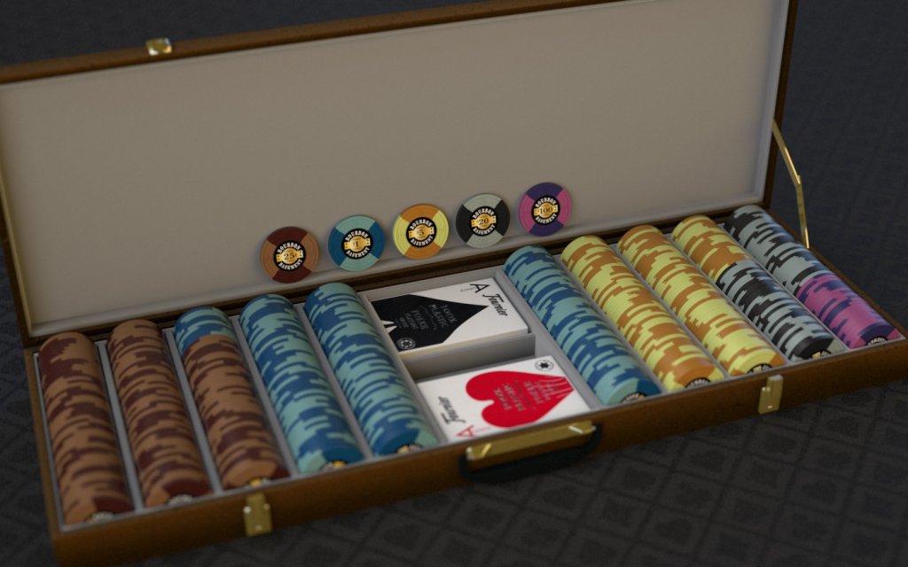
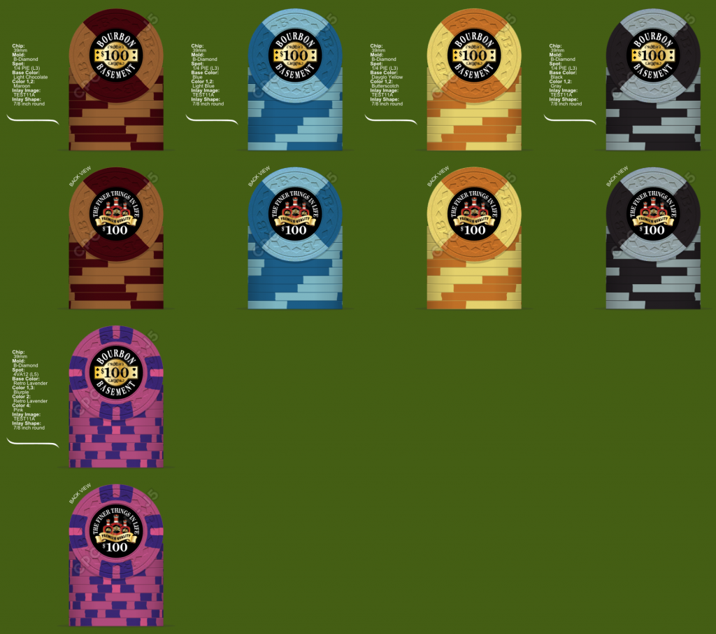
Ever since I saw @Psypher1000 quarter pie set I knew someday I would have to own one for myself. His sample set didn't cut it for me. Then @ChaosRock introduced me to the fantastic B mold Bubbles set. Now I knew what edge spots and what mold they would be on. We play poker in my basement. Paulo has turned me into a huge bourbon fan. It seemed like a good marriage to me.

I reached out to David Spragg a few weeks ago to casually inquire when the next round for the B mold would be. He says in the next 3-6 weeks. DAMN............

My next email was to @p5woody . Wow. I can't say enough good things about him. His work is fantastic. His replies/communication couldn't be any faster. An over all great guy to work with.

After I contact woody. I then spent the better part of the last week and a half mocking up quarter pie colors. I thought, who better to recruit than Scott and Paulo. They were both very generous with their time. I was constantly blowing up their inbox. Thanks guys.

Last but not least a thanks has to go out to @Ray-Col for his fantastic mock ups. A few more will be coming when he has time.

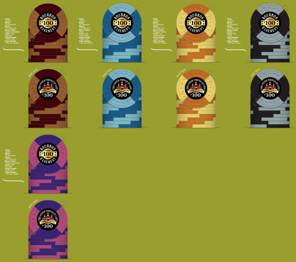
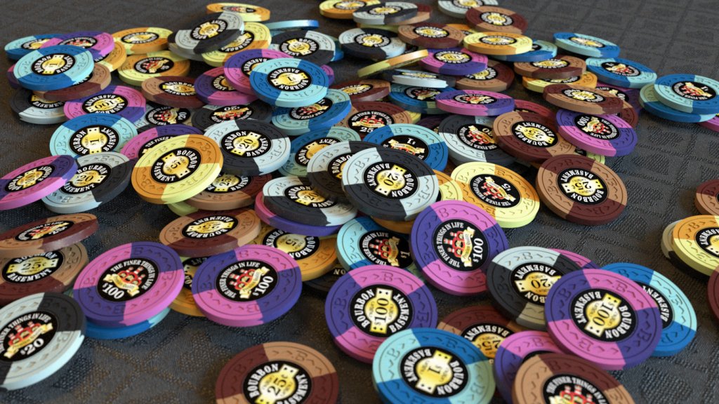
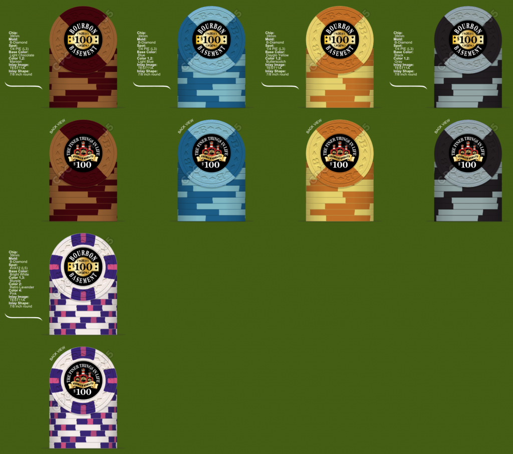
The colors are locked in. As of now I'm leaning towards the quarter pie for the 100 chip. The other two are options as well with a close second going to the level 5 lavender/blurple chip.
14DC56A97E-82E3-407D-960D-A0FFF45046EC.png
155585F4BE-9D10-4C40-9894-B553CF9BE48A.png
case_001.jpg
MONEY54D1606E-0BC3-4C33-800A-28761C4D0CCD.png
splash_001.jpg
stacks_001.jpg
 
Might as well use this thread to gauge for samples. Only want to know who is interested. I'm guessing it will be in the 15-16 shipped price range (to the US). I will ship over seas.

@MikesDad
@krafticus
@Sparty
@p5woody ***
@EGLIDE73
@Ghoti
@pokerplayingpisces
@phaze12
@chipjoker
@Psypher1000 ***
@Ronoh ***
@Ray-Col
@Blaster
@CraigT78
@Forty4
@Payback
@Poker Zombie
@Jeff
@Jambine
@Forest@Farmington
@ceramicmike
@K1100lt
@Trihonda
@arch3r
@Rhodeman77 trade***
@Lars
@ThinkingFold
@pedrofisk
@RowdyRawhide
@Steve5k

H/Q for some reason I can't tag HQ.
 
Last edited:
In for a sample set whatever you decided. My vote is keep the quarter pies throughout.

the 100's rarely see the felt at my table. When they do it feels like it should be bigger than any other chip out there. Saying that. I do prefer all quarter pies through out.

I spent hours messing with the quarter chip. Trying to force a solid or a half pie design to kick things off. They all failed in comparison to the choc/light choc quarter.
 
^^ I agree, can't have a quarter pie set if you change the big chip to another pattern!

Also how in the world did you get a set done before me? :p
 
I don't normally collect samples, but these are going to be pretty awesome. All quarter-pie is the correct move. Anything else looks like a chip was stolen from a different set. Besides, it's bourbon. There's not pop and sparkle in bourbon, it's all about subtleties.

I'm not sold on the 3 bottle reverse-side inlay. The bottles will be so small they will be nearly unreadable. The ribbon text is so small, I had to move closer to my monitor to read it, and I have a 52" monitor (and old eyes, so there's that).

Still, count me in for a sample set!
 
^^ I agree, can't have a quarter pie set if you change the big chip to another pattern!

Also how in the world did you get a set done before me? :p

lol. I have had the idea for a long time. I've been "dating" the chip design tool for the better part of the last six months trying to come up with different quarter pie colors. Once I settled on this theme and design everything else fell into place.

There could still be some minor tweaks I guess, but overall I'm really happy with what @p5woody has done with this.
 
the 100's rarely see the felt at my table. When they do it feels like it should be bigger than any other chip out there. Saying that. I do prefer all quarter pies through out.

I spent hours messing with the quarter chip. Trying to force a solid or a half pie design to kick things off. They all failed in comparison to the choc/light choc quarter.

100% QP. However, I may consider using charcoal/black instead of grey. The light blue on the 1 and the grey on the 100 look really similar in a mixed pot..especially with QPs
 
100% QP. However, I may consider using charcoal/black instead of grey. The light blue on the 1 and the grey on the 100 look really similar in a mixed pot..especially with QPs

I guess Im looking at your $20 chip, but still think my point is valid
 
Might as well use this thread to gauge for samples. Only want to know who is interested. I'm guessing it will be in the 15-16 shipped price range (to the US). I will ship over seas.

@Psypher1000
@Ronoh
@Ray-Col
@Blaster
@CraigT78
@Forty4
@Payback
@Poker Zombie
@Jeff
No
Might as well use this thread to gauge for samples. Only want to know who is interested. I'm guessing it will be in the 15-16 shipped price range (to the US). I will ship over seas.

@Psypher1000
@Ronoh
@Ray-Col
@Blaster
@CraigT78
@Forty4
@Payback
@Poker Zombie
@Jeff
bill u dog! U got me! Luvem all! I'm in!
 
I guess Im looking at your $20 chip, but still think my point is valid
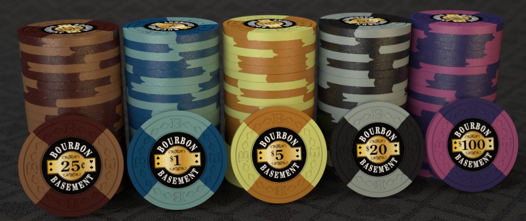
Also could there be issues between the quarter and the five? Like Paulo says it is all about contrast with CPC. Light blue and grey are very similar, and the light browns, butterscotches and yellows concern me. I could be wrong but Paulo is the man to talk to about this.
 
Also could there be issues between the quarter and the five? Like Paulo says it is all about contrast with CPC. Light blue and grey are very similar, and the light browns, butterscotches and yellows concern me. I could be wrong but Paulo is the man to talk to about this.


I have talked to Paulo. I believe it's good to go
 
Light blue and grey are very similar
Yussir - that was agreed upon by the three of us. What saves it is the starkness of the black. As long as there's a modicum of light - and you'd think there'd have to be in order to see the cards well - that black really helps to differentiate the chips. Note that we're only really concerned about the profile view - on their faces, the blue reads slightly lighter when paired w/light blue, and the light blue reads slightly "bluer" when paired with blue so differentiating the faces between the blue and the grey/black becomes pretty easy.

Imperial blue was suggested as a possible alternative to regular blue, but Bill decided he liked the regular blue as is, and I can't say that I blame him. DG Peacock also pairs well with light blue, but it also un-mutes the palette right in the middle of the workhorse lineup and I think he was trying to stay a little muted/more earthy for the whiskey/bourbon theme. Bill would have to have the final comment on that, though.

the light browns, butterscotches and yellows concern me
With these, the DG Yellow really makes the fiver sufficiently stand out. You're not wrong that a lot of their yellow/brown palette is similar, but when playing w/the samples & looking at the renders, I don't know that any of us registered any cause for concern here, save for not wanting them to be adjacent to one another in the denom progression.
 

Create an account or login to comment

You must be a member in order to leave a comment

Create account

Create an account and join our community. It's easy!

Log in

Already have an account? Log in here.

Back
Top Bottom