You are using an out of date browser. It may not display this or other websites correctly.
You should upgrade or use an alternative browser.
You should upgrade or use an alternative browser.
Best Fully Custom Chipset of 2021: Final, The Poker Lab vs. Casa Mango (1 Viewer)
- Thread starter JMC9389
- Start date
Eloe2000
Straight Flush
Good luck to you to David! Love your set design and theme so much!


Last edited:
Thanks … your set is awesome!Good luck to you to David! Love your set design and theme so much!View attachment 1010518View attachment 1010519View attachment 1010521View attachment 1010522View attachment 1010523View attachment 1010524View attachment 1010525View attachment 1010526View attachment 1010527View attachment 1010528View attachment 1010529
Eloe2000
Straight Flush
25¢:
Inspired by the electric pink sunsets that we can get at anytime of year that bath the city in pink. My daughters love to run and jump around outside in the yard when the sky lights up like this.
DG Pink with Lavender, Blurple


$1:
I have always been a fan of water and fishing. My wife (then GF) and I came down to Miami for a week to find a condo and over the course of that week I was able to offshore fish the gulf stream, learned to spearfish, tried kite boarding, swam with wild dolphins and manatees, and caught lobster. The amazing deep blue and turquoise water and coral reefs within the view of downtown Miami has been a major draw for us and will remain the most memorable feature of Miami if and when we leave.
DG Peacock Blue with Bright White, Light
Green


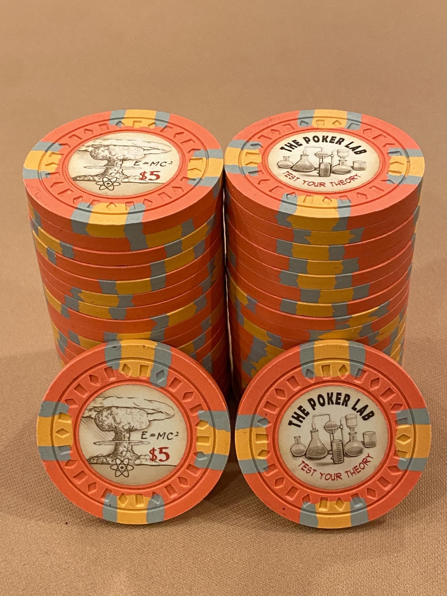
$5:
The mango fiver. The inspiration for the entire set. I don’t really need to say more. They are gorgeous with their yellow/orange/red ombre and delicious and used to earn you five bucks at our game under the mango tree at Casa Mango.
DG Arc Yellow with DG Yellow, DG Tiger, Retro Red


$20:
I love the tropical greenery and colors of the outdoors here. Bougainvillea are a great representation of that year round greenery and tropical color. My wife and I had bougainvillea plants at our wedding that we subsequently planted around Casa Mango and they now grow on the house and around the property.
DG Green with DG Prink, Retro Lavender, Green


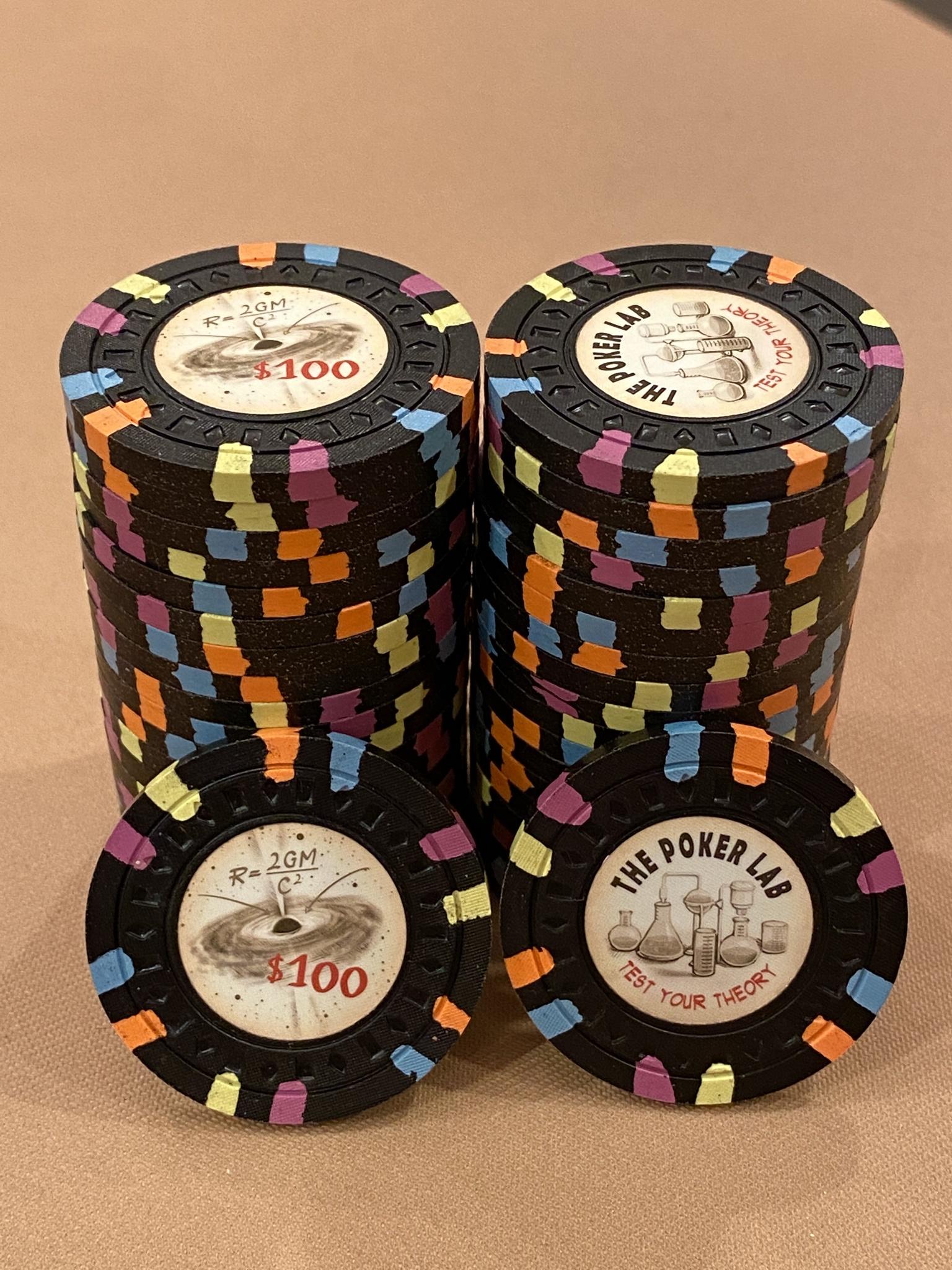
$100:
The city of Miami at night from the water is full of gorgeous color while remaining calm and peaceful. Also a great time and place for tarpon fishing.
Black with DG Peach, Imperial Blue, DG Yellow


NCV (Seating/Show Em):
Just something nautical and fun. And also the chance for me to use a quarter pie.
Bright White with DG Tiger


Inspired by the electric pink sunsets that we can get at anytime of year that bath the city in pink. My daughters love to run and jump around outside in the yard when the sky lights up like this.
DG Pink with Lavender, Blurple
$1:
I have always been a fan of water and fishing. My wife (then GF) and I came down to Miami for a week to find a condo and over the course of that week I was able to offshore fish the gulf stream, learned to spearfish, tried kite boarding, swam with wild dolphins and manatees, and caught lobster. The amazing deep blue and turquoise water and coral reefs within the view of downtown Miami has been a major draw for us and will remain the most memorable feature of Miami if and when we leave.
DG Peacock Blue with Bright White, Light
Green
$5:
The mango fiver. The inspiration for the entire set. I don’t really need to say more. They are gorgeous with their yellow/orange/red ombre and delicious and used to earn you five bucks at our game under the mango tree at Casa Mango.
DG Arc Yellow with DG Yellow, DG Tiger, Retro Red
$20:
I love the tropical greenery and colors of the outdoors here. Bougainvillea are a great representation of that year round greenery and tropical color. My wife and I had bougainvillea plants at our wedding that we subsequently planted around Casa Mango and they now grow on the house and around the property.
DG Green with DG Prink, Retro Lavender, Green
$100:
The city of Miami at night from the water is full of gorgeous color while remaining calm and peaceful. Also a great time and place for tarpon fishing.
Black with DG Peach, Imperial Blue, DG Yellow
NCV (Seating/Show Em):
Just something nautical and fun. And also the chance for me to use a quarter pie.
Bright White with DG Tiger
Two amazing sets!!! Good luck to both!
Thirded!Seconded
These 2 sets are literally a toss up. Love them both.
And thanks for putting this together.
And thanks for putting this together.
Two awesome sets, anybody have sample sets of both that can take pictures in the same lighting side by side?
detroitdad
Royal Flush
Eloe2000
Straight Flush
WedgeRock
Royal Flush
Is Casa Mango an outdoor set only?
WedgeRock
Royal Flush
I also voted for @Hornet, but it was a close call. Both sets are thoughtful, and both have killer colors.This is a tough one. I voted for both of these sets until this point. I voted @Hornet set. I love the artwork, and I love the uniqueness of his set. This does not take away from the casa mango set!
The inspiration photos for Casa Mango are awesome, and the logo is clean, if not familiar. The size of the set is impressive, and the composition of the photos is top notch. I would have never picked the $1 colors, but with the inspiration photos, they look great; I love that chip. The $5 is also an amazing chip. Even the $20, it didn't wow me at first, but it's an amazing chip when paired with the bougainvillea plants. Top to bottom, I love this set for it's personal meaning to @Eloe2000. The colors, particularly frac-to-five, interact so well in a pot.
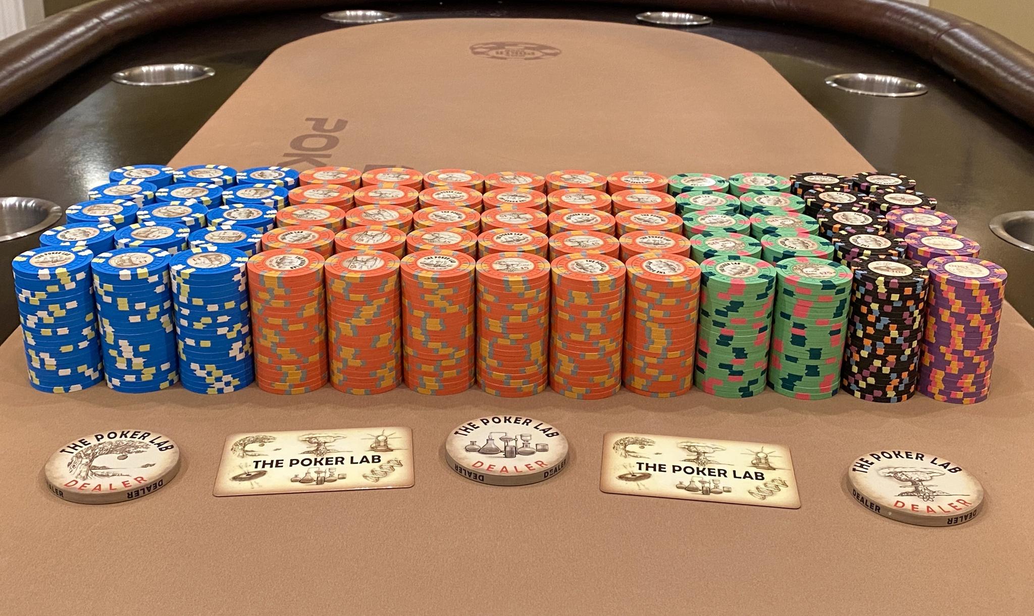
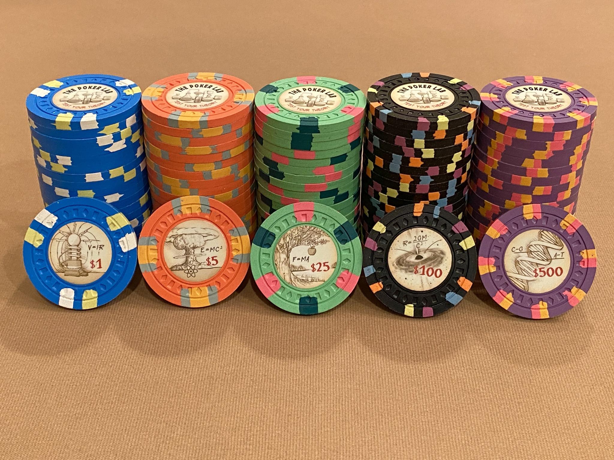
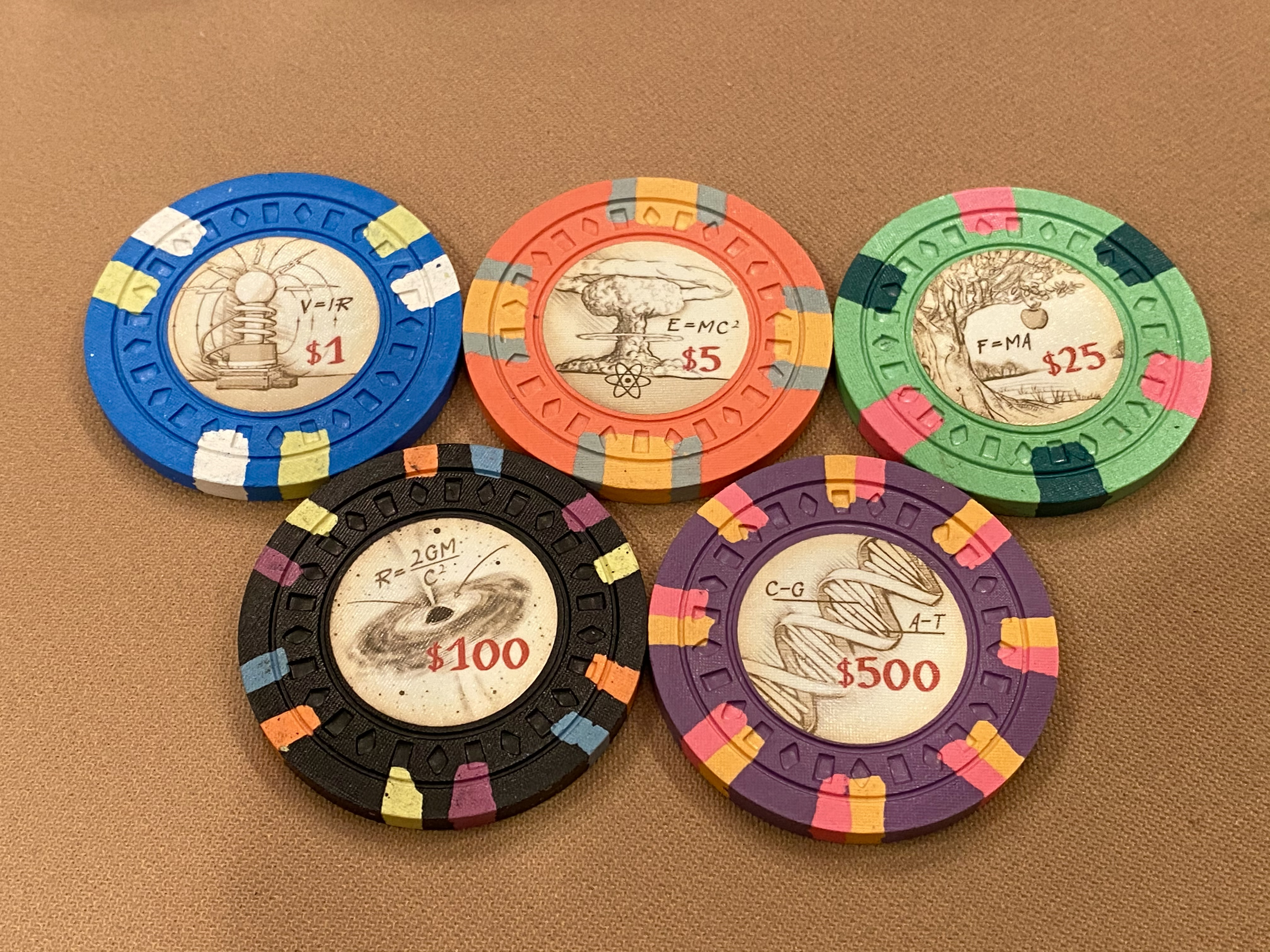
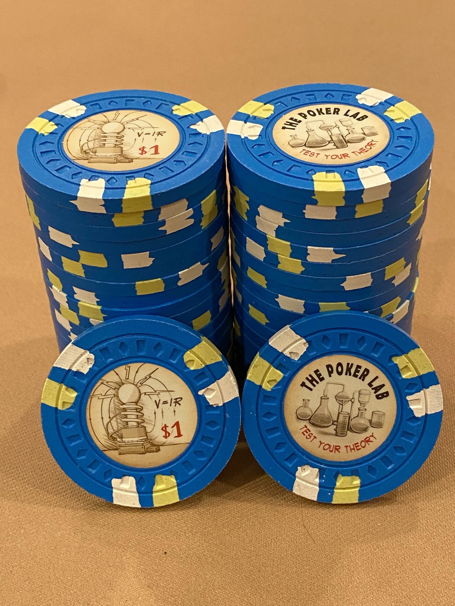
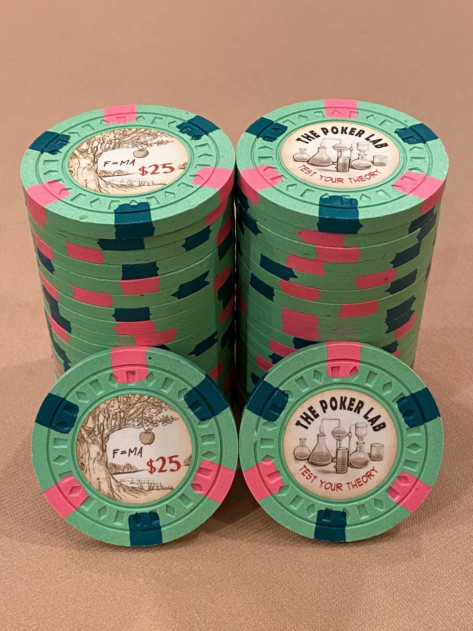
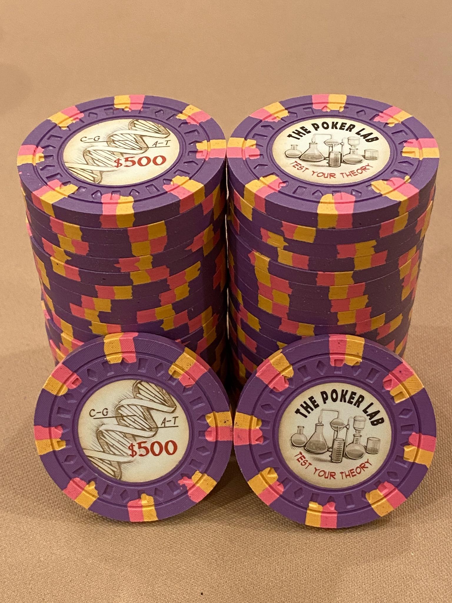
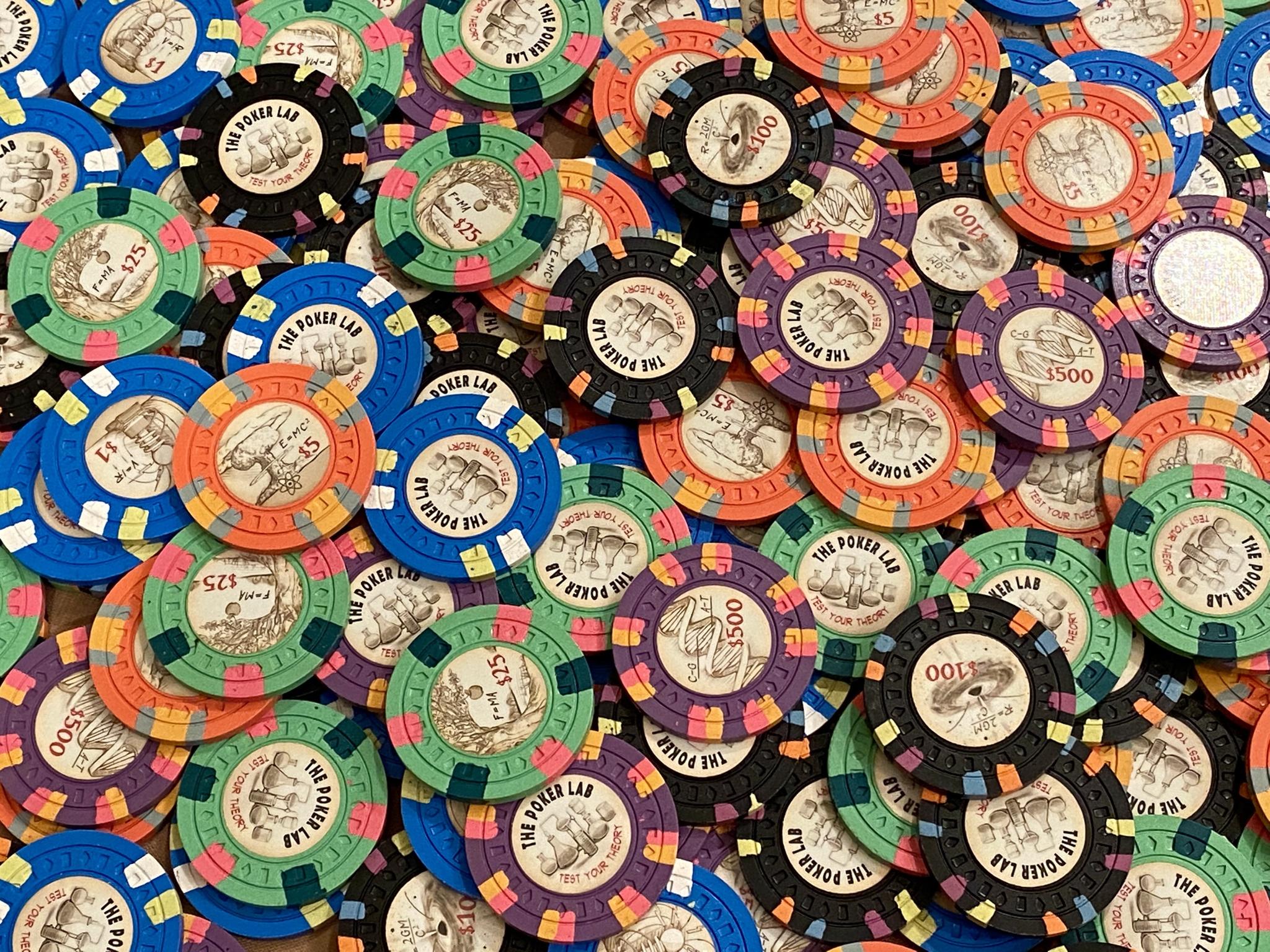
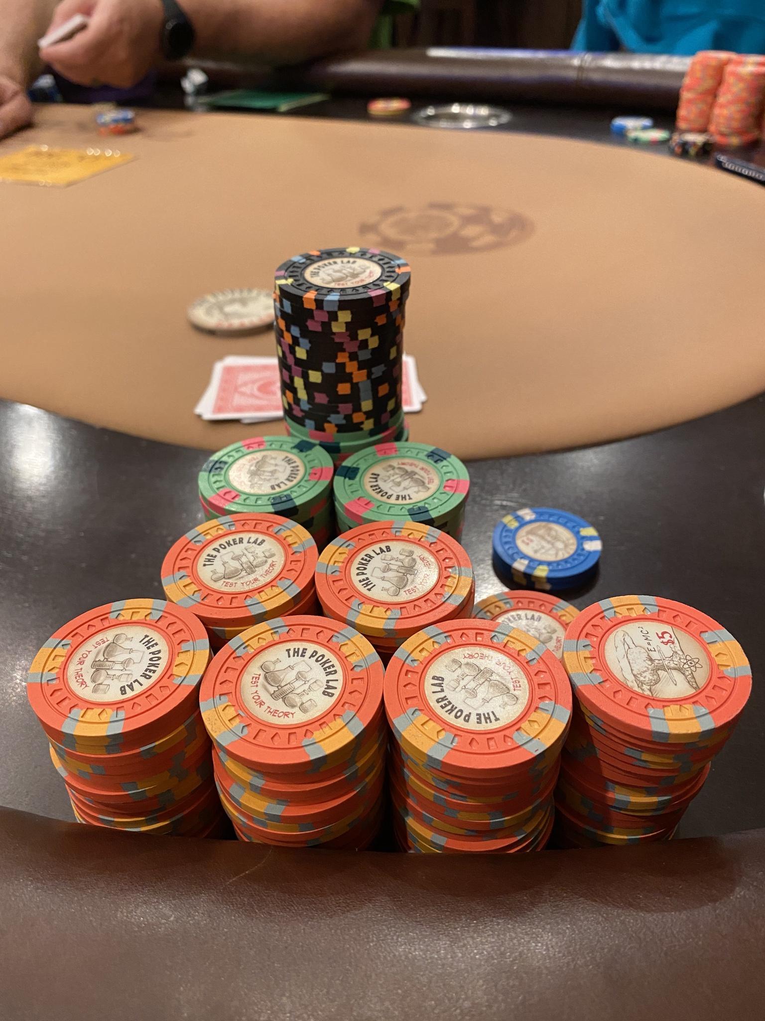
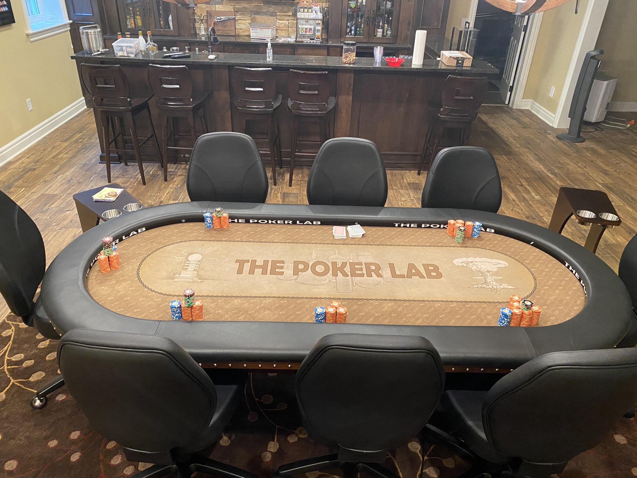
The Poker Lab is a new concept, unlike anything I've seen before. The workhorse $5 is amazing, as is the $100. A splashed pot five-to-hundo (@Hornet plays a bigger game than I do) looks great as all the colors look great together. At first, I thought the labels looked dirty, but they've grown on me. They look aged, like they were written in a notebook decades ago. I also vastly prefer the mold for Poker Lab, and with the retro feel of the mold, it pairs perfectly with the aging labels. This set is timeless.
It looks like I'm in the minority on my preference, and that's fine. I think Casa Mango has more mass appeal and is a deserved winner. But I gave the nod to Poker Lab for it's sneaky coolness.
NotRealNameNoSir
4 of a Kind
Absolute fire. Yes, this is a preference battle lol, both are gorgeous. I'm preferential towards the Lab cause then I could wax poetic about math while I bluffed off my chips.
detroitdad
Royal Flush
I also voted for @Hornet, but it was a close call. Both sets are thoughtful, and both have killer colors.
The inspiration photos for Casa Mango are awesome, and the logo is clean, if not familiar. The size of the set is impressive, and the composition of the photos is top notch. I would have never picked the $1 colors, but with the inspiration photos, they look great; I love that chip. The $5 is also an amazing chip. Even the $20, it didn't wow me at first, but it's an amazing chip when paired with the bougainvillea plants. Top to bottom, I love this set for it's personal meaning to @Eloe2000. The colors, particularly frac-to-five, interact so well in a pot.
The Poker Lab is a new concept, unlike anything I've seen before. The workhorse $5 is amazing, as is the $100. A splashed pot five-to-hundo (@Hornet plays a bigger game than I do) looks great as all the colors look great together. At first, I thought the labels looked dirty, but they've grown on me. They look aged, like they were written in a notebook decades ago. I also vastly prefer the mold for Poker Lab, and with the retro feel of the mold, it pairs perfectly with the aging labels. This set is timeless.
It looks like I'm in the minority on my preference, and that's fine. I think Casa Mango has more mass appeal and is a deserved winner. But I gave the nod to Poker Lab for it's sneaky coolness.
I basically said the same thing
") well said sir.
well said sir.Side by side with a crappy iPhone camera and a little bit of natural light.Two awesome sets, anybody have sample sets of both that can take pictures in the same lighting side by side?
Eloe2000
Straight Flush
Is Casa Mango an outdoor set only?
Yes, we only play outdoors all year round. We played under the massive mango tree, which is the basis for the name.
Trying to get a new indoor/outdoor patio/sun-room space done but the demand for contractors is insane (due to migration from NE into FL, recertification requirements after Surfside collapse, and overvalued property prices driving up ROI on remodeling) and general home remodeling project cost is currently up about 200-300%. It’s pretty crazy and frustrating.
So many fantastic sets last year, but these are two worthy finalists. Both winners in my books.
Amazing set. It was literally a toss up for me, but voted for the Casa since I'm partial to palm trees (reminds me of the Mirage).
Well if you're selling them.......dibs.
I'd fight you for them.Well if you're selling them.......dibs.
Eloe2000
Straight Flush
Woohoo! Party time!
Thanks @JMC9389 for all of the time and effort running these. A huge thank you to @JeepologyOffroad for being terrific and important sounding boards and consultants over many months of agonizing decisions over the most minute details of my CPC sets. I probably traded more messages with Jeep over those months than with my own family members combined. Additional thanks to @ReallyGoodUsername for design feedback and @MarquetteMonkey for his shaped inlay help. I want to also thank @Tommy for creating this amazing place.
This place has been an incredible source of enjoyment and inspiration. I feel like there has been a completely new wave of CPC sets and the past two years have been amazing. It was an absolute honor to compete with @Hornet ’s creative and innovative Poker Lab set as well as those in earlier rounds. It is an honor just to be thought of in the same class as these other sets. I have seen some amazing sets coming out in this current year and know some incredible ones are in the works. I am so excited to see what everyone comes up with and continue to push the bar.


Thanks @JMC9389 for all of the time and effort running these. A huge thank you to @JeepologyOffroad for being terrific and important sounding boards and consultants over many months of agonizing decisions over the most minute details of my CPC sets. I probably traded more messages with Jeep over those months than with my own family members combined. Additional thanks to @ReallyGoodUsername for design feedback and
@MarquetteMonkey for his shaped inlay help. I want to also thank @Tommy for creating this amazing place.This place has been an incredible source of enjoyment and inspiration. I feel like there has been a completely new wave of CPC sets and the past two years have been amazing. It was an absolute honor to compete with @Hornet ’s creative and innovative Poker Lab set as well as those in earlier rounds. It is an honor just to be thought of in the same class as these other sets. I have seen some amazing sets coming out in this current year and know some incredible ones are in the works. I am so excited to see what everyone comes up with and continue to push the bar.
Congrats to an absolutely beautiful set to win it all. Amazing sets in this tournament. Poker Lab was also an amazing looking set.
This was a lot of fun, and I was honored to be included in the tournament.
This was a lot of fun, and I was honored to be included in the tournament.
Similar threads
- Poll
- Replies
- 6
- Views
- 642
- Locked
- Poll
- Replies
- 15
- Views
- 655
- Replies
- 16
- Views
- 748
- Locked
- Poll
- Replies
- 14
- Views
- 832
- Locked
- Poll
- Replies
- 21
- Views
- 1K