Juice
Sitting Out
I'm not a graphic designer, or frankly, even minimally artistic. I guess I hew closer to the analytic parts of my brain.
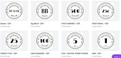
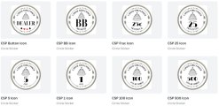
However, I've been trying to play around with an inlay design based around the concept that, "less is more" (for my personal taste). And I keep coming back to "simple," "clean," and "throwback" when I focus on ideas and themes.
As you may guess, I live and work in the D.C. area, and I was looking for a connection that works for me and folks I play with.
I think I prefer a white background (going back to the "clean" theme), but I have also played around with a silver background a little. But my big struggle is with image vs no image. Which do people prefer?
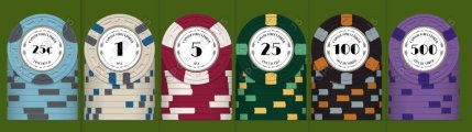
I am focused on the inlay design right now. But I am including an early chip design using one version, because I suspect it helps to see the inlay on a chip. I chose a cheaper mold design and inlay patterns because if I can afford CPC's, it will have to be on the more affordable end.
I appreciate the feedback. I'll try to take it constructively and not feel thin-skinned.")
However, I've been trying to play around with an inlay design based around the concept that, "less is more" (for my personal taste). And I keep coming back to "simple," "clean," and "throwback" when I focus on ideas and themes.
As you may guess, I live and work in the D.C. area, and I was looking for a connection that works for me and folks I play with.
I think I prefer a white background (going back to the "clean" theme), but I have also played around with a silver background a little. But my big struggle is with image vs no image. Which do people prefer?
I am focused on the inlay design right now. But I am including an early chip design using one version, because I suspect it helps to see the inlay on a chip. I chose a cheaper mold design and inlay patterns because if I can afford CPC's, it will have to be on the more affordable end.
I appreciate the feedback. I'll try to take it constructively and not feel thin-skinned.