any opinions on my poker chip designs for my first set?? (1 Viewer)

Senor_Corona

Sitting Out
Joined
May 19, 2022
Messages
15
Reaction score
18
Location
Houston Texas
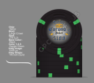
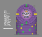
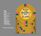
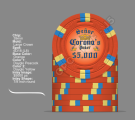
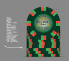
so im trying to design my self some personal chips and im literally a new born when it comes to illustrator but im a quick learner did this in about 1 hr. and on the fly. i like the way they came out but i cant decided on the pips i want to add on each chip. im looking for some suggestions and opinions about my design.
 

Attachments

  • 282871891_715085123172588_1854339152983074533_n.png
    282871891_715085123172588_1854339152983074533_n.png
    194.6 KB · Views: 212
100 and 500 may create issues in low light. Especially if there is no spots on the rolling edges.

Keep in mind that the chip is 39mm or 43mm and that thin lines can be an issue with ceramic printing and that ceramic print is less sharp than a print on a label or inlay.

For a solid set, I like the choice of colors. Would just pick a light blue or lavender for the 500.
 
For the 1k I’d go with a gold for the edge artwork. All your other colors are darker, so a lighter color for the edge artwork worked but on yellow it gets washed out.

Did you have the edge artwork in white and then changed the opacity? For the yellow 1k, you can do something similar but start with a dark color like gold or brown, and play with the opacity.
Ok so I think I've addressed the issues and messed with the colors to see what looked best but still a lil un happy with the orange and dark green chip but this is the best color I can come up with. anymore suggestions?
 

Attachments

  • $25000.png
    $25000.png
    131 KB · Views: 48
  • $5000.png
    $5000.png
    129 KB · Views: 47
  • $1000.png
    $1000.png
    142.8 KB · Views: 49
  • $500.png
    $500.png
    132.7 KB · Views: 47
  • $100.png
    $100.png
    138 KB · Views: 61
Is your art different than the Corona beer company logo? That could be a concern for a chip producer.
its slightly different by scale. font you have to make to get it to look like Corona C everything else is basic old english. but if Brpropoker says no then i can always revise. but im still strugling on denom color
 
its slightly different by scale. font you have to make to get it to look like Corona C everything else is basic old english. but if Brpropoker says no then i can always revise. but im still strugling on denom color
They might not care. I know one artist that wouldn’t take the job however.
 
Also thinking about some cpc chips. im still on the fence on both kinds
 

Attachments

  • $100 Chip.png
    $100 Chip.png
    290.5 KB · Views: 55
  • $500 Chip.png
    $500 Chip.png
    384.7 KB · Views: 42
  • $1000 Chip.png
    $1000 Chip.png
    386.2 KB · Views: 42
  • $5000 Chip.png
    $5000 Chip.png
    402.2 KB · Views: 41
  • $25000 Chip.png
    $25000 Chip.png
    361.8 KB · Views: 51

Create an account or login to comment

You must be a member in order to leave a comment

Create account

Create an account and join our community. It's easy!

Log in

Already have an account? Log in here.

Back
Top Bottom