Another colour matching issue (CPC) (1 Viewer)

doakwolf

Straight
Joined
Jun 23, 2015
Messages
964
Reaction score
828
Location
Van Diemen's Land
Need some help, please :D

Well, I'm kinda stuck deciding if I like Peach or Tiger for my $1 and the samples I've received seem different to the ones on-screen. Yep, I understand monitors and other things play a factor in how things "appear" but will explain my confusion...

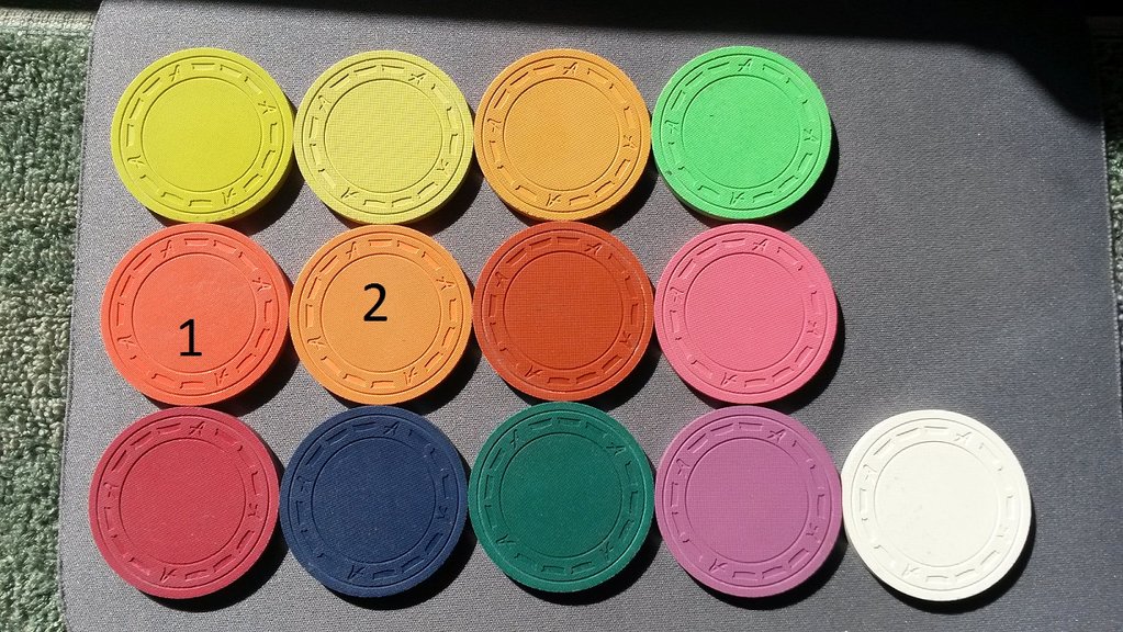
Firstly, would everyone agree I've got my unweighted colours lined up correctly as per this
link? http://www.homepokerchips.com/pokerchips/realclay/colorchart.htm
2016-02-19 16.38.02.jpg


Assuming they're correct and #1 is DG Peach and #2 is DG Tiger, why does my tiger look more like the DG Orange in the design tool and my Peach looks more like the Tiger sample? Leads back to the monitor issue, perhaps, but all other colours seem pretty close. I'm using a pretty high end IPS screen tuned to Adobe RGB.

I just (finally) oiled the Peach, Tiger and Arc Yellow but no change to my view.

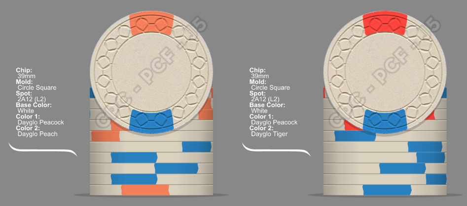
Here's an example from the design tool: To my eyes, the Tiger in design tool looks nothing like the Tiger in the sample photo. It's more reddish with the sample heading more into the yellowish tone.
peach and tiger.png


If all is lined up correctly, I'm going to have to change my spot to DG Tiger and pray it doesn't look like it does in the design tool haha.

Appreciate any input.

Does anyone have any photos of Tiger spots on white from their own sets? :)
 
OK to my eyes, I need to flip them based on the image you posted, 72o. The tiger has the more vibrant redness to it like it does in the design tool with the Peach being somewhere between the Arc Yellow and Tiger. Gawd, I literally saw the option for "inlaid" samples the DAY after my plain sample set was shipped hahaha.
 
OK to my eyes, I need to flip them based on the image you posted, 72o. The tiger has the more vibrant redness to it like it does in the design tool with the Peach being somewhere between the Arc Yellow and Tiger. Gawd, I literally saw the option for "inlaid" samples the DAY after my plain sample set was shipped hahaha.
I would say based on your photo that you have it backwards like slisk said. Tiger is definitely the more vibrant orange of the bunch.

And make sure that is dg orange too and not standard orange..check for the absence of brass flakes. DG orange is darker than standard orange.
 
Based on that, 72o, would you agree the Tiger below doesn't look quite vibrant/reddish enough compared to real life / design tool? Stocky's got me concerned now though. I guess at the end of the day, they'll both look good. Just want to get it right.

cpc colours.png
 
Based on that, 72o, would you agree the Tiger below doesn't look quite vibrant/reddish enough compared to real life / design tool? Stocky's got me concerned now though. I guess at the end of the day, they'll both look good. Just want to get it right.

View attachment 31731
Yes that is a horrible representation of dg tiger on their website.
 
Yes #2 is definitely NOT tiger. I'm not sure if it's the photo or maybe hhey need oil but they all seem a little washed out to me
 
In the photo posted in the OP, starting at top left moving L to R:

DG Saturn - DG Yellow - DG Arc Yellow - DG Green
DG Tiger - DG Peach - DG Orange - DG Pink
Retro Red - Retro Blue - Retro Green - Retro Lavender - Bright White

No question, 100%. (y) :thumbsup:
 
Thanks heaps, everyone. The matter is resolved and I'm relieved. @Puggy , I should have remembered you had the Tiger on base white. I voted for that set this year after all!
 
Sounds like I'm beating a dead horse but....

ImageUploadedByTapatalk1455882396.951362.jpg


72o is right.
 
Last edited:
I had the full intentions of going with Dayglo Tiger as my quarter. Once I had the sample set in hand I changed my mind to Dayglo Orange. I'm really happy with my decision.

20160104_182559_zpsxmdx45g2.jpg
 
I had the full intentions of going with Dayglo Tiger as my quarter. Once I had the sample set in hand I changed my mind to Dayglo Orange. I'm really happy with my decision.

20160104_182559_zpsxmdx45g2.jpg

You're right. DG Orange is more sunsettish. And those do look marvellous live. I'm really glad was able to get the sample set :)
 
Yes that is a horrible representation of dg tiger on their website.
Too true. I'm looking at my color samples and the Tiger is more orange than the peach. Pic on the CPC site makes the Tiger look pale & washed out. In fact it is a very bright orange leaning a bit toward pink
 
I'm probably in the minority but I actually want the no inlay version of the color sample set when I order it, I like having no inlay on them to see more of the color.

With guys like me who will just put a small number on one side of the chips and keep a separate key to identify them, I wonder if adding a picture of the no inlay chips with all there colors named would be a good thing to add to the reference section of this site? I know that monitors are different, but with some decent pictures it would probably be a pretty easy thing to sort through colors and identify them if needed. It may not be perfect but it has to be ten times better than the pictures on the cpc site.
I agree about the no inlay...that's why I ordered mine without as well. I put the round sticker with the color only on one side so I can see the full chip still.

For those with the CPC color sample set with the inlays, are the inlays on both sides of the chip?
 
I have thought a few times of a small numbered hot stamp on one side. I'm good with a silver or gold foil, but yeah, just a number that could match to a key. Satisfy my intense love of hot stamps and wanting to see more color!!
 
Best answer is to buy both sets. Added bonus is that then you can take three chips two of the same color and stick a second color in between to see how the spot would look. Or at least that was what I did.
 

Create an account or login to comment

You must be a member in order to leave a comment

Create account

Create an account and join our community. It's easy!

Log in

Already have an account? Log in here.

Back
Top Bottom