Erich Wise
Pair
I am attaching here my design for 3 versions of sets I have been working on. Included are the CPC Chip Designer (thank you J5 and David Sprag) .PNG files and their greyscale variants for:
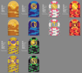
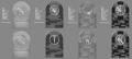
Full Cash Set; Denominations:
$0.05
$0.25
$1.00
$5.00
$20.00
$100.00
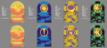
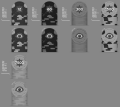
Cali Color Set; Denominations:
$0.25
$1.00
$5.00
$20.00
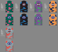
Tournament Set; Base 60; T12K:
T12
T60
T300
T1500
T7500
The Cash sets are designed with hot stamps, front with symbols and patterns from the Ancient Near Eastern peoples; including the seed of life, the asphodel, and several dead gods encircled within a ring. The denominations are hot stamped on the back with a cuneiform marking for the denomination within a ring. I am still thinking about a five cent chip for the Cali set, and would likely only order either the "Full Cash Set" or the Cali color set. I also included the Hot Stamp Icon design in a clear to see black and white image clear from the chip as the actual hot stamp is easier to see then in the image as "gold."
As for the Tourney set. I know that the main/first gripe/comment/critique/warning/help (lol) will be that the base sixty numeration will be too weird. It's weird, but it is also better in numerous ways, and works with the Ancient Near East theme. One question I do have, and I'd be curious what @BAinGA thinks here, would the T300 still be used far less then the others, like with the chip it "replaces (T500)." The units are equally spaced and so the blind structure and play would be even as well.
It is fine to give your opinion, snark, criticisms. I am not going to get hurt by anything said here, but I am curious about what the community thinks. It is not a set that is particularly light and playful, I know. I did put the units in clear legible numeration. The inlay includes a star/flower of eight points with blue and red blended points behind the numerals which also reads as an explosion like that of a sale sign and plays with the poker/casino dazzle dazzle. On the backs are the Sumerian Eyes (creepy).
Also I have a sample color set and am aware of the dayglo Saturn color, I may also be one of the few fans.
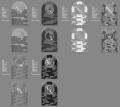
I attach the greyscale because it helps to identify dirty stack issues as well as make sure others who read colors differently will not have a difficult time.
The designs have changed quite a bit over time, and with lots of patience from David explaining why it was impossible to do various designs. As it is they won't do Diamond Square Hot Stamping etc...
If there is any interest I am happy to post previous designs and iterations, as well as my spreadsheet for possible order and breakdowns.
Thank you for your time, questions, and comments.
Full Cash Set; Denominations:
$0.05
$0.25
$1.00
$5.00
$20.00
$100.00
Cali Color Set; Denominations:
$0.25
$1.00
$5.00
$20.00
Tournament Set; Base 60; T12K:
T12
T60
T300
T1500
T7500
The Cash sets are designed with hot stamps, front with symbols and patterns from the Ancient Near Eastern peoples; including the seed of life, the asphodel, and several dead gods encircled within a ring. The denominations are hot stamped on the back with a cuneiform marking for the denomination within a ring. I am still thinking about a five cent chip for the Cali set, and would likely only order either the "Full Cash Set" or the Cali color set. I also included the Hot Stamp Icon design in a clear to see black and white image clear from the chip as the actual hot stamp is easier to see then in the image as "gold."
As for the Tourney set. I know that the main/first gripe/comment/critique/warning/help (lol) will be that the base sixty numeration will be too weird. It's weird, but it is also better in numerous ways, and works with the Ancient Near East theme. One question I do have, and I'd be curious what @BAinGA thinks here, would the T300 still be used far less then the others, like with the chip it "replaces (T500)." The units are equally spaced and so the blind structure and play would be even as well.
It is fine to give your opinion, snark, criticisms. I am not going to get hurt by anything said here, but I am curious about what the community thinks. It is not a set that is particularly light and playful, I know. I did put the units in clear legible numeration. The inlay includes a star/flower of eight points with blue and red blended points behind the numerals which also reads as an explosion like that of a sale sign and plays with the poker/casino dazzle dazzle. On the backs are the Sumerian Eyes (creepy).
Also I have a sample color set and am aware of the dayglo Saturn color, I may also be one of the few fans.
I attach the greyscale because it helps to identify dirty stack issues as well as make sure others who read colors differently will not have a difficult time.
The designs have changed quite a bit over time, and with lots of patience from David explaining why it was impossible to do various designs. As it is they won't do Diamond Square Hot Stamping etc...
If there is any interest I am happy to post previous designs and iterations, as well as my spreadsheet for possible order and breakdowns.
Thank you for your time, questions, and comments.
Attachments
-
 2020.1.26 ANE Cash .png656.6 KB · Views: 301
 -
 2020.1.26 ANE Cali Color Cash.png385.5 KB · Views: 302
 -
 2020.1.26 ANE Tourney.png516.3 KB · Views: 263
 -
 2020.1.26 GS ANE Cash .png428.7 KB · Views: 229
 -
 2020.1.26 GS ANE Cali Color Cash.png234.9 KB · Views: 192
 -
 2020.1.26 GS ANE Tourney.png348.7 KB · Views: 185
 -
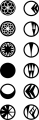 2020.1.26 ANE Icons.png149 KB · Views: 195
")