Ambessa CPC tournament set - assistance please (1 Viewer)

sotiris

New Member
Joined
Jan 19, 2016
Messages
3
Reaction score
1
Rewards
0
Location
US
Hi all, I've been lurking for a few days while also spending too much time with the chip design tool. I've gone through so many variations of this set I need to step back and get some feedback and suggestions to lock these in. Thanks!

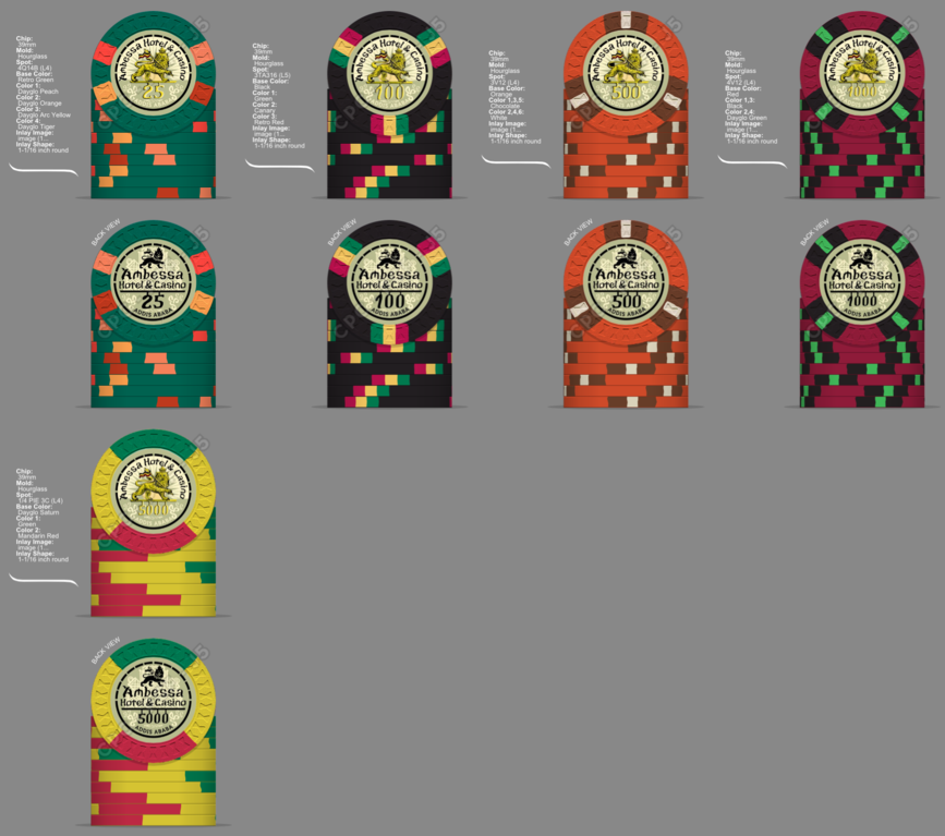
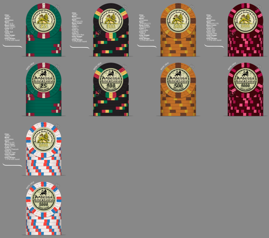
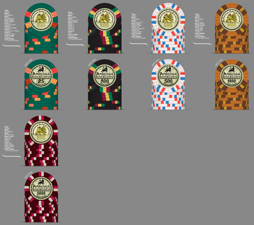
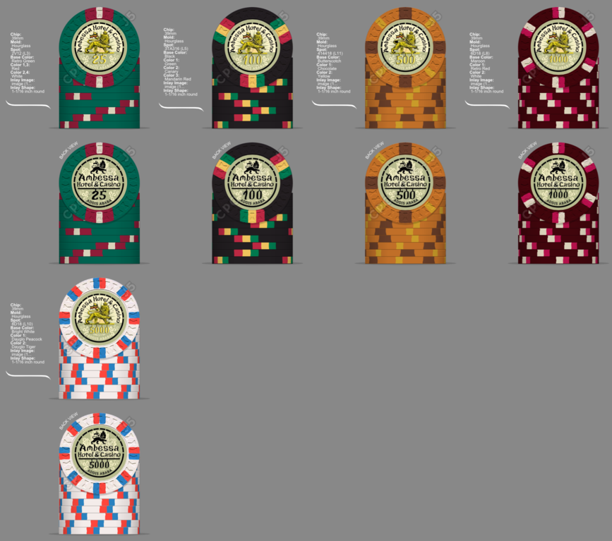
Here are (some of) the multiple combinations I've been working through. Top to bottom = first to last,


Ok, let's get some things out of the way:

1. Welcome, great first post.

2. It is not possible to spend too much time with the chip design tool

3....um

I'll post more when I look at your chips some more.
 
3. The white chip clashes a bit with the remainder of your colors which are mostly dark and moody (very cool). I also like v1 the best. Great start!
 
T25 V 1 maybe only use two spot colors
T100 obvious answer is obvious
T500 V 5.3 not sure I love any of them though
T1000 V 5.2 seems room for improvement
T5000 V 5.1 does stand out compared to rest Maybe same spot pattern regular white with retro red and retro blue spots to tone it down

great start I like the inlay.....is there a backstory to these
 
My first and only piece of feedback at this point is the yellow denom color needs to change, or at least be outlined in a dark color. Currently it's so light that it doesn't contrast enough w/the background to be easily read, plus it's proximity/attachment to the same-colored lion - I think it's a lion? - muddies the denom even further. If there's one thing you want to be clear on your chips, it's the denomination.
 
Thanks guys! I agree the bright white chip is a bit out of place, which is why I tried moving it to the 5k chip to maybe still get away with it, as I really like the idea of a bright white base.

And yes, image is a lion. Not sure why everything turns out so small, it's pretty clear at full size/resolution. Noted about the front side denominations - will definitely make that change on the final design but not for the purposes of these mock ups.

Is this better for the 25? I just feel the need to get away from any orange on that chip. Guess I still have to work at the 1k and 5k. I'll have to look through more pictures and artwork to get more inspiration for color combos.

A25 v3.png


And does the 500 looks better with a brighter yellow to punch up the colors?
A500 v4.png
 
Welcome......I know what you mean about the Chip Design Tool. Its my mistress and I love her.

Anyways..........I love V1. I hate the quarter pie chip. It just seems out of place with the rest of the set.
 
Thank you! Yes I wasn't sold on the quarter pie either, which is what started my downward spiral. Then I didn't want an orange base chip, thought maroon could be a bit different than a red base, wanted spots other than orange for the 25.... Sigh
 
Thank you! Yes I wasn't sold on the quarter pie either, which is what started my downward spiral. Then I didn't want an orange base chip, thought maroon could be a bit different than a red base, wanted spots other than orange for the 25.... Sigh

We all get what you're saying. Lol. You're in the right place
 
I think Version 5.3 is my favorite, the 1000 brings in bright colors that make the 5000 go better with the set..

Great start, Welcome to PCF, may your wallet be empty and your CHIP racks be full.

Always get samples of the molds, if you dont have them yet, and many people on here have great advice on colors, logos, and designs so please take ALL advice into consideration..

This is a great FUN community.
 

Create an account or login to comment

You must be a member in order to leave a comment

Create account

Create an account and join our community. It's easy!

Log in

Already have an account? Log in here.

Back
Top Bottom