Advice on Inlay Font/Colors (1 Viewer)

Firmat

Sitting Out
Joined
Jul 19, 2021
Messages
20
Reaction score
30
Location
Jacksonville FL
Hello, I'm new to the forum but have lurked here off and on. I was trying to learn how to design chips and started with the inlays using a template for Aces that have been posted elsewhere in this forum. I am wondering about the legibility of the fonts, below I have put a few examples of what I have been trying out. I would appreciate any advice, tips, or preferences.
1627429823669.png

1627429869645.png
 
I'm not colorblind and had to double check to see what the denominations were. :oops:


The fish design is nice, but it too busy to put anything else like text over it. You might want to either simplify that design or make a specific space for the denomination (and other text) rather than trying to put it on top. For chip inlay designs, contrast is king.

Finally, it's always worth printing any inlay design at the actual size it will be on whatever chip it's going on and look at it from arms length, or on a table in similar lighting where you play. Something that looks OK on screen might be illegible once printed on an chip.
 
Is this your dog?

I don't think the image will print out as clearly as you'd want. If you aren't using a photograph of your exact dog, maybe a generic blue tick photo would work better.

Here is the Truman's House set which has a similar kind of design:

1627434520400.png
 
I'm not colorblind and had to double check to see what the denominations were. :oops:


The fish design is nice, but it too busy to put anything else like text over it. You might want to either simplify that design or make a specific space for the denomination (and other text) rather than trying to put it on top. For chip inlay designs, contrast is king.

Finally, it's always worth printing any inlay design at the actual size it will be on whatever chip it's going on and look at it from arms length, or on a table in similar lighting where you play. Something that looks OK on screen might be illegible once printed on an chip.
The Fish design? Isn't it a Dog?

I missed that there were denoms on the chips.

Agree 100% contrast is king!
 
The Fish design? Isn't it a Dog?

I missed that there were denoms on the chips.

Agree 100% contrast is king!
I only noticed it was a dog after your post and @kaimat 's. At first glance, it sure looked like a black and white outline of a fish and some algae to me. :oops:

Again, here's a recommendation that simplifying a bit might help the overall design. The Truman's House chips work as there one central element (Truman the Dog) with clear, non-overlapping text and denomination.


I'd honestly recommend looking though the "gone but not forgotten" thread:

https://www.pokerchipforum.com/thre...en-pr0n-now-with-pr0n-of-over-200-sets.13031/

There are a lot of designs there that should give you some good ideas of how you might proceed. You have a nice concept. It just need some polishing. Any of my designs have taken many weeks of iteration until I get something that looks good and I'm happy with. Patience is a virtue and you will be happier with a design you have worked on to get right rather that rushing a design.

GOOD LUCK!! :tup:
 
Last edited:
Lol, yeah it's a vector of my dog contrasting on the black background. I thought it was pretty tough to read so the consensus seems to be to put a denom over a non-patterned area of the chip, ill go back to the drawing board and see if I can make something work.

Is this your dog?

I don't think the image will print out as clearly as you'd want. If you aren't using a photograph of your exact dog, maybe a generic blue tick photo would work better.

Here is the Truman's House set which has a similar kind of design:

View attachment 743849
It is an image of my dog/fish that I created a vector out of thinking that the simplified image would survive the printing quality loss better than a normal picture would but I guess it could also just compound the issue. Do you think a standard photo is better for chips over a stylized vector?
 
I can offer some advice…
1) Never print text or graphics that stop at the edge of your picture plane. You will risk it getting cropped when cut post-print. Leave a margin from the edge to avoid this. Background graphics like patterns or color gradients should extend outside the picture plane for the opposite reason - you don’t want it to look like something stops short of the edge.

2) Mixed, irregular, high contrast values (white/black) as a background make it very difficult for text legibility. If you’re dead set about using that graphic, you’d need a thicker font, a white or light tinted stroke (outline) around the characters, or a small background shape behind the text.

3) …I haven’t thought of anything else as I am half asleep typing this.
Thanks for the input. So for your first point, how large of a buffer area do you normally recommend? These are being drawn up for potentially ceramic printing and I am not sure if the same point stands but extended to the totality of chip face instead of just the inlay or if the inlay is still the point of most concern about spacing.

I tried to take your 2nd point and my main areas of concern with bringing it to the board into consideration and added some outlines and shadows or understroke, not sure what it's called but filling the path behind the charachters. I think it has helped with legibility but am still not sure if it's where it needs to be.

I havent reduced the graphic size other than slightly on the 5 cent yet because I am concerned about the quality loss if it is too small, I also and trying to decide if I like the stroke on the shadow of "Card Room" which I have on my 5, Maybe the 1 should have the text be either black or white, not sure if that clay color is popping enogh though I sort of like it as a color. Also still need to do the print test.

1627764747317.png

1627764888486.png
 
Here’s a ruff idea to help you separate things.
View attachment 746039
@Firmat This is a perfect example of the margin you need for the outer area. See how much space is between the top of Bluetick Card Room and the edge of the inlay? You need to pull the text in closer in your layout.

There‘s also enough contrast of white to black where the graphic is more visible. Your dog has too much black-on-black with the background.

The values are also located in the same position for each chip instead of moving it around.

It’s difficult to picture what I’m suggesting without an illustration of it. Maybe I could make some quick mock-ups the adjustments to show you…
 
I like the vector artwork. I just think it's too big and fights the type.
Also, I like it when the text is treated like art, almost a logo.
Here's an example:
mockup2.jpg


mockup1.jpg


You could also use this design if you wanted all the inlays to remain with a black background, as the white outline around the dog will give it enough separation.
black-inlay.jpg
 

Attachments

  • mockup2.jpg
    mockup2.jpg
    129.1 KB · Views: 65
I like the vector artwork. I just think it's too big and fights the type.
Also, I like it when the text is treated like art, almost a logo.
Here's an example:
View attachment 746105

View attachment 746097

You could also use this design if you wanted all the inlays to remain with a black background, as the white outline around the dog will give it enough separation.
View attachment 746099
I like this as well but that Jacksonville might as well not even be there. Will be way too small. And again, white outline on letters doesn’t translate well IMO. But I like it
 
Wow, I really appreciate everyone's help and suggestions but never expected people to be mocking up designs to help. Yall are a lot of help, and a lot better at design and the software than me to be able to knock these out in an evening, I spent several hours learning how to get my text to path to cooperate, so I guess thats not saying much. Really appreciate the input and I have liked what people have posted. I am going to play around with yalls suggestions and examples. Really just wanted to say thanks with this post and I feel like I have a better grasp on how to make it work thanks to yall.
 
Wow, I really appreciate everyone's help and suggestions but never expected people to be mocking up designs to help. Yall are a lot of help, and a lot better at design and the software than me to be able to knock these out in an evening, I spent several hours learning how to get my text to path to cooperate, so I guess thats not saying much. Really appreciate the input and I have liked what people have posted. I am going to play around with yalls suggestions and examples. Really just wanted to say thanks with this post and I feel like I have a better grasp on how to make it work thanks to yall.
Ill Send my address for a sample set when you have then done haha
 
So I went back in thinking about all the feedback, particularly from @chipinla and @Colquhoun. I liked the formats Chipinla and Colguhoun had provided and felt like I needed to make a decision about if I wanted the image to be the most prominent or the text, with the limited space that we have on the inlay and my limited ability with design, even though I think Colguhoun's did a great job of balancing both. I chose to use most of the real estate for the image and took Colquhoun's suggestion about outlining the vector to make it stand out more against the backdrop. I feel like these are much easier to read than my starting designs and am pretty happy with them but I know there is room for improvement as if I stare at them long enough I always end up adjusting some things. I switched from black shadow to white shadow for the denominations once it hit $5 to help differentiate the dollar chips from the cent chips further. I still need to do a print test to make sure that things are legible, luckily I would never need a 6 figure chip, or else I think I would run into serious trouble, both financially and design-wise. I might make some minor size and location adjustments after this depending on the print test... also Just ignore that yellow one...
CHUPChipCircleFINAL.png
 
This is looking much closer to a finished design than when you started. Great job isolating your dog in the design and giving the denomination a space. The white stroke around that helps make it more readable.

The only unreadable portion is the name and location at the top and bottom. The color match to the base of the chip combined with the black background makes it hard to read in a handful of cases, specifically the quarter, the $5 and the $25. The other three are still a little tricky to read, but not as bad as those two.

Off the top of my head, I don't know what to suggest. Others might have ideas, and I might come up with something at some point in the near future, but for now I'm not quite sure how to make those more readable.


Looking good. This is getting there and quickly too!
 
I played a bit and got this Idea as heads/tails, I wouldn't want the name on the pic side since it doesn't match and competes with the alternate style, correct? I am thinking just the pic and the small denomination on heads and the card room on tails, like on the .25 chip. I might lose location all together on both sides and make the denomination a bit bigger on tails. thoughts on style? I still need to space things and center stuff up but was just playing with the idea.

1628641083746.png
 
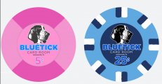
Stack "CARD" on top of 'ROOM" and nestle it under "BLUETICK". Have location follow the curve at the bottom. Now you have more room for your denom on the tails side.

On the heads side, remove the numerical denom, and use full text "FIVE CENTS" where the name is.
 
Stack "CARD" on top of 'ROOM" and nestle it under "BLUETICK". Have location follow the curve at the bottom. Now you have more room for your denom on the tails side.

On the heads side, remove the numerical denom, and use full text "FIVE CENTS" where the name is.
I like that idea, thanks!
 
New heads and tails mockup with a slightly modified vector of my dog. I went with @allforcharity 's suggestions and I think it really helped especially on the heads side that was looking a bit barren. I think the spelled out denominations has some of the same legibility issues as the name had in previous iterations BUT there are giant numbers on the other side to help out. I also sort of like the basic look of the the spelled denominations without a white shadow or something. One thing I am playing with in my head is picking a all time collor for the "Card Room" portion as it was hard to have it the same collor as the denom in some cases, I sort of like the pink from the 5 cent with the light blue , might make that the constant color and just change the denom colors.
1628916791104.png
 
Looks good!
i would just move the denomination down a bit, it looks a bit cramped with the text above.
Other than that, looks like a winner
 
Thought I would update that I got them back from a cards mold order there are a few things I would change but overall turned out pretty good!
20220120_165310.jpg
20220120_165342.jpg
Anyone who helped me put and wants a sample set just dm me your shipping info and I will mail them out when I get a chance.
 

Create an account or login to comment

You must be a member in order to leave a comment

Create account

Create an account and join our community. It's easy!

Log in

Already have an account? Log in here.

Back
Top Bottom