Advice on a CPC design. (1 Viewer)

HughDrackman

Two Pair
Joined
Sep 2, 2022
Messages
457
Reaction score
974
Location
Denver
Hey all, I wanted to get the opinion of the masses on this CPC design. The colors were inspired by the school district in which I work. If you want the full story, you can find it here.

I'm concerned about the potential for dirty stacks. The inlay I have is just a place holder. Eventually, I want @mattross1313 to help me with a variation of the "Phoenix Fire Card Room" design he came up with for my 43mm Tina chips. For the denoms, I'm thinking - .25, $1, $5, $20, $100
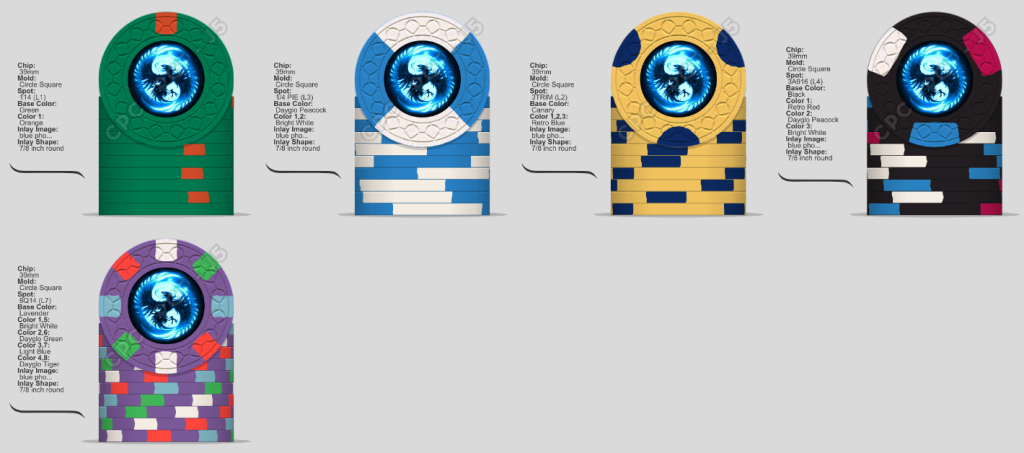
A14 designs.png
 
A lot of blue. Your frac/$1/$5 should work thanks to the green, bright white, and yellow. The $20 & $100 seem most problematic.

It’s difficult to make just a few colors work across a 5 chip set.
 
I think the dirty stacks wont be an issue with the chips you posted, but the flow of the chips seems off. Maybe consider a more simple 100 and 500 like just retro red in the 100 and just dayglo tiger in the 500? Not as exciting , but a simpler set. Sometimes less is more
 
Okay, here are the inlays that the amazing @mattross1313 put together for this set. I'm over the moon about how things turned out, now I just need to squirrel away the $$ to get them pressed.

CPC designs with inlays.png
 
Use a credit card…get that order in before the cutoff!
LOL. I'm waiting to close on the sale of a condo. When that happens, I'll have enough to get the order in. Besides, I thought the circle square molds were at the end of their run?
 

Create an account or login to comment

You must be a member in order to leave a comment

Create account

Create an account and join our community. It's easy!

Log in

Already have an account? Log in here.

Back
Top Bottom