Silver Eagle Cash Set Inlay Design (1 Viewer)

crussader

Flush
Joined
Dec 2, 2014
Messages
1,675
Reaction score
2,088
Location
Houston, Tx
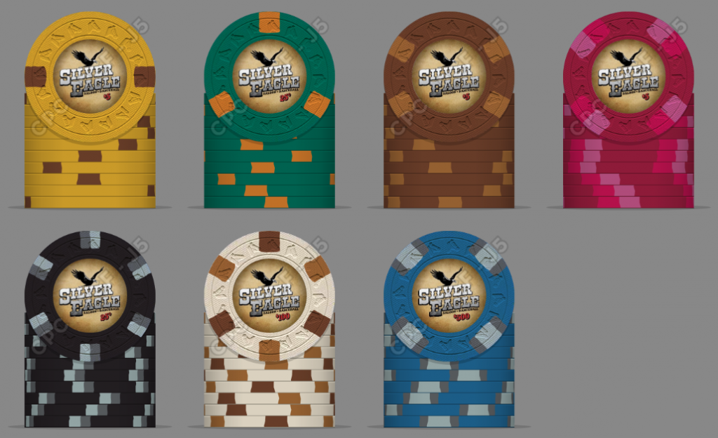
After months of working on this project, the colors and edge spots are ready to go. Now I need to settle in on an inlay design.

The forum's newest designer, @timinater, has graciously provided a prototype. It has been a pleasure working with him. He knows his way around the design tools (including CPC's templates), works quickly, and is very attentive to feedback.

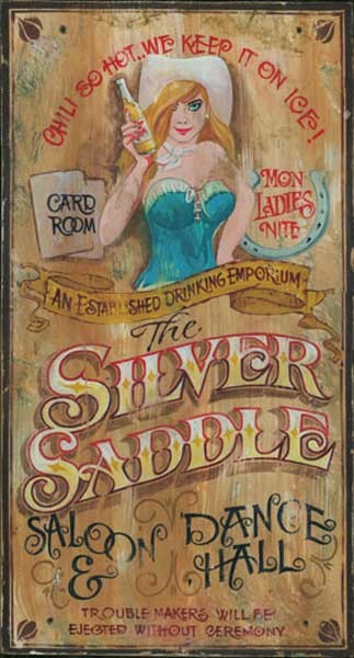
The inspiration for the design was this...
_sample1.jpg


Here is the prototype...

sample 1.jpg


tim01.png


Feedback welcome.
 
I'm thinking the brown is ok. It's synergistic with the inlay.

The blue 500 is my favorite. That's one of my favorite spot patterns and the blue vs the grey shades is a nice accent.

Nice spot progression overall.

One thing though.... your denom text is reeeeeeeeeeeealllly small.
 
Last edited:
I could be wrong on this, but to my eye, it seems that the font is too modern to fit your overall theme.

Agree on the denom being too small as well.

Like the overall inlay idea though. It just needs a bit of tweaking imo.
 
  • Like
Reactions: Nex
The clean gradient is what makes the name label look way out of place (too modern for the theme).
I'd suggest trying a flat single color, a medium gray or black (no pitch black though), also adding some artificial scratches/wear. Maybe a bright white would also work if you keep the broad black border.

Denom label is way too small; not just because of readability but also because of the looks. The fancy font makes it even harder to read. Sizing it up should be all that's necessary to fix though. Make it use up all the space that's left below the logo.

$5 may get really dark. $1, $5 and $500 seem to be lacking contrast.
My biggest favorites edge spot-wise are the 25c, 5c and $100.
 
Last edited:
I agree with everyone that the denomination font is too small. Part of this test was to see how small we could go and still be effective. There is definitely some tweaking left to do.
 
The clean gradient is what makes the name label look way out of place (too modern for the theme).
I'd suggest trying a flat single color, a medium gray or black (no pitch black though), also adding some artificial scratches/wear. Maybe a bright white would also work if you keep the broad black border.

I've had similar thoughts about the gradient.
 
Your inlay appears to be smaller than those AND its crammed into a corner. I'd also agree that those denom sizes are not something to model after

I can also say that at chip size the "saloon and Dancehall" are not discernible
 

Create an account or login to comment

You must be a member in order to leave a comment

Create account

Create an account and join our community. It's easy!

Log in

Already have an account? Log in here.

Back
Top Bottom