Custom set design tips and tricks (1 Viewer)

Toby

Full House
Joined
Nov 2, 2014
Messages
3,791
Reaction score
6,351
Location
The Shire
I've seen a few tips and tricks spread around the forum, thought it might be helpful to record some of your approaches to the process.

Obviously, there's the CPC poker chip design tool (which is awesome).

What else do you use?

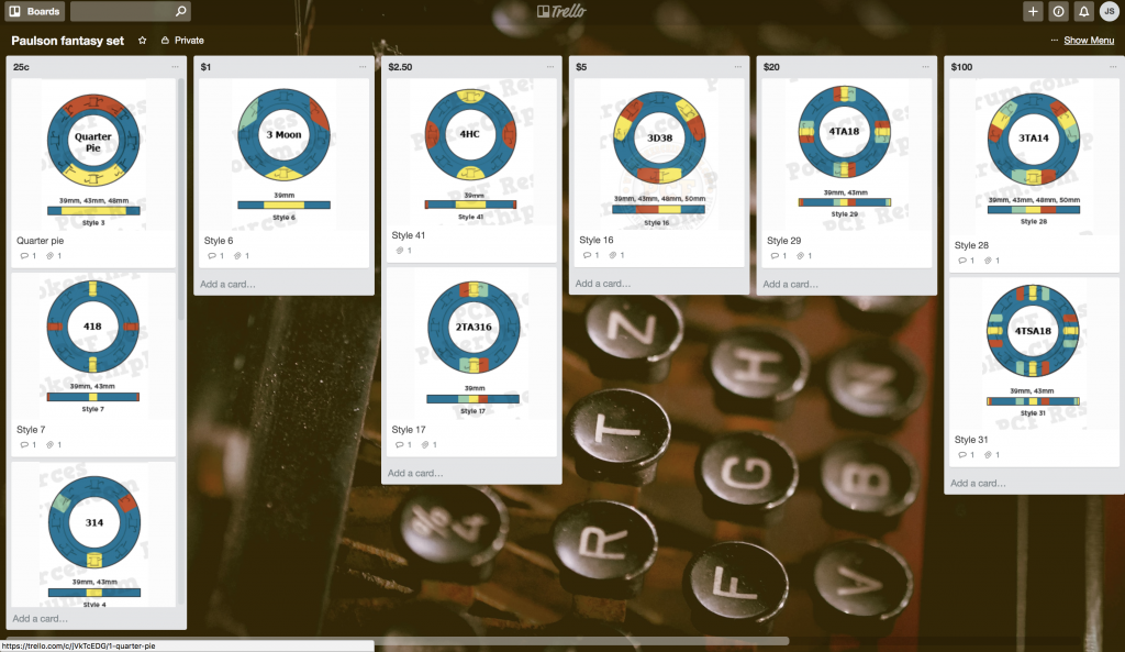
I've been experimenting with Trello for spot progression recently.

I like that you can shuffle cards around and reorder your progression quickly and easily. Same goes for options within a chip slot - e.g. if you've got multiple candidates for your, say, $1 chip, it's quick and easy to rotate them to see how they look in Trello by moving cards around to try different combos.

I've used the Paulson edgespots as an example:
Screen Shot 2017-11-13 at 16.40.40.png


...but you could equally use Trello when working with designing a CPC set, too.

I find Trello used in this manner a lot more efficient than loading up chips in the CPC tool, reordering them, saving a JPG, etc. Trello's a lot faster/easier to move things around and try different combos.

Next time round I'd likely use the CPC design tool and Trello for research, I reckon.

Share your tips and quirks!
 
Last edited:
I spent literally WEEKS carrying around my (at that point in time) ASM color sample set, comparing and contrasting the physical chips' colors one against the other, which helped me decide on my base and spot choices.

I see elsewhere on the forum, this tip from @Puggy for when you're reviewing your CPC color samples:

"At first I removed some colors I definitely don't want to use. When I had done playing with the set enough, I came up with small, but good idea to get some new color combinations.

Simple:
Just take 14 or 16 colors (or whichever amount you feel comfortable with), both bright and dark.
And just start shuffling. Between the shuffles you can separate 3-4 chips from the stack and see
how they look together, Both from the sides and especially from the edges. Coincidence does matter.

This way I have come up with some color combos I'd never thought to use, but which actually look great together."
It's super important to get chips in hand (get the "Get samples!" tattoo, if you want to be properly hardcore), from the perspective of look, feel, and complementary/contrasting colors.

If you'd doubt the sage advice from Puggy above, this method helped inform the colors for his Colony Club set from CPC:

dsc_0406-jpg.23304

dsc_0409-jpg.23306


Weep at their beauty. Go on, WEEP!!!!
 
Last edited:
From a research point of view, I like to use the Chip Guide's map/casino listings to look up my favorite casinos to check out chip designs, edgespots, progression, etc:

The Chip Guide website


I've used the individual state listings, for example Nevada, to peruse the list of casino/card room names for inspiration for fantasy casino names. There's a lot of guff, but also some nuggets/clever/great names in the mix to provide inspiration if you're struggling with your own custom set name.

Even more awesome is its Chip Query function, which I struggle find EVERY TIME I VISIT THE WEBSITE. Rather than waiting for them to improve site signposting, I should really bookmark the following link:

Chip Guide query facility

I particularly like the query facility, since you can query on specific molds. This is great if you're thinking about a set on a specific CPC mold, like if you're researching retro patterns/designs on a particular mold.

Likewise great if you want to compare a bunch of chips of a specific denom - the tool allows for that as well.

These two are more obvious resources, natch, but maybe not so well known to newcomers to the hobby looking to explore their first set...
 
You can rotate the spots within the CDT. I mention this because only a very small percentage of mockups/sets I see posted go with anything other than the standard placement auto-created when mocking up chips and on many spot patterns I personally prefer a 45degree rotation. For those who haven’t ordered or may otherwise be unaware CPC aligns all labels based on the final mockups you send them. In the below example #1 is standard while I greatly prefer #2.

87F4AC58-3235-473F-B56D-43011311D41E.jpeg
 
Even more awesome is its Chip Query function
+1 to that. I've referred to the Chip Guide and it's query facility heavily recently while developing two different sets (one of which is in production as I type - woot!). For some types of research it can be invaluable. If you want an old-school Vegas-style set, cool? Drop in your location and dates, and poof - examples! Want a Caribbean feel? How 'bout some of the zanyness from the myriad Cali card rooms? All easily searchable. Great for both targeted research and random inspiration!
 
You can rotate the spots within the CDT. I mention this because only a very small percentage of mockups/sets I see posted go with anything other than the standard placement auto-created when mocking up chips and on many spot patterns I personally prefer a 45degree rotation. For those who haven’t ordered or may otherwise be unaware CPC aligns all labels based on the final mockups you send them. In the below example #1 is standard while I greatly prefer #2.

View attachment 133902

An excellent point - this functionality is easy to miss!
 
For my set development, two tips have been pretty critical in my process...
  1. Get an anchor chip developed, then build from there. This chip is set in stone. It's the immovable object. It's the reference point for the rest of the set, & really helps to inform the rest of your spot & color decisions. For The Armory cash set, it was the $1 chip. I knew I wanted to build a set around a Mapes-lookalike $1 chip. The rest were then built around it.

  2. Don't force it. For me, concepts either come together pretty quickly, or not at all. If I find myself developing a set for more than ten minutes or so - not just playing around, but truly trying to develop something I'd want to have created - then I close the site. If I'm pressing that hard then I figure there's probably nothing there, so just move on. You can either scrap the idea or just put it away for a while and come back to it another day, but forced ideas are rarely good ones, IMO. Better to step away than to put something out there that's actually nothing.
 
I also highly recommend getting your set in front of others' eyes - if not here on the forums at large, at least with a handful of chippers whose prior work & opinions you respect. They'll almost always find an issue and/or a solution you didn't think of & your set will be better for it. That's not to say you should incorporate ever suggestion offered, particularly if you have a strong vision for what you want them to be - they're your chips, so be sure to get what you want! But at least get a few other people to look at it before they go to press. Neither science nor art is at its best without peer review.
 
Next up... Mockups on the go.

In the artistic stakes, I'm a complete spazzwit.

Fortunately there are loads of great apps that allow you to create really quite sophisticated compositions, easily, on mobile and tablet.

00c7a4d4-2ea4-4a6e-9853-efcefbf02342.png


This took about 15 minutes to do and most of that was working out how to use the app tools.

For this latest "Hotdog Lounge" design, I used two Android apps on my phone:
  1. Background Editor
  2. PixelLab
Google clip art broadly representative of the graphic style/theme you want, download it.

Isolate the part of image you want to retain by deleting background and unwanted elements using Background Eraser.

PixelLab makes it easy for you to construct a crude label:
  1. Create a new file with transparent background
  2. Draw a circle using the shape tool
  3. Add your edited image
  4. Add text layers for set name, denom, tag line, etc
  5. Save as .png and upload to the CPC chip drsigner
You can style text, manipulate size, curve/distort - there's loads you can do.

If you're working with a chip artist, playing around with mockups like this allows you to explore layout and composition before you take your concept to the artist/designer.

I find it can save time trying to explain the concept. Without the embarrassment of me drawing something crap by hand...

When I have more time on my hands, I use Photoshop. But for a quick fix on-the-go, there are some decent phone apps out there.
 
Last edited:
I also highly recommend getting your set in front of others' eyes - if not here on the forums at large, at least with a handful of chippers whose prior work & opinions you respect. They'll almost always find an issue and/or a solution you didn't think of & your set will be better for it. That's not to say you should incorporate ever suggestion offered, particularly if you have a strong vision for what you want them to be - they're your chips, so be sure to get what you want! But at least get a few other people to look at it before they go to press. Neither science nor art is at its best without peer review.

Agreed, its a very good idea to have people you can bounce ideas off of. I can honestly say my Nirvana set would have looked vastly different if not for the circle of trust.
 
I like coming up with a number of different inlays and spot patterns. Then I mock up each set and use them as a windows wallpaper for a while (at least a week). You will eventually find that you like one set better than the others. When you are doing some work then you close the window and see set on the screen that was different from the one when you started opened the window - and your heart leaps - that's the right direction to go.

This is also a great way to figure out that one pesky chip that you just can't get.

Also - and I can't say this one enough - don't get locked into spot progression. It can limit your ability to really get exactly what you want.
 
I also highly recommend getting your set in front of others' eyes - if not here on the forums at large, at least with a handful of chippers whose prior work & opinions you respect. They'll almost always find an issue and/or a solution you didn't think of & your set will be better for it. That's not to say you should incorporate ever suggestion offered, particularly if you have a strong vision for what you want them to be - they're your chips, so be sure to get what you want! But at least get a few other people to look at it before they go to press. Neither science nor art is at its best without peer review.

Absolutely this!!!!
 
Fonts...

Again, some great research tools out there.

I like the fonts.com browse library function.

You can add your own (set name) text and cycle through literally thousands of options and shortlist fonts you dig.

Use the controls to explore different styles to find fonts you like, then go Google 'free fonts similar to [insert font name here]'. Prolly worth checking if your chip artist has access to the font first, if you're using one.

If you're like @jbutler you'll want to use the 'Script' filter to bring up those ace handwriting fonts for your latest cursive love letter design:

Screenshot_20171116-170722.png


There are loads of site out there where you can explore fonts:
When trialling fonts, I'll sometimes take a screen shot of one I like on my phone, then load it up in Background Eraser to isolate the text so I can try it out in Pixel lab. Admittedly, I'd have to be pretty bored to go that trouble often...

Guerilla, cheapass mockups on the fly!

Whichever fonts you're looking at, don't forget to consider readability...
 
Last edited:
Readability...

I try to get my designs to fill the inlay space nicely without cramming in too much detail.

It's good to be able to see the elements easily, including denoms, so your ageing and sight-failing players (cf @courage) aren't constantly asking "What's this one worth again?"

Designs might look awesome at 3000 x 3000 px on your super-HD monitor but they'll ultimately be printed down to as small as 7/8"...

A great test is to reduce the design down to actual printed size and then print it off. Or to ask your chip artist to do that for you.

Or if you're super OCD, hire out the CPC factory to prototype your design*

BGinGA2.JPG


*actual hiring out of CPC factory may not have actually happened
 
For me it's based around a theme. My first set was based around my (at the time) Mustang. My second and third sets were based on currency and my favorite team.
 
It's been mentioned a couple of times before but it's worth mentioning again.

PCF is a smashing place to get advice and guidance when exploring your custom set.

Create a new thread in the Custom Chip Mockup and Design subforum and ask the community for help. You'll get the benefits of experience, objectivity and chip wisdom, to steer you towards a kicking end product.

If you're not comfortable with a community view of your project, reach out to a few folk via pm. Most of the fine, upstanding PCF folk will gladly lend a hand or opinion.

Many a great set has been collaborated over pm and email!

For the hardcore, you might want to try the Chippr app. It's not available in any app store but if you navigate to Chiptalk, Russian robots will download it to your device for you.

It's got some great features and you'll get lots of degen chip design action on the go.

chippr-logo1.jpg


chippr-features.jpg
 
Last edited:
It's been mentioned a couple of times before but it's worth mentioning again.

PCF is a smashing place to get advice and guidance when exploring your custom set.

Create a new thread in the Custom Chip Mockup and Design subforum and ask the community for help. You'll get the benefits of experience, objectivity and chip wisdom, to steer you towards a kicking end product.

If you're not comfortable with a community view of your project, reach out to a few folk via pm. Most of the fine, upstanding PCF folk will gladly lend a hand or opinion.

Many a great set has been collaborated over pm and email!

For the hardcore, you might want to try the Chippr app. It's not available in any app store but if you navigate to Chiptalk, Russian robots will download it to your device for you.

It's got some great features and you'll get lots of degen chip design action on the go.

View attachment 134689

View attachment 134690

I wasn't able to find this anywhere and from Google Chippr App is a whole different community...
 
My way of doing my Club Hel design basically was a variant of what @Poker Zombie did.
Didn't put the current mockup as my wallpaper, but had it open nearly fullscreen on my side computer while doing various stuff on the main computer; always in sight.
Every now and then, but more rarely towards the end, a tiny change - maybe just one color.
I ended up with over 80 versions from the earliest draft to the final mockup, spread over a time frame of about seven months.
Do give yourself that much time too. Looking back at my earlier drafts, I probably would be quite pissed/dissatisfied if I ended up finalizing my order with one of those half-done, rough versions.

I also often had the color sample chips lying around near my keyboard, some of them stacked slightly shifted to reflect all the spot colors I used on a particular chip, with the body color chip on top of all (in an attempt to roughly replicate the color balance that would be present on an actual chip in those colors). All the other color samples were in reach so I would every now and then take a slightly different shade of one color, replace it in the stack, and then look at it again for a while.

Also always keep the history of the rendered-out mockups (including spot detail texts on the side) saved on your machine somewhere, and preferably a versioned history of your inlay artwork files as well. This way, you can modify and delete mockups in your set without any fears or regrets and work around more freely - after all, you can always go back and check how exactly a previous version was configured if you need to retrace.

I would really recommend everyone using the chip design tool to modify their view options and select either the dark gray or light gray background, both for working as well as for render exporting. The issue with actually colored backgrounds is that they can skew your perception of the spot colors, while gray tones are fairly neutral in regards to that effect. Professional artist software like Lightroom, Photoshop, Premiere etc. also deliberately have their user interfaces and backgrounds in neutral grays for that very reason, by the way.

If you are trying to replicate the design/colors of existing casino chips, I can only recommend getting a sample of each of those chips. While digital photos are available of so many, the colors often are very skewed. You really want to put the original chip and your color sample chips next to each other in person to get the closest-possible match.
 
Can I just say how much I love this thread?

I really, really love this thread.

Thanks!

I'm glad you like it. :)

I'm wondering if any of the chip artists have any tips to share. Even if it's along the lines of best ways to convey a concept to them effectively?

@Johnny5 @PokerChipsDesign @p5woody @ttttubby

Also, if you happen to read this and know of anyone who designed their own set, tag 'em to see if they want to contribute.

@72o did the Knollwoods himself I believe. That is one of my favorite designs. Outstanding use of inlay space, truly a top-notch design.

Any insights into your process, please do share!
 
  • Like
Reactions: 72o
I'm always noticing fonts and thinking about the way they look on signs and packages etc that I see in everyday life (in print ads or at the grocery store etc). If you get into the habit of doing that ideas start to pop up organically.
 
Thanks!

I'm glad you like it. :)

I'm wondering if any of the chip artists have any tips to share. Even if it's along the lines of best ways to convey a concept to them effectively?

@Johnny5 @PokerChipsDesign @p5woody @ttttubby

Also, if you happen to read this and know of anyone who designed their own set, tag 'em to see if they want to contribute.

@72o did the Knollwoods himself I believe. That is one of my favorite designs. Outstanding use of inlay space, truly a top-notch design.

Any insights into your process, please do share!
Thank you for the mention and kind words, Toby.

What a great thread!

Let me preface this by saying that I am FAR from a graphic designer. I left the finished product in the trustworthy hands of a professional (J5). What I did try to do however was try to give him a clear design of what I wanted. When I started my inlay design, I went old school. I grabbed a pencil and some paper, sat on the couch, and started doodling. Maybe I'm just old, but working this way negated the constraints of learning a new computer program (something I really didn't want to do). It also allowed me to work in "real scale" much easier. I simply took sheets of paper and drew out some 7/8"-1" dia. circles and started blocking out spaces. By putting pencil to paper, I soon realized where I wanted the inlay elements to be placed and I could quickly cut out the sketched inlays and apply to a sample chip for "feel". Here's a few examples of some early sketches:

Inlay1-compressed.jpg
Inlay2_compressed.jpg
Inlay3_compressed.jpg


See...nothing great but it gave me some direction. As soon as that last design was put on paper, I knew that that was the one for me and it narrowed it down and gave me something to develop further. From there, I went digital. I work with CADD (Computer Aided Drafting & Design) in my professional life drafting construction drawings so I figure why not try to "digitize" my sketch with what I know. I easily slapped this together and was able to send this along to J5 so he could add his mastery of all things graphical.


Inlay4_compressed.jpg
 
Thank you for the mention and kind words, Toby.

What a great thread!

Let me preface this by saying that I am FAR from a graphic designer. I left the finished product in the trustworthy hands of a professional (J5). What I did try to do however was try to give him a clear design of what I wanted. When I started my inlay design, I went old school. I grabbed a pencil and some paper, sat on the couch, and started doodling. Maybe I'm just old, but working this way negated the constraints of learning a new computer program (something I really didn't want to do). It also allowed me to work in "real scale" much easier. I simply took sheets of paper and drew out some 7/8"-1" dia. circles and started blocking out spaces. By putting pencil to paper, I soon realized where I wanted the inlay elements to be placed and I could quickly cut out the sketched inlays and apply to a sample chip for "feel". Here's a few examples of some early sketches:

View attachment 135264 View attachment 135265 View attachment 135266


See...nothing great but it gave me some direction. As soon as that last design was put on paper, I knew that that was the one for me and it narrowed it down and gave me something to develop further. From there, I went digital. I work with CADD (Computer Aided Drafting & Design) in my professional life drafting construction drawings so I figure why not try to "digitize" my sketch with what I know. I easily slapped this together and was able to send this along to J5 so he could add his mastery of all things graphical.


View attachment 135269

Thanks, @72o! This is exactly the kinda stuff I'm looking for folk to share here, so thank you for sharing your experience!

Anyone else..?

Maybe @toad94 has some insights from his epic BCC sets... Seem to recall Mark did his own designs, too...
 
  • Like
Reactions: 72o
I've seen a few tips and tricks spread around the forum, thought it might be helpful to record some of your approaches to the process.

Obviously, there's the CPC poker chip design tool (which is awesome).

What else do you use?

I've been experimenting with Trello for spot progression recently.

I like that you can shuffle cards around and reorder your progression quickly and easily. Same goes for options within a chip slot - e.g. if you've got multiple candidates for your, say, $1 chip, it's quick and easy to rotate them to see how they look in Trello by moving cards around to try different combos.

I've used the Paulson edgespots as an example:

View attachment 133898

...but you could equally use Trello when working with designing a CPC set, too.

I find Trello used in this manner a lot more efficient than loading up chips in the CPC tool, reordering them, saving a JPG, etc. Trello's a lot faster/easier to move things around and try different combos.

Next time round I'd likely use the CPC design tool and Trello for research, I reckon.

Share your tips and quirks!
I did something similar on my site. While not for customs per se, it could help with colors and spots.
https://pokerchip.gallery/mixed-set-tool-standard/
 
@mashoo asked about this one in a pm.

An extension of color choices, the use of dark or tonally similar base colors is something to consider.

It's good to avoid similar base colors on neighboring or nearby chips, as in low light they can be difficult to distinguish and hard to spot in dirty stacks.

CPC Charcoal and Black were the subject of our discussion.

Not so much of an issue if your tables is well lit:
20171107_102416-min.jpg


But if you play in a degen dungeon, where it's murky and less bright, it becomes much easier to mix chips up:

20171107_102353-min.jpg


Dirty stacks:

20171107_102510-min.jpg


If you're concerned about contrast and telling chips apart, seek out advice from someone who has stacks of the colors you're considering. Like mashoo did with me. :)
 
Keep in mind that similar colors are very hard to tell apart for color-blind players. Roughly 8% of the male population is color blind. If you fill 2 tables with random people, odds are high that at least 1 player will be color-blind.

This is my biggest reason for opposing "spot progression". A color blind player may struggle with a red or a green chip, but they can easily identify radically different spot patterns. It just becomes that much more difficult if the spots are just 1 pip different, which makes them near impossible to differentiate in stacks.

A player that struggles to tell the difference in chips is far less likely to be a returning player.

Don't lose 8% of your players just because your chips are designed for perfect-vision.
 

Create an account or login to comment

You must be a member in order to leave a comment

Create account

Create an account and join our community. It's easy!

Log in

Already have an account? Log in here.

Back
Top Bottom