Custom Felt, Music Shack?? (3 Viewers)

chipjoker

Flush
Joined
Nov 5, 2014
Messages
2,277
Reaction score
2,036
Location
California
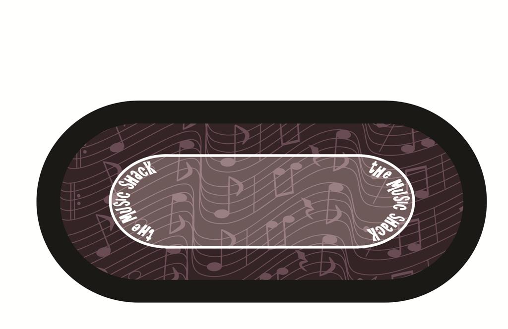
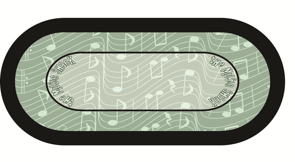
What do you guys think about these.

Please give feed back..ALL criticism is welcome..

#1
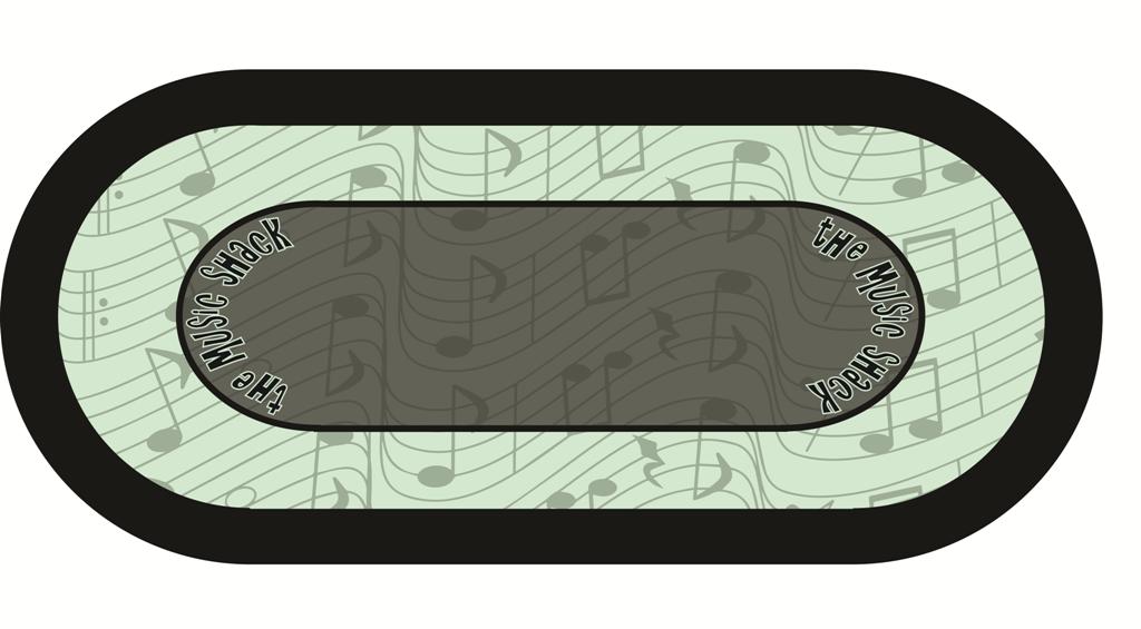
Table 6.jpg

#2
Table 7.jpg

#3
Table 8.jpg
 
IMO I would use moderate to deep tones for the table. Bright colors really place a strain on the eyes. I like the design but would use deeper tones.

I like table 2. But the center should be plain so the pots are always easily readable.
 
I agree with Steve above and like #2 best colorwise. And second his advice to make the middle solid. Maybe try making the music notes at a smaller scale and using the lighter shade of the notes (currently on the outside) as the center solid color and only have the notes on the outside portion of the betting line.
 
I'll second basically everything said already.

1. Solid middle. Preferably darker color

2. Move wording to the straight edge....even it starts at the curve i.e. Off center

3. Make the notes slightly smaller maybe 1/3 - 1/2 the current size.

So my recommendation for sheez and geez

Charcoal center (#1 center with no notes, maybe a tad darker)
Maroon racetrack (#2 colors look Good to me) maybe a bluefish hue would work too
Use the black lettering with white border (#1 lettering)
 
I'm afraid the (awesome) dealer button gets lost if the inside of th layout is too dark. That's a deal-breaker, for me.

The $20 chips get lost when the outside is too dark... Also a problem.
 
Definitely like that new mockup

What if you take #1 and use the current colors on it make center solid and reverse the notes and background colors on the racetrack
 
Last edited:
I also prefer the clean center area, but I think I'd like to see the shack from the hundo at the end (inside the blank area) and perhaps one of the instruments on the opposite end.
 
i like the middle one, without the actual shack picture, im not sure how great the quality of that will come out
 
I like the one without the logo 1/17 11:32am but if you must use the logo I prefer the one from 1/17 11:14am. You might also try playing with how you use the logo (get rid of the border and make it a cutout of the inner betting oval etc to make it more subtle). Whatever you do leave the shack and the instruments off. Blowing up clip art that large isn't doing you any favors.
 
@chipjoker I saw this guys VLOG playing at Hard Rock, please look carefully as the poker room there looks like it has a similar style as to what you are going for in looks.

I cant find any closeups of the print, though

 
Thanks, @manamongkids , I am hoping to get back on this soon. I like the simple layout.. I also saw another felt I liked that gave me another idea when I was looking at some pic's I am going to try... I a getting two felts, so I want two designs for the same theme.
 
I like the grey/dull color scheme for the felt with the colorful chips on top. There has to be some analogy in there somewhere related to the chips being music notes, and music makes life colorful/vibrant/etc.
 
Your drafts all look great. My favorite so far is the one with the shack in the middle:

table-12-jpg.77130


My suggestions are tone down the background a little, maybe make it a bit more faded. I would also move the actual photo of the shack further up so that it's not sitting on the betting line.

Is it just me or does the betting line look a little pointy at the ends?
 
Yes, its pointy, These have been rough drafts that I have been throwing together (time is scarce sometimes) ... Once I nail down a design I will make the one for my lit table the size and betting line to fit.. Then I will do the one for my next build, as my playing surface will be larger on the next.

Thank you for you sugestions @T_Chan, your comments are much appreciated..
 
Thank you,

My game I have @Shaggy dealing across from me Every Other hand, and if he can make it then I have others shuffle for me and I deal.. So, I think I will stick the card slots....My second table might not have them.. :D
 
Love the changes you made between the first look and this one. Goes really well with your chip set. Nice job!
 

Create an account or login to comment

You must be a member in order to leave a comment

Create account

Create an account and join our community. It's easy!

Log in

Already have an account? Log in here.

Back
Top Bottom