You are using an out of date browser. It may not display this or other websites correctly.
You should upgrade or use an alternative browser.
You should upgrade or use an alternative browser.
First CPC - Comments and Feedbacks please (1 Viewer)
- Thread starter alim8
- Start date
Hi and welcome to the site!
I assume this set is for tournament play? I see you are in Asia so I'm not sure about denominations. If you tell us a bit more about the application of the set that will help.
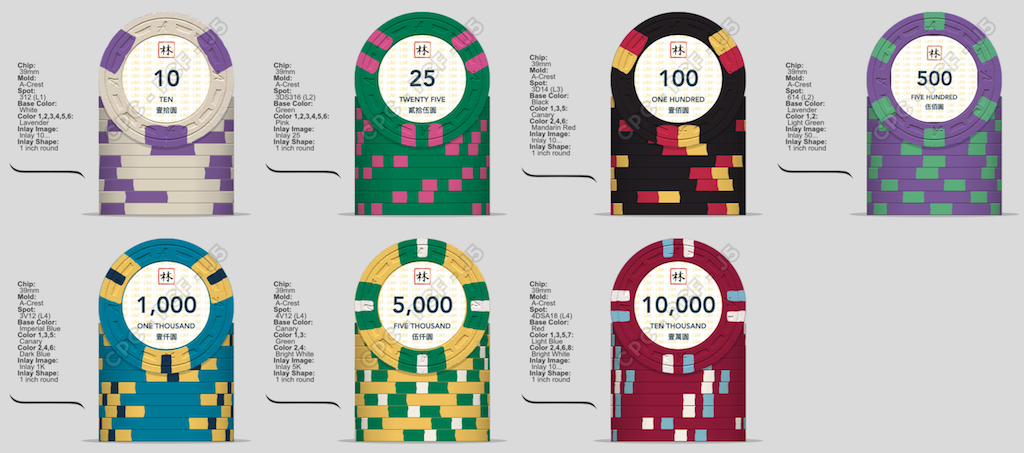
One piece of feedback I can offer is that denominations of 10 and 10,000 are not typically used. Typical tournament denominations are as follows:
25/100/500/1000/5000/25000 (and sometimes 5)
Or
25/100/500/2000/10000/50000 (used less often than above)
You're sure to get lots of good advice on design and breakdown here!
I assume this set is for tournament play? I see you are in Asia so I'm not sure about denominations. If you tell us a bit more about the application of the set that will help.
One piece of feedback I can offer is that denominations of 10 and 10,000 are not typically used. Typical tournament denominations are as follows:
25/100/500/1000/5000/25000 (and sometimes 5)
Or
25/100/500/2000/10000/50000 (used less often than above)
You're sure to get lots of good advice on design and breakdown here!
Get color and mold samples. The colors in Person vary greatly from those on screen. I Haven’t seen one set where someone mock up colors, then didn’t change them Once they received color samples in person. A lot of the colors very significantly and this affects which colors go with what colors. Having the chip samples in hand allows you to put the colors next to each other to see how they will complement or clash in person.
The molds vary greatly as well. I would suggest getting your hands on a couple of different custom molds. I have sample sets from just about every mold made, which was not cheap, but I did not have to go and purchase a mold sample set. Luckily both mold and color sample sets can be resold to others who were in your boat after you are done with them.
I would highly agree with the above post, To simplify things, whether it’s a cash or tournament set, the most efficient use of your dollars spent on chips, and the most efficient poker play typically Uses a chip multiplier of four or five times the previous denomination. This is why most often chips such as T25 and T50 Don’t belong in the same set. The one exception that is typically acceptable, is with the 500 chip and 1000 chip. However as noted above, you can always do a 500 chip then a 2K chip. Just Option is less typical, but there are a number of people that have gone this route.
Gameface
Two Pair
If I were doing a custom tourney set I would go with
25/100/500/2000/10,000 maybe a 50K depending on what I wanted to do.
25/100/500/2000/10,000 maybe a 50K depending on what I wanted to do.
I think this is a conceptually good idea, but it depends on what you’re used to. I had played with 1000/5000 for so long, I found it difficult to play with 2000/10000. I kept miss counting my declare bet when I would go to cut the chips.If I were doing a custom tourney set I would go with
25/100/500/2000/10,000 maybe a 50K depending on what I wanted to do.
200 Motels
Flush
Most folks seem to be used to 25/100/500/1000/5000. Functionally, its less versatile than the 2000/10,000 version but i find nonchippers get confused with less common denoms.
UNLESS, this is a cash set and you're playing a 10/25. If that is the case then you may want a $5 chip.
UNLESS, this is a cash set and you're playing a 10/25. If that is the case then you may want a $5 chip.
- Joined
- Nov 7, 2014
- Messages
- 2,136
- Reaction score
- 2,342
- Location
- Northern NJ and NY/Long Island Areas
make the 10K a 20K if you want to keep the other denominations .. Not sure why you need the 10 below the 25 ..
Last edited:
dickzapper
Straight
I feel like the inlay has too much white space on it. Personally I'd make the denomination bold font and probably remove the commas in the higher denoms. My first instinct was that the set would work on the smaller inlay. I'm liking the spot design, but not sure about the colors that repeat in some chips. Also have you considered the circle-square mold? Not sure if there is any theme connection to the A-mold but personally I'd go with csq mold despite that mold feeling less textured and more smooth, I love the feel and look of csq.
Rhodeman77
Straight Flush
Couple things that jump out at me is the 1000 and 5000 chip are too close in color. Sharing. Color on 2 chips next to each other in denomination is never a good idea, on top of that blue and green can get confused easily in low light.
Is the inlay just a place holder for now? If not I recommend working with a designer. There is a lot of empty space you can be using up. And I would go with a 7/8” inlay as well since you aren’t using the whole inlay for some dramatic art work let the clay be seen!!
Look for some interesting fonts possibly. The font can give a set a lot of character when you are trying to keep the design more simple.
You could definitely scale the Asian character to be much larger and even behind the denom. Agree about getting someone with design, graphics capabilities.
If you're looking for help with the inlay design, shoot me a PM and I can give you an overview. ")
Poker Zombie
Royal Flush
The 10 is not useful because it does not play well with a 25. You can make the 10 a 5 though, and all will be well.
Pay no attention to the 2000 / 10,000 camp. I've played in some games with them, an all they do is confuse people and make you buy more 500 chips than you would have needed otherwise. Probably the reason casinos don't use 2000 / 10000 chips.
Pay no attention to the 2000 / 10,000 camp. I've played in some games with them, an all they do is confuse people and make you buy more 500 chips than you would have needed otherwise. Probably the reason casinos don't use 2000 / 10000 chips.
I am really overwhelmed with the response! Thank you everyone for the input, very much appreciated!
Most of the feedback concerns denomination: I will be using these chips more for casino-style card games, rather than poker games, hence the denominations and colours resemble closer to those in casino than cash/ tourney chips for poker.
It is not to say that the chips won't be used to play poker, but most of my friends are used to casino chips and their denominations. The 10s are unlikely to go on the poker table, but it will be useful for my regular card games
p.s. I am not running a casino! We just play a lot of cards!
Yes, and I am really thankful for the advice!
As mentioned, they will be primarily for table card games, 10/25/100/500 for smaller games and 100/500/1000/5000/10000 for higher limits. Asians generally prefer luck-based rather than skill-based games, hence we don't play poker that often!
I will surely look into this! I chose the A-mold because it is the initial of my first name
Well noted on the 1000 and 5000 chip. Personally I feel the same, and thought I would ask here to see if it was just me who thought so! If there's any suggestion to that I would be really thankful!
I am considering working with a designer, this is just a mockup of what I feel I want. There's no dramatic artwork, and I will rethink about using a 7/8" inlay, thanks!
Most of the feedback concerns denomination: I will be using these chips more for casino-style card games, rather than poker games, hence the denominations and colours resemble closer to those in casino than cash/ tourney chips for poker.
It is not to say that the chips won't be used to play poker, but most of my friends are used to casino chips and their denominations. The 10s are unlikely to go on the poker table, but it will be useful for my regular card games
p.s. I am not running a casino! We just play a lot of cards!
Hi and welcome to the site!
I assume this set is for tournament play? I see you are in Asia so I'm not sure about denominations. If you tell us a bit more about the application of the set that will help.
One piece of feedback I can offer is that denominations of 10 and 10,000 are not typically used. Typical tournament denominations are as follows:
25/100/500/1000/5000/25000 (and sometimes 5)
Or
25/100/500/2000/10000/50000 (used less often than above)
You're sure to get lots of good advice on design and breakdown here!
Yes, and I am really thankful for the advice!
As mentioned, they will be primarily for table card games, 10/25/100/500 for smaller games and 100/500/1000/5000/10000 for higher limits. Asians generally prefer luck-based rather than skill-based games, hence we don't play poker that often!
I feel like the inlay has too much white space on it. Personally I'd make the denomination bold font and probably remove the commas in the higher denoms. My first instinct was that the set would work on the smaller inlay. I'm liking the spot design, but not sure about the colors that repeat in some chips. Also have you considered the circle-square mold? Not sure if there is any theme connection to the A-mold but personally I'd go with csq mold despite that mold feeling less textured and more smooth, I love the feel and look of csq.
I will surely look into this! I chose the A-mold because it is the initial of my first name
Couple things that jump out at me is the 1000 and 5000 chip are too close in color. Sharing. Color on 2 chips next to each other in denomination is never a good idea, on top of that blue and green can get confused easily in low light.
Is the inlay just a place holder for now? If not I recommend working with a designer. There is a lot of empty space you can be using up. And I would go with a 7/8” inlay as well since you aren’t using the whole inlay for some dramatic art work let the clay be seen!!
Look for some interesting fonts possibly. The font can give a set a lot of character when you are trying to keep the design more simple.
Well noted on the 1000 and 5000 chip. Personally I feel the same, and thought I would ask here to see if it was just me who thought so! If there's any suggestion to that I would be really thankful!
I am considering working with a designer, this is just a mockup of what I feel I want. There's no dramatic artwork, and I will rethink about using a 7/8" inlay, thanks!
Similar threads
- Replies
- 59
- Views
- 2K
- Replies
- 38
- Views
- 1K
- Replies
- 14
- Views
- 367